- Power BI forums
- Updates
- News & Announcements
- Get Help with Power BI
- Desktop
- Service
- Report Server
- Power Query
- Mobile Apps
- Developer
- DAX Commands and Tips
- Custom Visuals Development Discussion
- Health and Life Sciences
- Power BI Spanish forums
- Translated Spanish Desktop
- Power Platform Integration - Better Together!
- Power Platform Integrations (Read-only)
- Power Platform and Dynamics 365 Integrations (Read-only)
- Training and Consulting
- Instructor Led Training
- Dashboard in a Day for Women, by Women
- Galleries
- Community Connections & How-To Videos
- COVID-19 Data Stories Gallery
- Themes Gallery
- Data Stories Gallery
- R Script Showcase
- Webinars and Video Gallery
- Quick Measures Gallery
- 2021 MSBizAppsSummit Gallery
- 2020 MSBizAppsSummit Gallery
- 2019 MSBizAppsSummit Gallery
- Events
- Ideas
- Custom Visuals Ideas
- Issues
- Issues
- Events
- Upcoming Events
- Community Blog
- Power BI Community Blog
- Custom Visuals Community Blog
- Community Support
- Community Accounts & Registration
- Using the Community
- Community Feedback
Register now to learn Fabric in free live sessions led by the best Microsoft experts. From Apr 16 to May 9, in English and Spanish.
- Power BI forums
- Forums
- Get Help with Power BI
- Desktop
- Segment data by time using Days or Months in the s...
- Subscribe to RSS Feed
- Mark Topic as New
- Mark Topic as Read
- Float this Topic for Current User
- Bookmark
- Subscribe
- Printer Friendly Page
- Mark as New
- Bookmark
- Subscribe
- Mute
- Subscribe to RSS Feed
- Permalink
- Report Inappropriate Content
Segment data by time using Days or Months in the same graph
Hi everyone,
we are using PowerBI desktop to visualize several metrics and their changes in time. What is the best way how to do it?
We have a "date" dimension, which containts Day, Month and Year information for every row. We would like to see a timeline for different time periods - Last Week, Last Month, Last Quarter, Last Year, and more. When I create a report for Last Month or Last Quarter, seeing data by Day is fine (meaning I see data segmented by Day).
However, when I choose Last Year or more options, it would be better if the graph changed automatically to show the same date using Month dimension (meaning I want to see data only for the whole month, not for every day).
Does anyone have any idea how to do it? In general? And if it was possible to do it in a single graph.
Thank you in advance.
- Mark as New
- Bookmark
- Subscribe
- Mute
- Subscribe to RSS Feed
- Permalink
- Report Inappropriate Content
You cannot change a chart axis dynamically (from Days to Months). However, the axis could be a date hierarchy and then you can view totals at different levels (Year, Month, etc.).
Follow me on Twitter: https://twitter.com/AdolfoSocorro
- Mark as New
- Bookmark
- Subscribe
- Mute
- Subscribe to RSS Feed
- Permalink
- Report Inappropriate Content
Asocorro, thank you very much for your answer, very much appreciated.
May I ask you - could you be please more specific, what do you mean by "date hierarchy"? What do you suggest that we should do?
Thank you in advance.
- Mark as New
- Bookmark
- Subscribe
- Mute
- Subscribe to RSS Feed
- Permalink
- Report Inappropriate Content
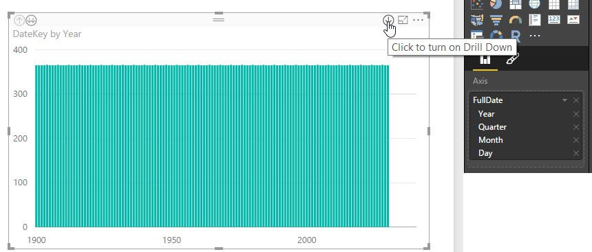
If it is a date field, when you drop it in the axis well you should see it is displayed automatically as a hierachy, and your chart will have navigation buttons.
Follow me on Twitter: https://twitter.com/AdolfoSocorro
- Mark as New
- Bookmark
- Subscribe
- Mute
- Subscribe to RSS Feed
- Permalink
- Report Inappropriate Content
Hi Asocorro,
thank you for your answer.
The strange thing is that we cannot see these options in the date hierarchy.
We download data from Google Analytics and we have a dimension Date, in this format: (dddd, MMMM d, yyyy)
However, when I use a dimension Date in the graph, for example as X-Axis, I can see only Year as an option in the Date hierarchy and no months or days.
Do you know what might be a problem?
Thanks in advance.
Helpful resources

Microsoft Fabric Learn Together
Covering the world! 9:00-10:30 AM Sydney, 4:00-5:30 PM CET (Paris/Berlin), 7:00-8:30 PM Mexico City

Power BI Monthly Update - April 2024
Check out the April 2024 Power BI update to learn about new features.

| User | Count |
|---|---|
| 111 | |
| 100 | |
| 80 | |
| 64 | |
| 57 |
| User | Count |
|---|---|
| 146 | |
| 110 | |
| 93 | |
| 84 | |
| 67 |

