- Power BI forums
- Updates
- News & Announcements
- Get Help with Power BI
- Desktop
- Service
- Report Server
- Power Query
- Mobile Apps
- Developer
- DAX Commands and Tips
- Custom Visuals Development Discussion
- Health and Life Sciences
- Power BI Spanish forums
- Translated Spanish Desktop
- Power Platform Integration - Better Together!
- Power Platform Integrations (Read-only)
- Power Platform and Dynamics 365 Integrations (Read-only)
- Training and Consulting
- Instructor Led Training
- Dashboard in a Day for Women, by Women
- Galleries
- Community Connections & How-To Videos
- COVID-19 Data Stories Gallery
- Themes Gallery
- Data Stories Gallery
- R Script Showcase
- Webinars and Video Gallery
- Quick Measures Gallery
- 2021 MSBizAppsSummit Gallery
- 2020 MSBizAppsSummit Gallery
- 2019 MSBizAppsSummit Gallery
- Events
- Ideas
- Custom Visuals Ideas
- Issues
- Issues
- Events
- Upcoming Events
- Community Blog
- Power BI Community Blog
- Custom Visuals Community Blog
- Community Support
- Community Accounts & Registration
- Using the Community
- Community Feedback
Register now to learn Fabric in free live sessions led by the best Microsoft experts. From Apr 16 to May 9, in English and Spanish.
- Power BI forums
- Forums
- Get Help with Power BI
- Desktop
- Scrolling page with 10 charts based on Dynamic Ran...
- Subscribe to RSS Feed
- Mark Topic as New
- Mark Topic as Read
- Float this Topic for Current User
- Bookmark
- Subscribe
- Printer Friendly Page
- Mark as New
- Bookmark
- Subscribe
- Mute
- Subscribe to RSS Feed
- Permalink
- Report Inappropriate Content
Scrolling page with 10 charts based on Dynamic Rank
Hi All,
I'm trying to create a scrolling page which will have 10 charts vertically, and that update dynamically based on top sales.
I have an existing view where you can click on a slicer to update a single set of charts, however, the users have asked that this be a scrolling view with top 10 instead of having to click through each item.
The idea here is that there are 2000 products classified by geographies and I would like to rank them by largest to smallest sales and then show the largest product in the first chart, the second largest product in the second chart, etc. When you filter the geography this would also update to show only the top 10 products in that geography.
I've tried a few methods but haven't had much success and can't find anyone doing this before.
Hoping I can find some help here.
Thanks!
Solved! Go to Solution.
- Mark as New
- Bookmark
- Subscribe
- Mute
- Subscribe to RSS Feed
- Permalink
- Report Inappropriate Content
Hey @Anonymous ,
here you find a pbix
please look at the page "Rank Directed To Visual".
I use this DAX statement to create a rank:
Rank Color Name by Sales Amount (Sales) =
RANKX(
    ALLSELECTED('DimProduct'[ColorName])
    , [Sales Amount (Sales)]
    ,
    , desc
    , Dense
)
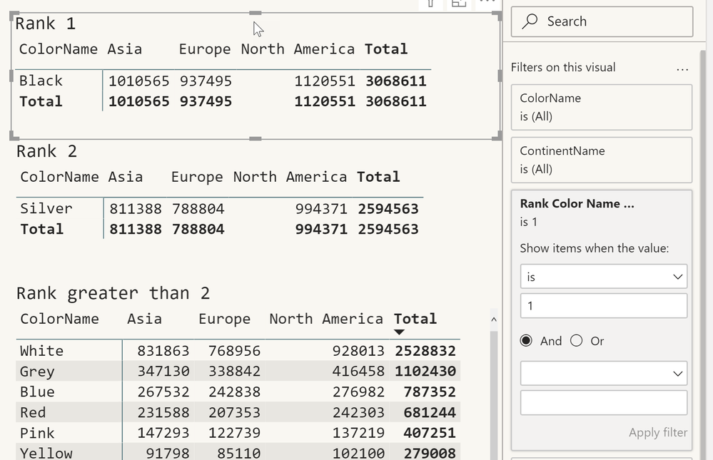
There is a larger table visual on the left side, this visual is just used for demonstration purpose, to show if the rank measure is working.
Then there are three matrix visuals on the right side, as you can see only the color with rank 1 is used in the top matrix visual. This is achieved by leveraging a visual level filter:
In my simple example directing color names to visuals is simple because I use the column that is rank inside the visual.
Hopefully, this provides some ideas to tackle your challenge.
Regards,
Tom
Did I answer your question? Mark my post as a solution, this will help others!
Proud to be a Super User!
I accept Kudos 😉
Hamburg, Germany
- Mark as New
- Bookmark
- Subscribe
- Mute
- Subscribe to RSS Feed
- Permalink
- Report Inappropriate Content
Hi @Anonymous
If you've fixed the issue on your own please kindly share your solution. if the above posts help, please kindly mark it as a solution to help others find it more quickly. If not, please kindly elaborate more. thanks!
If this post helps, then please consider Accept it as the solution to help the other members find it more
quickly.
- Mark as New
- Bookmark
- Subscribe
- Mute
- Subscribe to RSS Feed
- Permalink
- Report Inappropriate Content
Hey @Anonymous ,
creating a scolling page requires 2 steps:
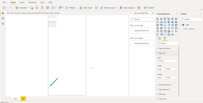
- adjust the height of the report page that fits your reporting needs, if you select the canvas you can adjust the page settings:
- First Power BI visualizes the new page size that it fits to your screen size
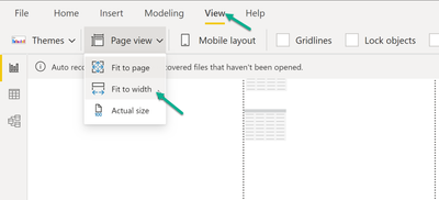
to make the page scrolling, adjust the viewing format
Hopefully this is what you are looking for.
Regars,
Tom
Did I answer your question? Mark my post as a solution, this will help others!
Proud to be a Super User!
I accept Kudos 😉
Hamburg, Germany
- Mark as New
- Bookmark
- Subscribe
- Mute
- Subscribe to RSS Feed
- Permalink
- Report Inappropriate Content
Tom,
Thank you very much for the explanation on how to make a scrolling page. I had actually already completed this part though, what I am stuck on is figuring out how to make charts that tie to a dynamic rank. meaning i have 10 charts which each represent the top 10 elements by sales volume, and when i filter for geography, this would also update to show the top 10 based on specific geography.
Hoping you can help, Thanks!
Martin
- Mark as New
- Bookmark
- Subscribe
- Mute
- Subscribe to RSS Feed
- Permalink
- Report Inappropriate Content
Hey @Anonymous ,
here you find a pbix
please look at the page "Rank Directed To Visual".
I use this DAX statement to create a rank:
Rank Color Name by Sales Amount (Sales) =
RANKX(
    ALLSELECTED('DimProduct'[ColorName])
    , [Sales Amount (Sales)]
    ,
    , desc
    , Dense
)
There is a larger table visual on the left side, this visual is just used for demonstration purpose, to show if the rank measure is working.
Then there are three matrix visuals on the right side, as you can see only the color with rank 1 is used in the top matrix visual. This is achieved by leveraging a visual level filter:
In my simple example directing color names to visuals is simple because I use the column that is rank inside the visual.
Hopefully, this provides some ideas to tackle your challenge.
Regards,
Tom
Did I answer your question? Mark my post as a solution, this will help others!
Proud to be a Super User!
I accept Kudos 😉
Hamburg, Germany
Helpful resources

Microsoft Fabric Learn Together
Covering the world! 9:00-10:30 AM Sydney, 4:00-5:30 PM CET (Paris/Berlin), 7:00-8:30 PM Mexico City

Power BI Monthly Update - April 2024
Check out the April 2024 Power BI update to learn about new features.

| User | Count |
|---|---|
| 118 | |
| 107 | |
| 70 | |
| 70 | |
| 43 |
| User | Count |
|---|---|
| 148 | |
| 105 | |
| 104 | |
| 89 | |
| 65 |


