- Power BI forums
- Updates
- News & Announcements
- Get Help with Power BI
- Desktop
- Service
- Report Server
- Power Query
- Mobile Apps
- Developer
- DAX Commands and Tips
- Custom Visuals Development Discussion
- Health and Life Sciences
- Power BI Spanish forums
- Translated Spanish Desktop
- Power Platform Integration - Better Together!
- Power Platform Integrations (Read-only)
- Power Platform and Dynamics 365 Integrations (Read-only)
- Training and Consulting
- Instructor Led Training
- Dashboard in a Day for Women, by Women
- Galleries
- Community Connections & How-To Videos
- COVID-19 Data Stories Gallery
- Themes Gallery
- Data Stories Gallery
- R Script Showcase
- Webinars and Video Gallery
- Quick Measures Gallery
- 2021 MSBizAppsSummit Gallery
- 2020 MSBizAppsSummit Gallery
- 2019 MSBizAppsSummit Gallery
- Events
- Ideas
- Custom Visuals Ideas
- Issues
- Issues
- Events
- Upcoming Events
- Community Blog
- Power BI Community Blog
- Custom Visuals Community Blog
- Community Support
- Community Accounts & Registration
- Using the Community
- Community Feedback
Register now to learn Fabric in free live sessions led by the best Microsoft experts. From Apr 16 to May 9, in English and Spanish.
- Power BI forums
- Forums
- Get Help with Power BI
- Desktop
- Scatterplot trend line does not go through data
- Subscribe to RSS Feed
- Mark Topic as New
- Mark Topic as Read
- Float this Topic for Current User
- Bookmark
- Subscribe
- Printer Friendly Page
- Mark as New
- Bookmark
- Subscribe
- Mute
- Subscribe to RSS Feed
- Permalink
- Report Inappropriate Content
Scatterplot trend line does not go through data
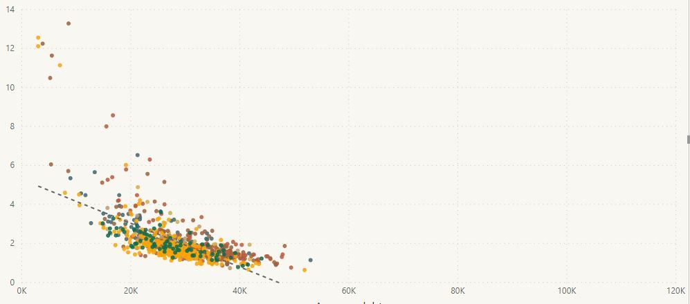
I am adding a trend line to a scatterplot. As you can see in the attached screen shot, the line does not go through the data. I cannot figure out what is going on here. In fact, two of my colleagues have looked at this and we're all stumped.
Things we've tried:
- Turning off all filters and slicers
- Filtering out blank values
- Filtering out values beyond the visible axes
- Turning off all axis limits (i.e., there is no data beyond the visible axes that could be pulling the line)
The line does respond to changes in filters: if we turn filters/slicers on and off, the line will shift, but it never actually goes through the displayed data.
Are there any other things that we should look at?
Edit/Update:
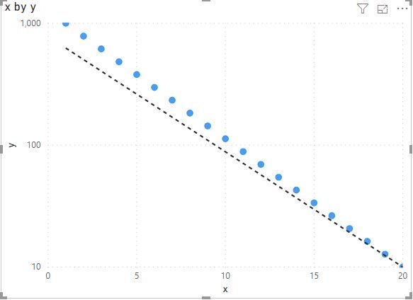
The y-axis is on a log scale. If I change the scale to linear, the line works properly. So, This appears to be a bug. When the y-axis is changed to log, the trend line continues to be on a linear scale. Is there any way to fix this?
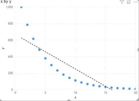
Screen shot of y-axis on a linear scale (same data) added for comparison.
Log scale:
Linear scale:
- Mark as New
- Bookmark
- Subscribe
- Mute
- Subscribe to RSS Feed
- Permalink
- Report Inappropriate Content
Hi! I'm facing the exactly same issue here. Is there any workaround except creating a custom visual by myself?
- Mark as New
- Bookmark
- Subscribe
- Mute
- Subscribe to RSS Feed
- Permalink
- Report Inappropriate Content
Hi @dtan ,
Can you please share some sample data for test? It is hard to test without any sample data.
How to Get Your Question Answered Quickly
Notice: please do mask on sensitive data before share
Regards,
Xiaoxin Sheng
If this post helps, please consider accept as solution to help other members find it more quickly.
- Mark as New
- Bookmark
- Subscribe
- Mute
- Subscribe to RSS Feed
- Permalink
- Report Inappropriate Content
Sure. Here is a table of log-linear data that I created with python:
| x | y |
| 1 | 1000 |
| 2 | 784.76 |
| 3 | 615.8482 |
| 4 | 483.293 |
| 5 | 379.269 |
| 6 | 297.6351 |
| 7 | 233.5721 |
| 8 | 183.2981 |
| 9 | 143.845 |
| 10 | 112.8838 |
| 11 | 88.58668 |
| 12 | 69.51928 |
| 13 | 54.55595 |
| 14 | 42.81332 |
| 15 | 33.59818 |
| 16 | 26.36651 |
| 17 | 20.69138 |
| 18 | 16.23777 |
| 19 | 12.74275 |
| 20 | 10 |
When I plot this in PowerBI with y on a linear scale, the trend line is correct. When I plot with y on a log scale, the trend line no longer goes through the data.
Linear scale:
Log scale:
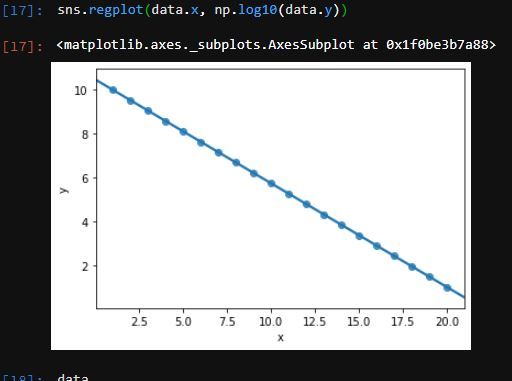
The data were created so that the relationship is perfectly log-linear, and the line should go exactly through the datapoints. Here is a plot I made with the data in python with the y data plotted as log10(y):
- Mark as New
- Bookmark
- Subscribe
- Mute
- Subscribe to RSS Feed
- Permalink
- Report Inappropriate Content
Hi @dtan ,
I can reproduce your scenario.
I build a table from your sample data and add a calculated column based y column, trend line works well as the result that your python code generated.
logY = LOG10([y])
Regards,
Xiaoxin Sheng
If this post helps, please consider accept as solution to help other members find it more quickly.
- Mark as New
- Bookmark
- Subscribe
- Mute
- Subscribe to RSS Feed
- Permalink
- Report Inappropriate Content
Thanks -- unfortunately with this fix (as in my Python demo) is that the y-axis is now in log-units.
The ideal scenario we're trying for is to have the y-axis in their original units (e.g., 1, 10, 100), but with their spacing on a log scale, and the trend line reflecting the linearized relationship *after* the log transform.
I can't find a clear way to plot the log-transformed datapoints with the values on the y-axis in the original scale, but with the trend line showing the now linearized relationship in PowerBI.
In scripting-based plotting tools you can generally apply values to the y-axis for display purposes (e.g., have 1, 10, and 100, equispaced along the y-axis), while plotting the log-transformed data with the appropriate trendline. Is this possible in PowerBI? Is there a hacky workaround that can be done to display the y-axis in the original units, while plotting the log transformed data with trend line?
More generally, it seems less than ideal to have a trendline *not* go through data after the axis is changed to a log scale (independent of my particular problem -- this is a platform-level issue).
Helpful resources

Microsoft Fabric Learn Together
Covering the world! 9:00-10:30 AM Sydney, 4:00-5:30 PM CET (Paris/Berlin), 7:00-8:30 PM Mexico City

Power BI Monthly Update - April 2024
Check out the April 2024 Power BI update to learn about new features.

| User | Count |
|---|---|
| 108 | |
| 100 | |
| 78 | |
| 64 | |
| 58 |
| User | Count |
|---|---|
| 148 | |
| 111 | |
| 94 | |
| 84 | |
| 67 |


