- Power BI forums
- Updates
- News & Announcements
- Get Help with Power BI
- Desktop
- Service
- Report Server
- Power Query
- Mobile Apps
- Developer
- DAX Commands and Tips
- Custom Visuals Development Discussion
- Health and Life Sciences
- Power BI Spanish forums
- Translated Spanish Desktop
- Power Platform Integration - Better Together!
- Power Platform Integrations (Read-only)
- Power Platform and Dynamics 365 Integrations (Read-only)
- Training and Consulting
- Instructor Led Training
- Dashboard in a Day for Women, by Women
- Galleries
- Community Connections & How-To Videos
- COVID-19 Data Stories Gallery
- Themes Gallery
- Data Stories Gallery
- R Script Showcase
- Webinars and Video Gallery
- Quick Measures Gallery
- 2021 MSBizAppsSummit Gallery
- 2020 MSBizAppsSummit Gallery
- 2019 MSBizAppsSummit Gallery
- Events
- Ideas
- Custom Visuals Ideas
- Issues
- Issues
- Events
- Upcoming Events
- Community Blog
- Power BI Community Blog
- Custom Visuals Community Blog
- Community Support
- Community Accounts & Registration
- Using the Community
- Community Feedback
Register now to learn Fabric in free live sessions led by the best Microsoft experts. From Apr 16 to May 9, in English and Spanish.
- Power BI forums
- Forums
- Get Help with Power BI
- Desktop
- Scatter plot with two nominal variables
- Subscribe to RSS Feed
- Mark Topic as New
- Mark Topic as Read
- Float this Topic for Current User
- Bookmark
- Subscribe
- Printer Friendly Page
- Mark as New
- Bookmark
- Subscribe
- Mute
- Subscribe to RSS Feed
- Permalink
- Report Inappropriate Content
Scatter plot with two nominal variables
I have a data set that contains three columns -- Sample ID (1 to 100), Experiment ID, and Result (between 0 to 1).
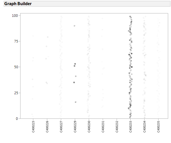
I would like to plot a scatter plot, x axis as Experiment ID, y axis as Sample ID, and the Resultwill be represented by color grade. Demo plot from other programs is given as following.
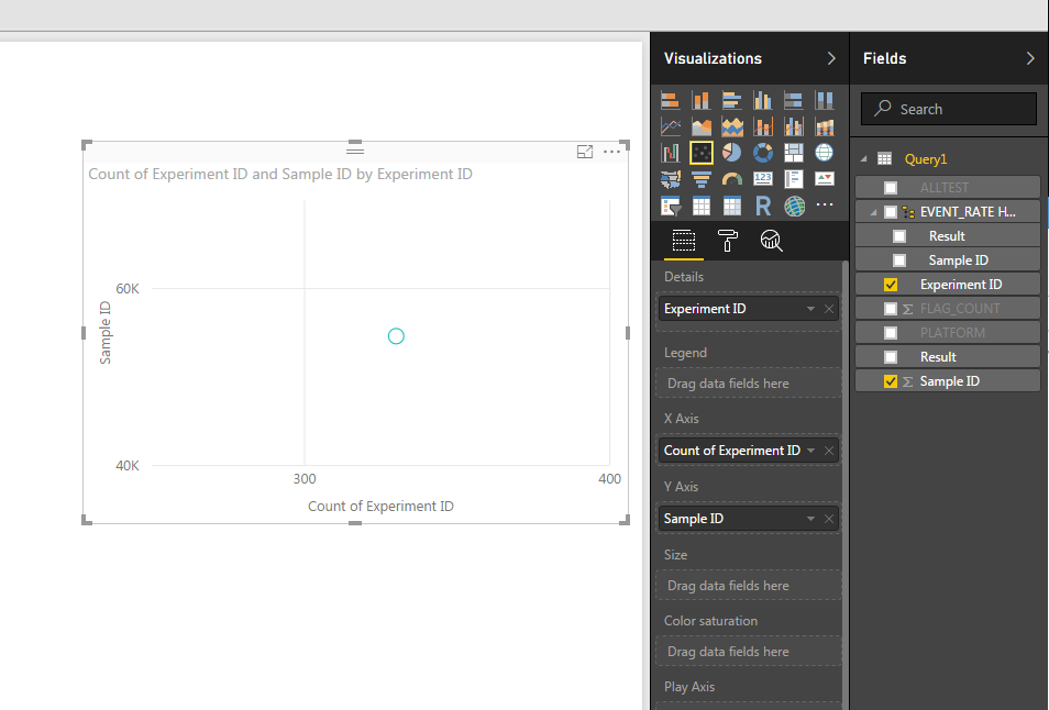
Could you please show me how to plot that in Power BI? Power BI tends to group the Sample IDand Experiment ID, and choose the details as Experiment ID seems not get what I want. Any hint or instruction will be helpful, thank you!
Solved! Go to Solution.
- Mark as New
- Bookmark
- Subscribe
- Mute
- Subscribe to RSS Feed
- Permalink
- Report Inappropriate Content
Hi @xzhang32,
First, ensure when connecting/importing your data that each column has the correct data type.
- Experiment ID = Whole number (remove the C from the beginning if possible - scatter plots don't like non-numerical values)
- Sample ID = Whole number
- Result = Decimal number
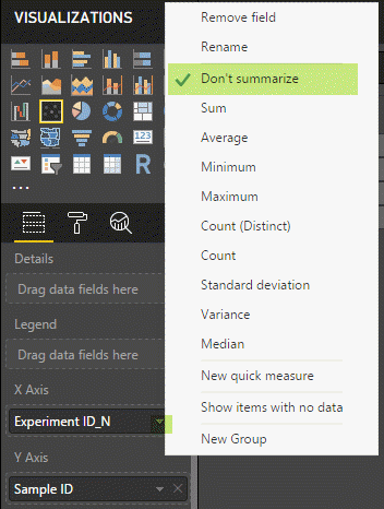
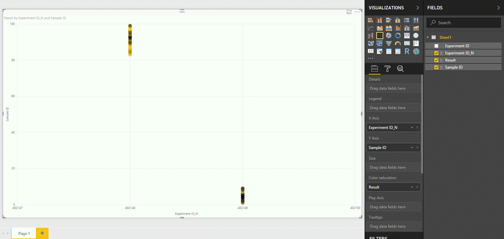
After adding Experiment ID as the x-axis set this attribute to "Don't summarize"
Do the same operation for the y-axis with Sample ID: Don't summarize
Add the Result column in the "Color saturation" shelf and then you can define a divering colors in the visual options to represent the Result
After applying these steps the data points in the scatter plot won't be summarized (Sum, count, etc.) and this should help you achieve your intended visual.
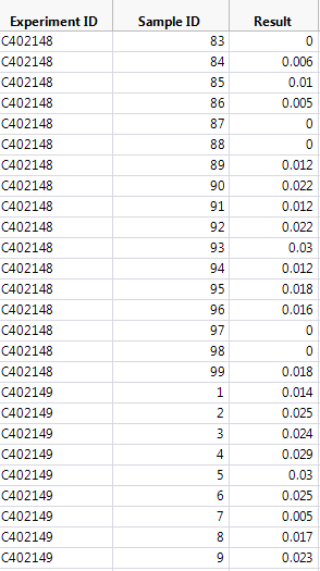
Sample data:
| Experiment ID | Experiment ID_N | Sample ID | Result |
| C402148 | 402148 | 83 | 0.000 |
| C402148 | 402148 | 84 | 0.006 |
| C402148 | 402148 | 85 | 0.010 |
| C402148 | 402148 | 86 | 0.005 |
| C402148 | 402148 | 87 | 0.000 |
| C402148 | 402148 | 88 | 0.000 |
| C402148 | 402148 | 89 | 0.012 |
| C402148 | 402148 | 90 | 0.022 |
| C402148 | 402148 | 91 | 0.012 |
| C402148 | 402148 | 92 | 0.022 |
| C402148 | 402148 | 93 | 0.030 |
| C402148 | 402148 | 94 | 0.012 |
| C402148 | 402148 | 95 | 0.018 |
| C402148 | 402148 | 96 | 0.016 |
| C402148 | 402148 | 97 | 0.000 |
| C402148 | 402148 | 98 | 0.000 |
| C402148 | 402148 | 99 | 0.018 |
| C402149 | 402149 | 1 | 0.014 |
| C402149 | 402149 | 2 | 0.025 |
| C402149 | 402149 | 3 | 0.024 |
| C402149 | 402149 | 4 | 0.029 |
| C402149 | 402149 | 5 | 0.030 |
| C402149 | 402149 | 6 | 0.025 |
| C402149 | 402149 | 7 | 0.005 |
| C402149 | 402149 | 8 | 0.017 |
| C402149 | 402149 | 9 | 0.023 |
Visual:
Let me know if this is helpful or if you have any questions.
Thanks
Kevin
Helpful resources

Microsoft Fabric Learn Together
Covering the world! 9:00-10:30 AM Sydney, 4:00-5:30 PM CET (Paris/Berlin), 7:00-8:30 PM Mexico City

Power BI Monthly Update - April 2024
Check out the April 2024 Power BI update to learn about new features.

| User | Count |
|---|---|
| 117 | |
| 107 | |
| 70 | |
| 70 | |
| 43 |
| User | Count |
|---|---|
| 148 | |
| 106 | |
| 104 | |
| 89 | |
| 65 |
