- Power BI forums
- Updates
- News & Announcements
- Get Help with Power BI
- Desktop
- Service
- Report Server
- Power Query
- Mobile Apps
- Developer
- DAX Commands and Tips
- Custom Visuals Development Discussion
- Health and Life Sciences
- Power BI Spanish forums
- Translated Spanish Desktop
- Power Platform Integration - Better Together!
- Power Platform Integrations (Read-only)
- Power Platform and Dynamics 365 Integrations (Read-only)
- Training and Consulting
- Instructor Led Training
- Dashboard in a Day for Women, by Women
- Galleries
- Community Connections & How-To Videos
- COVID-19 Data Stories Gallery
- Themes Gallery
- Data Stories Gallery
- R Script Showcase
- Webinars and Video Gallery
- Quick Measures Gallery
- 2021 MSBizAppsSummit Gallery
- 2020 MSBizAppsSummit Gallery
- 2019 MSBizAppsSummit Gallery
- Events
- Ideas
- Custom Visuals Ideas
- Issues
- Issues
- Events
- Upcoming Events
- Community Blog
- Power BI Community Blog
- Custom Visuals Community Blog
- Community Support
- Community Accounts & Registration
- Using the Community
- Community Feedback
Register now to learn Fabric in free live sessions led by the best Microsoft experts. From Apr 16 to May 9, in English and Spanish.
- Power BI forums
- Forums
- Get Help with Power BI
- Desktop
- Scatter plot different color shade
- Subscribe to RSS Feed
- Mark Topic as New
- Mark Topic as Read
- Float this Topic for Current User
- Bookmark
- Subscribe
- Printer Friendly Page
- Mark as New
- Bookmark
- Subscribe
- Mute
- Subscribe to RSS Feed
- Permalink
- Report Inappropriate Content
Scatter plot different color shade
Hi,
To make it simple, i have three variables X, Y, Z
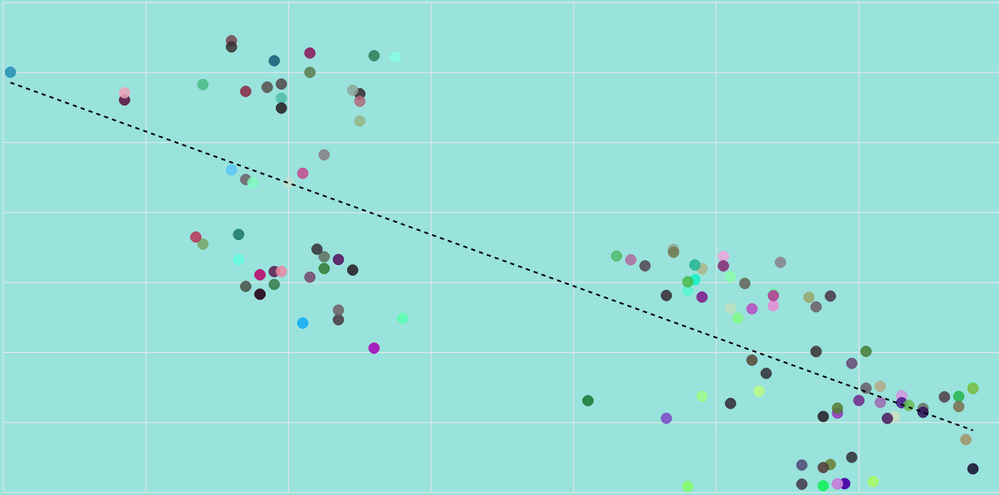
I have set up a scatter plot which represent X on axe X, Y on axe Y and Z as a dotes (as Legend). Z are dates. As you can see, each dates has a different color. I would like to know if i can easely set something like : most recent 10 dotes in Bleu, all the other one in Red. Or even better most recent 10 dotes in Brigh Red, between 10 an 50 : lighter red, 50 to 100, lighter lighter red 100 to 200 in black, in order to visualise how my data has evolved with the time passing.
Thanks in advance for your help
Cheers
Pierre
Solved! Go to Solution.
- Mark as New
- Bookmark
- Subscribe
- Mute
- Subscribe to RSS Feed
- Permalink
- Report Inappropriate Content
Hi @pitucc,
You can create a rank calculated column based on Z, then create another column similar the formula.
color = IF(Table[Rank]<=10,"Red",IF(Table7[Rank]<=50,"lighter red",IF(Table[Rank]<=100,"lighter lighter red","black")))
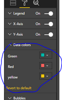
Then add the Z field as Detail level, the color as Lengend, then adjust the Lengend color using the hammer button.
I try to reproduce using my sample table, please review.
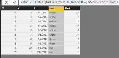
1. Create calculated column using the formulas.
Rank = RANKX(Table7,Table7[Z],,DESC,Dense)
color = IF(Table7[Rank]<=2,"Red",IF(Table7[Rank]<=5,"Green","yellow"))
You will get the results as follows.
2. Create a scatter chart. Click the hammer buttom, and select the expected color.
You will get expected result as follows, please note the X,Y,Z,color fields.
Best Regards,
Angelia
- Mark as New
- Bookmark
- Subscribe
- Mute
- Subscribe to RSS Feed
- Permalink
- Report Inappropriate Content
Your solution is properly perfect
Many thanks
Pierre
Helpful resources

Microsoft Fabric Learn Together
Covering the world! 9:00-10:30 AM Sydney, 4:00-5:30 PM CET (Paris/Berlin), 7:00-8:30 PM Mexico City

Power BI Monthly Update - April 2024
Check out the April 2024 Power BI update to learn about new features.

| User | Count |
|---|---|
| 114 | |
| 99 | |
| 83 | |
| 70 | |
| 61 |
| User | Count |
|---|---|
| 149 | |
| 114 | |
| 107 | |
| 89 | |
| 67 |


