- Power BI forums
- Updates
- News & Announcements
- Get Help with Power BI
- Desktop
- Service
- Report Server
- Power Query
- Mobile Apps
- Developer
- DAX Commands and Tips
- Custom Visuals Development Discussion
- Health and Life Sciences
- Power BI Spanish forums
- Translated Spanish Desktop
- Power Platform Integration - Better Together!
- Power Platform Integrations (Read-only)
- Power Platform and Dynamics 365 Integrations (Read-only)
- Training and Consulting
- Instructor Led Training
- Dashboard in a Day for Women, by Women
- Galleries
- Community Connections & How-To Videos
- COVID-19 Data Stories Gallery
- Themes Gallery
- Data Stories Gallery
- R Script Showcase
- Webinars and Video Gallery
- Quick Measures Gallery
- 2021 MSBizAppsSummit Gallery
- 2020 MSBizAppsSummit Gallery
- 2019 MSBizAppsSummit Gallery
- Events
- Ideas
- Custom Visuals Ideas
- Issues
- Issues
- Events
- Upcoming Events
- Community Blog
- Power BI Community Blog
- Custom Visuals Community Blog
- Community Support
- Community Accounts & Registration
- Using the Community
- Community Feedback
Register now to learn Fabric in free live sessions led by the best Microsoft experts. From Apr 16 to May 9, in English and Spanish.
- Power BI forums
- Forums
- Get Help with Power BI
- Desktop
- Scatter chart with hours as Y axis
- Subscribe to RSS Feed
- Mark Topic as New
- Mark Topic as Read
- Float this Topic for Current User
- Bookmark
- Subscribe
- Printer Friendly Page
- Mark as New
- Bookmark
- Subscribe
- Mute
- Subscribe to RSS Feed
- Permalink
- Report Inappropriate Content
Scatter chart with hours as Y axis
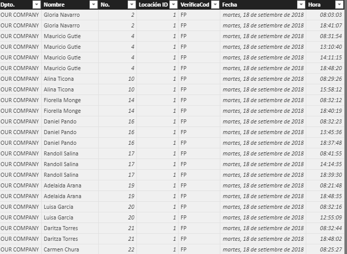
Hello Community. I'm trying to make a scatter chart showing the employees in the X axis and the hours of the day in the Y axis so I can show the hour of arrival of each employee. I have a database like this:
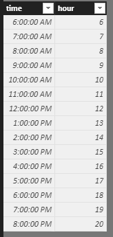
I have created a Date table and an Hour table but for some reason, Power Bi won't let me put the hours in the Y axis. This is my hour table:
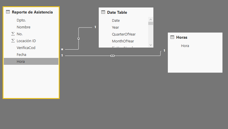
Adn this are my relationships:
I would really appreciate some help on this matter. Thanks in advance!
Solved! Go to Solution.
- Mark as New
- Bookmark
- Subscribe
- Mute
- Subscribe to RSS Feed
- Permalink
- Report Inappropriate Content
HI, @carlosflores
For the values on the Y-axis have to be aggregated, you need to add a "type" for your basic data to classify these Time.
for example:
assume that:
A representative When they get in.
B representative When they go to lunch
C representative When they come back from lunch
D representative When they leave for the day.
then drag the field type into Legend values
Result:
here is pbix, please try it.
https://www.dropbox.com/s/9rm7g2gpsivty6p/Scatter%20chart%20with%20hours%20as%20Y%20axis02.pbix?dl=0
Best Regards,
Lin
If this post helps, then please consider Accept it as the solution to help the other members find it more quickly.
- Mark as New
- Bookmark
- Subscribe
- Mute
- Subscribe to RSS Feed
- Permalink
- Report Inappropriate Content
@v-lili6-msft, thaks for your response and sorry for the late reply,
It works but I haven't mentioned an important part of the problem. There are 4 times a day when people record attendance:
1. When they get in.
2. When they go to lunch
3. When they come back from lunch
4. When they leave for the day.
People should get in before 8:30, should go to lunch at 1, should get back from lunch at 2 and leave for the day at 18:00.
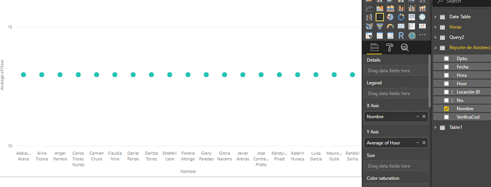
I'm using your method but I only see 1 dot per person, when there should be 4 per person (sometimes they don't mark the time, so there should be less dots for that person).
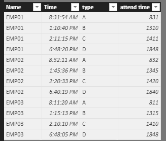
This is my data table
This is how it looks using your method:
As you can see, there's only one dot per person.
Thans again!
- Mark as New
- Bookmark
- Subscribe
- Mute
- Subscribe to RSS Feed
- Permalink
- Report Inappropriate Content
HI, @carlosflores
For the values on the Y-axis have to be aggregated, you need to add a "type" for your basic data to classify these Time.
for example:
assume that:
A representative When they get in.
B representative When they go to lunch
C representative When they come back from lunch
D representative When they leave for the day.
then drag the field type into Legend values
Result:
here is pbix, please try it.
https://www.dropbox.com/s/9rm7g2gpsivty6p/Scatter%20chart%20with%20hours%20as%20Y%20axis02.pbix?dl=0
Best Regards,
Lin
If this post helps, then please consider Accept it as the solution to help the other members find it more quickly.
- Mark as New
- Bookmark
- Subscribe
- Mute
- Subscribe to RSS Feed
- Permalink
- Report Inappropriate Content
- Mark as New
- Bookmark
- Subscribe
- Mute
- Subscribe to RSS Feed
- Permalink
- Report Inappropriate Content
hi, @carlosflores
Could you please tell me if your problem has been solved? If it is, could you please mark the helpful replies as Answered?
Best Regards,
Lin
If this post helps, then please consider Accept it as the solution to help the other members find it more quickly.
- Mark as New
- Bookmark
- Subscribe
- Mute
- Subscribe to RSS Feed
- Permalink
- Report Inappropriate Content
hi,@carlosflores
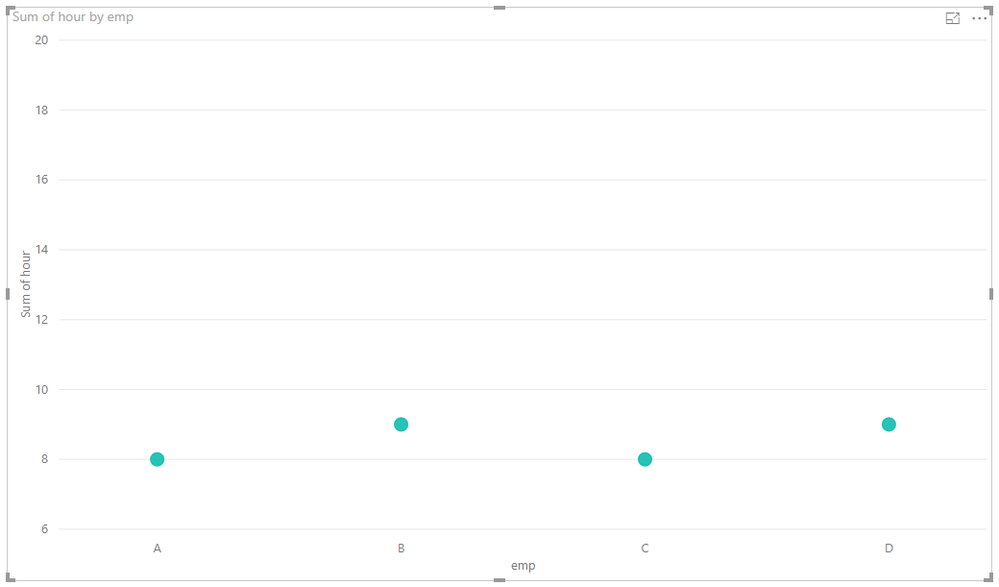
After my research, field which is not number couldn't be drag into Y axis in the scatter chart.
But you can achieve the requirement by this way:
Step1:
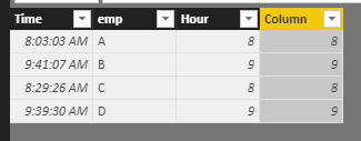
select time column and then click Add column->From date&time->Time->Hour->Hour in Query Edit
you can also do it by dax
Column = HOUR(Table1[Time])
also
then create the relationship by hour
then drag hour into Y aix and set the aggregate type is Average
Result:
Best Regards,
Lin
If this post helps, then please consider Accept it as the solution to help the other members find it more quickly.
- Mark as New
- Bookmark
- Subscribe
- Mute
- Subscribe to RSS Feed
- Permalink
- Report Inappropriate Content
Hello @v-lili6-msft, I did it exactly like you did and it won't work. Here's how it looks:
I can't add the field with the values of the data source
What I'm trying to do with this report is to show who is getting in late, the hour of entrance is 08:30 and we leave at 18:30. This is being done manually and it takes a lot of time. We'd like to automatize this procedure. Please help!
Thanks in advance
- Mark as New
- Bookmark
- Subscribe
- Mute
- Subscribe to RSS Feed
- Permalink
- Report Inappropriate Content
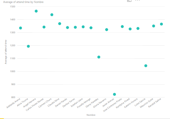
HI, @carlosflores
For your requirement, you can just do like these as below:
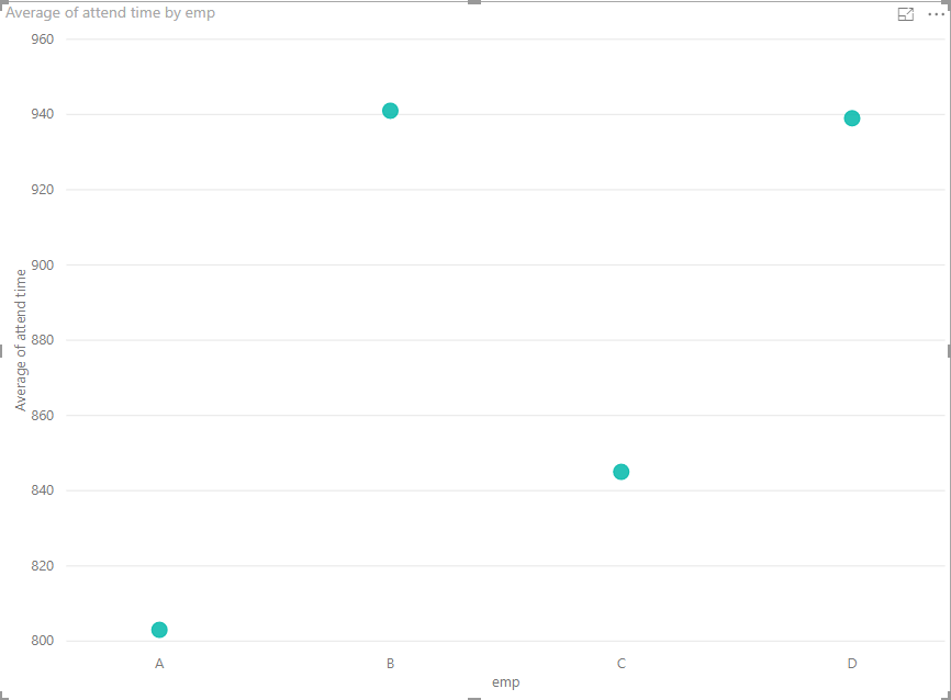
Step 1:
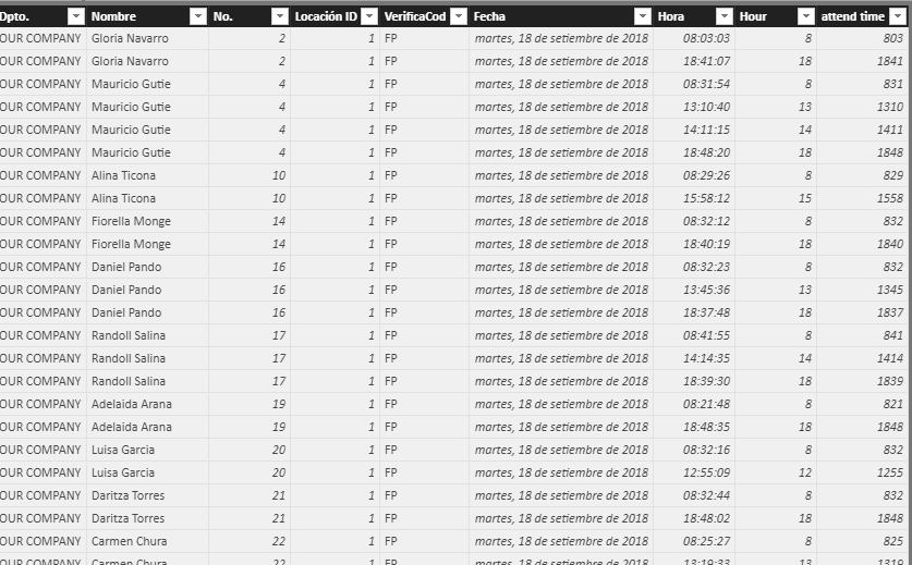
use this formula to add a column
attend time = HOUR(Table1[Time])*100+MINUTE(Table1[Time])
Step 2:
Do not create any relationship with time fact table, drag this field into Y-axis and set the aggregate type is Average.
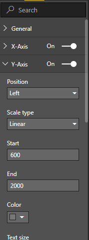
Step 3:
set the format of Y-axis start at 600 and end at 2000
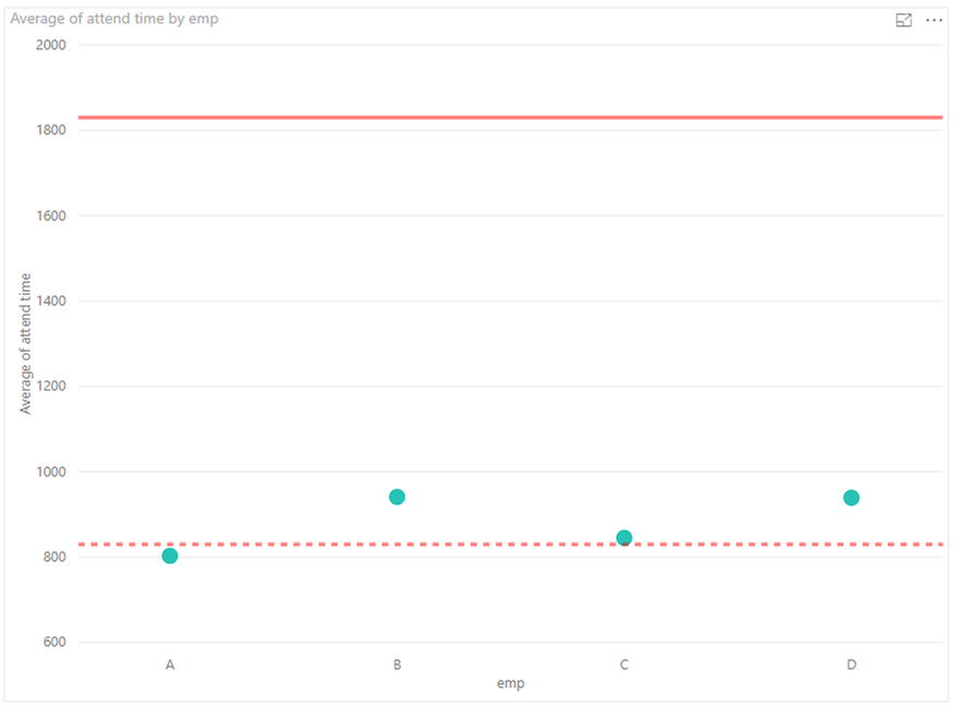
Step4:
you can also add two Y-Axis Constant line as the hour of entrance is 08:30 and we leave at 18:30.
Result:
here is pbix, please try it.
https://www.dropbox.com/s/n3cj47ymirmju55/Scatter%20chart%20with%20hours%20as%20Y%20axis.pbix?dl=0
Best Regards,
Lin
If this post helps, then please consider Accept it as the solution to help the other members find it more quickly.
Helpful resources

Microsoft Fabric Learn Together
Covering the world! 9:00-10:30 AM Sydney, 4:00-5:30 PM CET (Paris/Berlin), 7:00-8:30 PM Mexico City

Power BI Monthly Update - April 2024
Check out the April 2024 Power BI update to learn about new features.

| User | Count |
|---|---|
| 111 | |
| 95 | |
| 77 | |
| 68 | |
| 54 |
| User | Count |
|---|---|
| 144 | |
| 105 | |
| 102 | |
| 89 | |
| 63 |
