- Power BI forums
- Updates
- News & Announcements
- Get Help with Power BI
- Desktop
- Service
- Report Server
- Power Query
- Mobile Apps
- Developer
- DAX Commands and Tips
- Custom Visuals Development Discussion
- Health and Life Sciences
- Power BI Spanish forums
- Translated Spanish Desktop
- Power Platform Integration - Better Together!
- Power Platform Integrations (Read-only)
- Power Platform and Dynamics 365 Integrations (Read-only)
- Training and Consulting
- Instructor Led Training
- Dashboard in a Day for Women, by Women
- Galleries
- Community Connections & How-To Videos
- COVID-19 Data Stories Gallery
- Themes Gallery
- Data Stories Gallery
- R Script Showcase
- Webinars and Video Gallery
- Quick Measures Gallery
- 2021 MSBizAppsSummit Gallery
- 2020 MSBizAppsSummit Gallery
- 2019 MSBizAppsSummit Gallery
- Events
- Ideas
- Custom Visuals Ideas
- Issues
- Issues
- Events
- Upcoming Events
- Community Blog
- Power BI Community Blog
- Custom Visuals Community Blog
- Community Support
- Community Accounts & Registration
- Using the Community
- Community Feedback
Register now to learn Fabric in free live sessions led by the best Microsoft experts. From Apr 16 to May 9, in English and Spanish.
- Power BI forums
- Forums
- Get Help with Power BI
- Desktop
- Re: Scatter chart - two data points not in date or...
- Subscribe to RSS Feed
- Mark Topic as New
- Mark Topic as Read
- Float this Topic for Current User
- Bookmark
- Subscribe
- Printer Friendly Page
- Mark as New
- Bookmark
- Subscribe
- Mute
- Subscribe to RSS Feed
- Permalink
- Report Inappropriate Content
Scatter chart - two data points not in date order
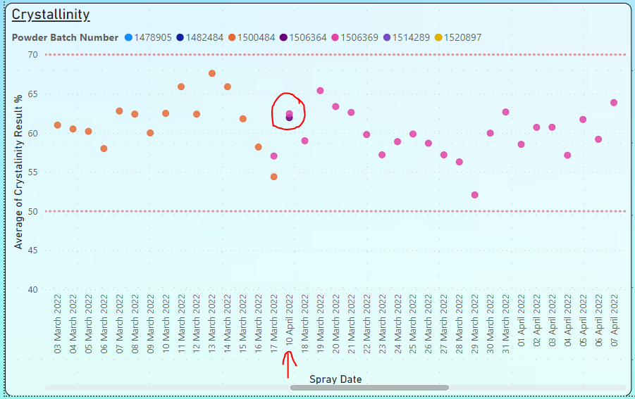
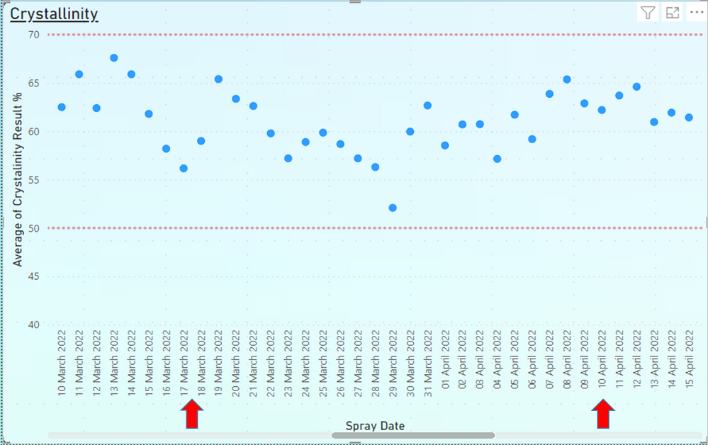
I have an issue with two data points on my XY scatter chart which are not in date order as shown in Fig.1. In this chart, I am trending the output of a manufacturing process ("Crystallinity", Y-axis) against the date the process took place ("Spray Date", X-axis). A legend is added to denote the batch of raw material used. As you can see, I have two data points with a spray date of 10 April 2022 which is displayed between 17 March 2022 and 18 March 2022 but I don't understand why it's out of sequence.
I've provided the background of my data and the queries used further below. Can anyone point out if I'm missing something obvious or is this a bug?
Fig.1
Background information on data and queries
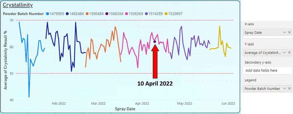
The settings for the X-axis are set to "Don't summarise" and set by "Spray Date" (instead of "Date Hierarchy") as shown in Fig.2.
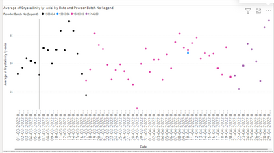
The data source is an Excel sheet on a network drive where the data is entered on the date of spraying (i.e. chronological order). I double checked the Excel sheet and there's nothing different about the date format of these entries compared to the rows above/below it. During the import of data to Power BI, I added a couple of queries to transform the data which includes the assignment of the date format for "Spray Date". All queries pertaining to "Spray Date" are shown in Fig.3.
After all queries are complete, I am left with the data shown in Fig.4. The two data points in question are listed in chronological order as per the Excel sheet and nothing looks out of the ordinary for these rows compared to the others. No sorting has been applied to the tabulated data.
Fig.2
Fig.3
Fig.4
ETA: Fix grammar
Solved! Go to Solution.
- Mark as New
- Bookmark
- Subscribe
- Mute
- Subscribe to RSS Feed
- Permalink
- Report Inappropriate Content
Hi @Richard_T ,
I have tested your data and could replicate the problem and also understand the grouping by date and legend together and then sorting.
Since last 2 days, I am trying sorting of x axis date with an index column, but somehow it does not allow date.
One more workaround is to use line chart in place of scatter chart, and not use the line color but just the marker color, and sort by date. It works fine even with legend, but you need to specify legend colors manually while publishing the report.
Hope it helps.
- Mark as New
- Bookmark
- Subscribe
- Mute
- Subscribe to RSS Feed
- Permalink
- Report Inappropriate Content
Hi @Richard_T ,
If possible, can you please share data in table format, just to easily copy and test at our end? Please remove sensitive data, only sample data should be enough.
- Mark as New
- Bookmark
- Subscribe
- Mute
- Subscribe to RSS Feed
- Permalink
- Report Inappropriate Content
Hi @mahenkj2, see the post from FarhanAhmed below. It looks like my data has been sub-sorted by date within each category that is listed in my legend.
As requested, here is some sample data between 01 March 2022 and 30 April 2022 so you should be able to recreate the issue I had with the data around 10 April 2022. Let me know how you get on.
| Spray Date (x-axis) | Powder Batch No (legend) | Crystallinity (y-axis) |
| 01 March 2022 | 1500484 | 58.2 |
| 02 March 2022 | 1500484 | 59.3 |
| 03 March 2022 | 1500484 | 61 |
| 04 March 2022 | 1500484 | 60.5 |
| 05 March 2022 | 1500484 | 60.2 |
| 06 March 2022 | 1500484 | 58 |
| 07 March 2022 | 1500484 | 62.8 |
| 08 March 2022 | 1500484 | 62.4 |
| 09 March 2022 | 1500484 | 60 |
| 10 March 2022 | 1500484 | 62.5 |
| 11 March 2022 | 1500484 | 65.9 |
| 12 March 2022 | 1500484 | 62.4 |
| 13 March 2022 | 1500484 | 67.6 |
| 14 March 2022 | 1500484 | 65.9 |
| 15 March 2022 | 1500484 | 61.8 |
| 16 March 2022 | 1500484 | 58.2 |
| 17 March 2022 | 1500484 | 54.4 |
| 17 March 2022 | 1506369 | 54.5 |
| 17 March 2022 | 1506369 | 59.6 |
| 18 March 2022 | 1506369 | 59 |
| 19 March 2022 | 1506369 | 65.4 |
| 20 March 2022 | 1506369 | 63.36 |
| 21 March 2022 | 1506369 | 62.62 |
| 22 March 2022 | 1506369 | 59.79 |
| 23 March 2022 | 1506369 | 57.2 |
| 24 March 2022 | 1506369 | 58.89 |
| 25 March 2022 | 1506369 | 59.86 |
| 26 March 2022 | 1506369 | 58.68 |
| 27 March 2022 | 1506369 | 57.2 |
| 28 March 2022 | 1506369 | 56.3 |
| 29 March 2022 | 1506369 | 52.19 |
| 29 March 2022 | 1506369 | 50.44 |
| 29 March 2022 | 1506369 | 53.62 |
| 30 March 2022 | 1506369 | 59.97 |
| 31 March 2022 | 1506369 | 62.67 |
| 01 April 2022 | 1506369 | 58.54 |
| 02 April 2022 | 1506369 | 60.71 |
| 03 April 2022 | 1506369 | 60.73 |
| 04 April 2022 | 1506369 | 57.15 |
| 05 April 2022 | 1506369 | 61.28 |
| 05 April 2022 | 1506369 | 62.15 |
| 06 April 2022 | 1506369 | 59.19 |
| 07 April 2022 | 1506369 | 63.87 |
| 08 April 2022 | 1506369 | 65.37 |
| 09 April 2022 | 1506369 | 62.89 |
| 10 April 2022 | 1506369 | 62.45 |
| 10 April 2022 | 1506364 | 61.95 |
| 11 April 2022 | 1506369 | 58.55 |
| 11 April 2022 | 1506369 | 61.78 |
| 11 April 2022 | 1506369 | 69.94 |
| 11 April 2022 | 1506369 | 64.53 |
| 12 April 2022 | 1506369 | 64.61 |
| 13 April 2022 | 1506369 | 60.96 |
| 14 April 2022 | 1506369 | 61.93 |
| 15 April 2022 | 1506369 | 61.43 |
| 16 April 2022 | 1506369 | 61.82 |
| 17 April 2022 | 1506369 | 59.21 |
| 18 April 2022 | 1506369 | 58.02 |
| 19 April 2022 | 1506369 | 62.94 |
| 20 April 2022 | 1506369 | 57.67 |
| 21 April 2022 | 1514289 | 57.89 |
| 22 April 2022 | 1514289 | 50.62 |
| 22 April 2022 | 1514289 | 60.45 |
| 23 April 2022 | 1514289 | 59.66 |
| 24 April 2022 | 1514289 | 63.6 |
| 25 April 2022 | 1514289 | 62.59 |
| 26 April 2022 | 1514289 | 60.36 |
| 27 April 2022 | 1514289 | 56.49 |
| 27 April 2022 | 1514289 | 57.37 |
| 28 April 2022 | 1514289 | 66.5 |
| 29 April 2022 | 1514289 | 67.71 |
| 30 April 2022 | 1514289 | 61.3 |
- Mark as New
- Bookmark
- Subscribe
- Mute
- Subscribe to RSS Feed
- Permalink
- Report Inappropriate Content
Hi @Richard_T ,
I have tested your data and could replicate the problem and also understand the grouping by date and legend together and then sorting.
Since last 2 days, I am trying sorting of x axis date with an index column, but somehow it does not allow date.
One more workaround is to use line chart in place of scatter chart, and not use the line color but just the marker color, and sort by date. It works fine even with legend, but you need to specify legend colors manually while publishing the report.
Hope it helps.
- Mark as New
- Bookmark
- Subscribe
- Mute
- Subscribe to RSS Feed
- Permalink
- Report Inappropriate Content
Perfect, this is exactly what I was looking for! I didn't think to use a line chart as I thought scatterplot would be the right tool.
I just changed the chart type and I didn't even have to move any of the fields. See below picture, which now shows the two data points correctly at 10 April 2022 instead of sitting within March.
- Mark as New
- Bookmark
- Subscribe
- Mute
- Subscribe to RSS Feed
- Permalink
- Report Inappropriate Content
Did you checked your "Sort By" in Visual
Did I answer your question? Mark my post as a solution! Appreciate your Kudos!!
Proud to be a Super User!
- Mark as New
- Bookmark
- Subscribe
- Mute
- Subscribe to RSS Feed
- Permalink
- Report Inappropriate Content
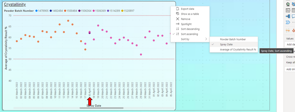
Hi Farhan. Originally, I had not applied any sorting to the chart. I added a sort by "Spray Date" and set to "Sort ascending" but the data is still out of sequence as shown in this new screenshot.
- Mark as New
- Bookmark
- Subscribe
- Mute
- Subscribe to RSS Feed
- Permalink
- Report Inappropriate Content
If you see that it is grouping the data based on the legends. then it is applying the sorting.
you may want to use another visual if you want your x-axis to be sorted by Date without grouping. You may try out Dual Axis Scatter Chart
Did I answer your question? Mark my post as a solution! Appreciate your Kudos!!
Proud to be a Super User!
- Mark as New
- Bookmark
- Subscribe
- Mute
- Subscribe to RSS Feed
- Permalink
- Report Inappropriate Content
I can confirm that removing the legend puts the data back chronological order as shown in the picture below.
Whilst this solves the problem, it's not a workable solution for me. I need to easily see when a powder batch change occurs and correlate this with any change in result on Y-axis. Tooltips is too slow to check for every point so the legend/colour coding data points is the most logical solution.
Is there really no way to add a legend and not subgroup the data?
- Mark as New
- Bookmark
- Subscribe
- Mute
- Subscribe to RSS Feed
- Permalink
- Report Inappropriate Content
Hi @Richard_T
There is one work around that you can check if possible in your scenario
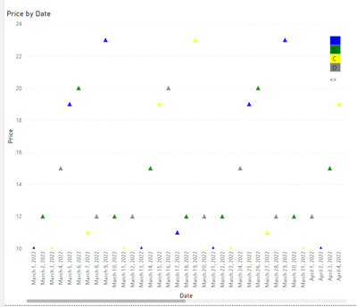
you can assign color to different category using DAX
Color = SWITCH('Table'[Product],
"A","Blue",
"B","Green",
"C","Yellow",
"D","Gray",
"Brown")
Then use Marker conditional color expression to Field Value
Then you will get results like below sorted by date
but you will not get the Legends as what color represtenting what data.
may be a table right next to visual something like below to give view like legends. similar conditional formatting apply on the table
see if this works for you.
Did I answer your question? Mark my post as a solution! Appreciate your Kudos!!
Proud to be a Super User!
- Mark as New
- Bookmark
- Subscribe
- Mute
- Subscribe to RSS Feed
- Permalink
- Report Inappropriate Content
This worked for me. Thanks
Matt
- Mark as New
- Bookmark
- Subscribe
- Mute
- Subscribe to RSS Feed
- Permalink
- Report Inappropriate Content
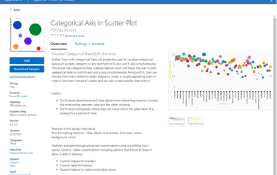
Try using this visual from Store
Did I answer your question? Mark my post as a solution! Appreciate your Kudos!!
Proud to be a Super User!
Helpful resources

Microsoft Fabric Learn Together
Covering the world! 9:00-10:30 AM Sydney, 4:00-5:30 PM CET (Paris/Berlin), 7:00-8:30 PM Mexico City

Power BI Monthly Update - April 2024
Check out the April 2024 Power BI update to learn about new features.

| User | Count |
|---|---|
| 111 | |
| 94 | |
| 83 | |
| 67 | |
| 59 |
| User | Count |
|---|---|
| 151 | |
| 121 | |
| 104 | |
| 87 | |
| 67 |
