- Power BI forums
- Updates
- News & Announcements
- Get Help with Power BI
- Desktop
- Service
- Report Server
- Power Query
- Mobile Apps
- Developer
- DAX Commands and Tips
- Custom Visuals Development Discussion
- Health and Life Sciences
- Power BI Spanish forums
- Translated Spanish Desktop
- Power Platform Integration - Better Together!
- Power Platform Integrations (Read-only)
- Power Platform and Dynamics 365 Integrations (Read-only)
- Training and Consulting
- Instructor Led Training
- Dashboard in a Day for Women, by Women
- Galleries
- Community Connections & How-To Videos
- COVID-19 Data Stories Gallery
- Themes Gallery
- Data Stories Gallery
- R Script Showcase
- Webinars and Video Gallery
- Quick Measures Gallery
- 2021 MSBizAppsSummit Gallery
- 2020 MSBizAppsSummit Gallery
- 2019 MSBizAppsSummit Gallery
- Events
- Ideas
- Custom Visuals Ideas
- Issues
- Issues
- Events
- Upcoming Events
- Community Blog
- Power BI Community Blog
- Custom Visuals Community Blog
- Community Support
- Community Accounts & Registration
- Using the Community
- Community Feedback
Register now to learn Fabric in free live sessions led by the best Microsoft experts. From Apr 16 to May 9, in English and Spanish.
- Power BI forums
- Forums
- Get Help with Power BI
- Desktop
- Scatter Plot using two datasets and a time slicer
- Subscribe to RSS Feed
- Mark Topic as New
- Mark Topic as Read
- Float this Topic for Current User
- Bookmark
- Subscribe
- Printer Friendly Page
- Mark as New
- Bookmark
- Subscribe
- Mute
- Subscribe to RSS Feed
- Permalink
- Report Inappropriate Content
Scatter Plot using two datasets and a time slicer
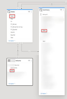
Hi All - I am trying to create a scatter plot from two tables: one table stores the volume for all items by dates, the other table stores the sales amount for all item by dates. In addition, I am using a time table to filter on both tables. Like in the picture, I am trying to create a scatter plot to show volume vs sales amount for each item. I am not able to link the two tables because they both are connected to the time table .... After I put the volume and sales onto one scatter plot. It always shows as one spotted line....
Any Idea how to solve this?
Solved! Go to Solution.
- Mark as New
- Bookmark
- Subscribe
- Mute
- Subscribe to RSS Feed
- Permalink
- Report Inappropriate Content
Hi,
According to your description, you want to add a slicer to filter the visual by category type, right?
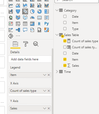
In this way, I think you can try to create a measure instead of the calculated column to be placed into the scatter chart:
Count of sales type = COUNTX(FILTER(ALL(Category),[Item]=MAX('Sales Table'[Item])&&[Type]=SELECTEDVALUE(Category[Type])),[Type])
And you can get what you want, like this:
You can download my test pbix file below
Thank you very much!
Best Regards,
Community Support Team _Robert Qin
If this post helps, then please consider Accept it as the solution to help the other members find it more quickly.
- Mark as New
- Bookmark
- Subscribe
- Mute
- Subscribe to RSS Feed
- Permalink
- Report Inappropriate Content
Hi,
According to your sample pbix file, I can roughly understand your requirement, I think you can create a calculated column in the sales table to be placed as the X-Axis of the chart, you can follow my steps:
- Create a calculated column in the sales table:
Count of sales type1 = COUNTX(FILTER(ALL(Category),[Item]=EARLIER('Sales Table'[Item])),[Type])- Go to the scatter chart to place it like this:
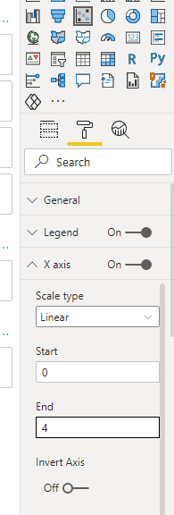
- Set the value range for the X-Axis based on the value:
And you can get what you want.
You can download my test pbix file below
Thank you very much!
Best Regards,
Community Support Team _Robert Qin
If this post helps, then please consider Accept it as the solution to help the other members find it more quickly.
- Mark as New
- Bookmark
- Subscribe
- Mute
- Subscribe to RSS Feed
- Permalink
- Report Inappropriate Content
Thanks @v-robertq-msft, tried this. The issue with this approach is that I am not able to filter on the category type. I don't want refund records, I only want sales records.
- Mark as New
- Bookmark
- Subscribe
- Mute
- Subscribe to RSS Feed
- Permalink
- Report Inappropriate Content
Hi,
According to your sample picture, I want to figure out what’s the field you placed into the Y-Axis of the scatter chart. Is it a measure or a column and what’s the table it belongs to?
I think the most proper reason for this problem is the relationships between these tables. I suggest you to post a sample pbix file with this problem without sensitive data if it’s possible so that we can help you in advance.
Scatter charts, bubble charts, and dot plot charts in Power BI
Thank you very much!
Best Regards,
Community Support Team _Robert Qin
If this post helps, then please consider Accept it as the solution to help the other members find it more quickly.
- Mark as New
- Bookmark
- Subscribe
- Mute
- Subscribe to RSS Feed
- Permalink
- Report Inappropriate Content
Hello Robert - Here is the file.
https://drive.google.com/drive/folders/12KdXNfep2QCGmzUhjE5HKpCFdEbyO_F3?usp=sharing
Helpful resources

Microsoft Fabric Learn Together
Covering the world! 9:00-10:30 AM Sydney, 4:00-5:30 PM CET (Paris/Berlin), 7:00-8:30 PM Mexico City

Power BI Monthly Update - April 2024
Check out the April 2024 Power BI update to learn about new features.

| User | Count |
|---|---|
| 107 | |
| 99 | |
| 76 | |
| 64 | |
| 58 |
| User | Count |
|---|---|
| 148 | |
| 113 | |
| 97 | |
| 84 | |
| 67 |


