- Power BI forums
- Updates
- News & Announcements
- Get Help with Power BI
- Desktop
- Service
- Report Server
- Power Query
- Mobile Apps
- Developer
- DAX Commands and Tips
- Custom Visuals Development Discussion
- Health and Life Sciences
- Power BI Spanish forums
- Translated Spanish Desktop
- Power Platform Integration - Better Together!
- Power Platform Integrations (Read-only)
- Power Platform and Dynamics 365 Integrations (Read-only)
- Training and Consulting
- Instructor Led Training
- Dashboard in a Day for Women, by Women
- Galleries
- Community Connections & How-To Videos
- COVID-19 Data Stories Gallery
- Themes Gallery
- Data Stories Gallery
- R Script Showcase
- Webinars and Video Gallery
- Quick Measures Gallery
- 2021 MSBizAppsSummit Gallery
- 2020 MSBizAppsSummit Gallery
- 2019 MSBizAppsSummit Gallery
- Events
- Ideas
- Custom Visuals Ideas
- Issues
- Issues
- Events
- Upcoming Events
- Community Blog
- Power BI Community Blog
- Custom Visuals Community Blog
- Community Support
- Community Accounts & Registration
- Using the Community
- Community Feedback
Register now to learn Fabric in free live sessions led by the best Microsoft experts. From Apr 16 to May 9, in English and Spanish.
- Power BI forums
- Forums
- Get Help with Power BI
- Desktop
- Scatter Plot sorting issue when adding legend
- Subscribe to RSS Feed
- Mark Topic as New
- Mark Topic as Read
- Float this Topic for Current User
- Bookmark
- Subscribe
- Printer Friendly Page
- Mark as New
- Bookmark
- Subscribe
- Mute
- Subscribe to RSS Feed
- Permalink
- Report Inappropriate Content
Scatter Plot sorting issue when adding legend
Hi Team,
here is my requirement:
Need to plot period on X axis (Drill down from year-qtr-month) and Amount on Y axis in a scatter plot. when we hover over the bubble the product name should appear.
For sorting of the month i have cretaed a month sort coulmn (Year*100+month_number), Qtr is sorted based on the year (Qtr value is like Qtr 1 2019, Qtr 2 2019 ...)
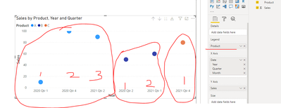
Same year,quarter,month can have multiple products so have added the product name in the legend, this is resulting in wrong sorting of the X axis.
Untill we add Product in the legend the sorting is perfect but as soon as we add product its sorting on the legend.
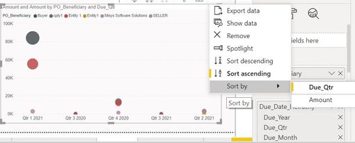
I have tried sort by year also, sort ascending descending also. 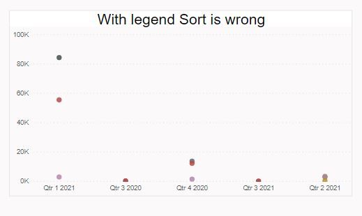

Solved! Go to Solution.
- Mark as New
- Bookmark
- Subscribe
- Mute
- Subscribe to RSS Feed
- Permalink
- Report Inappropriate Content
Hi @Anonymous ,
If you add ‘Legend’, visual will always sort X axis group by ‘Legend’.
Best regards,
Lionel Chen
If this post helps, then please consider Accept it as the solution to help the other members find it more quickly.
- Mark as New
- Bookmark
- Subscribe
- Mute
- Subscribe to RSS Feed
- Permalink
- Report Inappropriate Content
HI @Anonymous
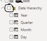
If you have a date field, I would use the date hierarchy and drill down.
If not i would create one and use as hierarchy.
And on top of the chart check the marked button in screenshot below, click it once to get the year and quarter.
Hope it resolves your issue? Did I answer your question? Mark my post as a solution! Appreciate your Kudos, Press the thumbs up button!! Linkedin Profile |
- Mark as New
- Bookmark
- Subscribe
- Mute
- Subscribe to RSS Feed
- Permalink
- Report Inappropriate Content
- Mark as New
- Bookmark
- Subscribe
- Mute
- Subscribe to RSS Feed
- Permalink
- Report Inappropriate Content
HI @Anonymous
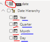
Observe closely the icons and names next to the image below as in my case. Bottom four icons and names are auto generated for a date data type. You don't have to do it manually.
Your data type has to be of type date as in below case. You are getting the issue as you have data type other than date.
Hope it resolves your issue? Did I answer your question? Mark my post as a solution! Appreciate your Kudos, Press the thumbs up button!! Linkedin Profile |
- Mark as New
- Bookmark
- Subscribe
- Mute
- Subscribe to RSS Feed
- Permalink
- Report Inappropriate Content
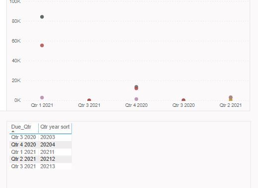
@Anonymous , do you have sort column defined for qtr year. this format will not sort
Qtr year sort = format([Date],"YYYYQ")
https://docs.microsoft.com/en-us/power-bi/create-reports/desktop-sort-by-column
Now you can sort your qtr column
Microsoft Power BI Learning Resources, 2023 !!
Learn Power BI - Full Course with Dec-2022, with Window, Index, Offset, 100+ Topics !!
Did I answer your question? Mark my post as a solution! Appreciate your Kudos !! Proud to be a Super User! !!
- Mark as New
- Bookmark
- Subscribe
- Mute
- Subscribe to RSS Feed
- Permalink
- Report Inappropriate Content
I have sorted the quarter column it works perfectly fine with Line Chart or any other chart but not with Scatter plot. I did try wat u gave still the same issue persist.
- Mark as New
- Bookmark
- Subscribe
- Mute
- Subscribe to RSS Feed
- Permalink
- Report Inappropriate Content
Hi @Anonymous ,
If you add ‘Legend’, visual will always sort X axis group by ‘Legend’.
Best regards,
Lionel Chen
If this post helps, then please consider Accept it as the solution to help the other members find it more quickly.
Helpful resources

Microsoft Fabric Learn Together
Covering the world! 9:00-10:30 AM Sydney, 4:00-5:30 PM CET (Paris/Berlin), 7:00-8:30 PM Mexico City

Power BI Monthly Update - April 2024
Check out the April 2024 Power BI update to learn about new features.

| User | Count |
|---|---|
| 110 | |
| 97 | |
| 78 | |
| 63 | |
| 55 |
| User | Count |
|---|---|
| 143 | |
| 109 | |
| 89 | |
| 84 | |
| 66 |
