- Power BI forums
- Updates
- News & Announcements
- Get Help with Power BI
- Desktop
- Service
- Report Server
- Power Query
- Mobile Apps
- Developer
- DAX Commands and Tips
- Custom Visuals Development Discussion
- Health and Life Sciences
- Power BI Spanish forums
- Translated Spanish Desktop
- Power Platform Integration - Better Together!
- Power Platform Integrations (Read-only)
- Power Platform and Dynamics 365 Integrations (Read-only)
- Training and Consulting
- Instructor Led Training
- Dashboard in a Day for Women, by Women
- Galleries
- Community Connections & How-To Videos
- COVID-19 Data Stories Gallery
- Themes Gallery
- Data Stories Gallery
- R Script Showcase
- Webinars and Video Gallery
- Quick Measures Gallery
- 2021 MSBizAppsSummit Gallery
- 2020 MSBizAppsSummit Gallery
- 2019 MSBizAppsSummit Gallery
- Events
- Ideas
- Custom Visuals Ideas
- Issues
- Issues
- Events
- Upcoming Events
- Community Blog
- Power BI Community Blog
- Custom Visuals Community Blog
- Community Support
- Community Accounts & Registration
- Using the Community
- Community Feedback
Register now to learn Fabric in free live sessions led by the best Microsoft experts. From Apr 16 to May 9, in English and Spanish.
- Power BI forums
- Forums
- Get Help with Power BI
- Desktop
- Re: Scatter Plot reference Line
- Subscribe to RSS Feed
- Mark Topic as New
- Mark Topic as Read
- Float this Topic for Current User
- Bookmark
- Subscribe
- Printer Friendly Page
- Mark as New
- Bookmark
- Subscribe
- Mute
- Subscribe to RSS Feed
- Permalink
- Report Inappropriate Content
Scatter Plot reference Line
Hi
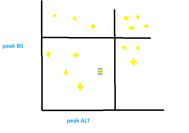
I want a scatter plot with refrence range lines on both axis X & Y. See the attachment.
is it possible please help on this
Solved! Go to Solution.
- Mark as New
- Bookmark
- Subscribe
- Mute
- Subscribe to RSS Feed
- Permalink
- Report Inappropriate Content
Thank you it works fine
@sanjeev803 wrote:Yes, you can do that from Analytics option given in Visulization pane (next to formatting pane) and add X- axis and Y-axis constant lines.
Cheers!
Sanj
@sanjeev803 wrote:Yes, you can do that from Analytics option given in Visulization pane (next to formatting pane) and add X- axis and Y-axis constant lines.
Cheers!
Sanj
- Mark as New
- Bookmark
- Subscribe
- Mute
- Subscribe to RSS Feed
- Permalink
- Report Inappropriate Content
Hi
Is there any way to set the X & Y axis reference as a column value instaed of manual entry
@Renjith wrote:Hi
I want a scatter plot with refrence range lines on both axis X & Y. See the attachment.
is it possible please help on this
Scatter with reference range
@Renjith wrote:Hi
I want a scatter plot with refrence range lines on both axis X & Y. See the attachment.
is it possible please help on this
Scatter with reference range
- Mark as New
- Bookmark
- Subscribe
- Mute
- Subscribe to RSS Feed
- Permalink
- Report Inappropriate Content
Yes, you can do that from Analytics option given in Visulization pane (next to formatting pane) and add X- axis and Y-axis constant lines.
Cheers!
Sanj
- Mark as New
- Bookmark
- Subscribe
- Mute
- Subscribe to RSS Feed
- Permalink
- Report Inappropriate Content
I have some doubt regarding the same concept. Can we add dynamic refrence line to scatter plot which will vary as per the data points in x axis.
- Mark as New
- Bookmark
- Subscribe
- Mute
- Subscribe to RSS Feed
- Permalink
- Report Inappropriate Content
Thank you it works fine
@sanjeev803 wrote:Yes, you can do that from Analytics option given in Visulization pane (next to formatting pane) and add X- axis and Y-axis constant lines.
Cheers!
Sanj
@sanjeev803 wrote:Yes, you can do that from Analytics option given in Visulization pane (next to formatting pane) and add X- axis and Y-axis constant lines.
Cheers!
Sanj
Helpful resources

Microsoft Fabric Learn Together
Covering the world! 9:00-10:30 AM Sydney, 4:00-5:30 PM CET (Paris/Berlin), 7:00-8:30 PM Mexico City

Power BI Monthly Update - April 2024
Check out the April 2024 Power BI update to learn about new features.

| User | Count |
|---|---|
| 111 | |
| 95 | |
| 77 | |
| 69 | |
| 52 |
| User | Count |
|---|---|
| 146 | |
| 109 | |
| 106 | |
| 88 | |
| 61 |
