- Power BI forums
- Updates
- News & Announcements
- Get Help with Power BI
- Desktop
- Service
- Report Server
- Power Query
- Mobile Apps
- Developer
- DAX Commands and Tips
- Custom Visuals Development Discussion
- Health and Life Sciences
- Power BI Spanish forums
- Translated Spanish Desktop
- Power Platform Integration - Better Together!
- Power Platform Integrations (Read-only)
- Power Platform and Dynamics 365 Integrations (Read-only)
- Training and Consulting
- Instructor Led Training
- Dashboard in a Day for Women, by Women
- Galleries
- Community Connections & How-To Videos
- COVID-19 Data Stories Gallery
- Themes Gallery
- Data Stories Gallery
- R Script Showcase
- Webinars and Video Gallery
- Quick Measures Gallery
- 2021 MSBizAppsSummit Gallery
- 2020 MSBizAppsSummit Gallery
- 2019 MSBizAppsSummit Gallery
- Events
- Ideas
- Custom Visuals Ideas
- Issues
- Issues
- Events
- Upcoming Events
- Community Blog
- Power BI Community Blog
- Custom Visuals Community Blog
- Community Support
- Community Accounts & Registration
- Using the Community
- Community Feedback
Register now to learn Fabric in free live sessions led by the best Microsoft experts. From Apr 16 to May 9, in English and Spanish.
- Power BI forums
- Forums
- Get Help with Power BI
- Desktop
- Re: Scatter Plot or Line Plot with correctly space...
- Subscribe to RSS Feed
- Mark Topic as New
- Mark Topic as Read
- Float this Topic for Current User
- Bookmark
- Subscribe
- Printer Friendly Page
- Mark as New
- Bookmark
- Subscribe
- Mute
- Subscribe to RSS Feed
- Permalink
- Report Inappropriate Content
Scatter Plot or Line Plot with correctly spaced X values
I'm trying to create a scatter plot with x and y values, similar to how I would do it in Excel. I can write a query to associate distinct numeric x and y values, but when I plot these values, the scatterplot is drawn so that all plots are evenly spaced along the x axis.
For instance, I have three points, (2, 3), (3, 5), and (5, 8). Each point is correctly drawn along the y axis at y=3, 5, and 8, respectively. However, while I would expect (3, 5) and (5, 😎 to be twice the distance along the x-axis as (2, 3) and (3, 5) are, they are instead evenly spaced. Displaying my data as a line plot produces similar behavior.
Each data point also has its own label along the x axis, rather than periodically labeling values as is done with the y-axis. My guess is that it's because Power BI is treating my x-axis data as categories, which would also explain the spacing behavior.
Any idea why this is happening, and how to get the scatterplot to behave like Excel?
EDIT: A scatterplot in R (drag in the data values from the PowerBI query, use "plot(dataset)") also works correctly. So it's not an issue with my data being malformed.
Solved! Go to Solution.
- Mark as New
- Bookmark
- Subscribe
- Mute
- Subscribe to RSS Feed
- Permalink
- Report Inappropriate Content
Hi @Hansinator255 ,
What is your desired result?
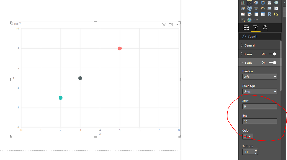
You could modify the X distance and Y distance for your visual in the setting:
Regards,
Daniel He
If this post helps, then please consider Accept it as the solution to help the other members find it more quickly.
- Mark as New
- Bookmark
- Subscribe
- Mute
- Subscribe to RSS Feed
- Permalink
- Report Inappropriate Content
OK, I think I figured it out. While my data is numerical, it was not being statically typed as such, and I had to add a Change Type step to my query to change the X and Y columns to Decimal Number. When I did this, the X and Y axes appeared correctly scaled and I could modify the axis scales for both.
- Mark as New
- Bookmark
- Subscribe
- Mute
- Subscribe to RSS Feed
- Permalink
- Report Inappropriate Content
Hi @Hansinator255 ,
What is your desired result?
You could modify the X distance and Y distance for your visual in the setting:
Regards,
Daniel He
If this post helps, then please consider Accept it as the solution to help the other members find it more quickly.
- Mark as New
- Bookmark
- Subscribe
- Mute
- Subscribe to RSS Feed
- Permalink
- Report Inappropriate Content
@v-danhe-msftThat does look like what I want, and I do get those options for the Y axis on my data. I do not, however, get those options on my X axis and instead get options for displaying categories, even though both my x and y values are numeric.
Note also that an R scatterplot displays this data correctly. I've edited the question post to reflect this.
- Mark as New
- Bookmark
- Subscribe
- Mute
- Subscribe to RSS Feed
- Permalink
- Report Inappropriate Content
Hi @Hansinator255 ,
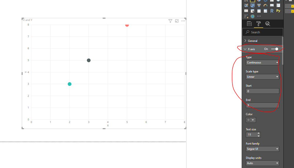
It do could set with the X-axis on my side:
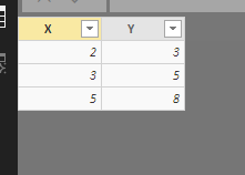
My data(all number):
I suggest you test again or you could download my pbix file to have a view.
Regards,
Daniel He
If this post helps, then please consider Accept it as the solution to help the other members find it more quickly.
- Mark as New
- Bookmark
- Subscribe
- Mute
- Subscribe to RSS Feed
- Permalink
- Report Inappropriate Content
OK, I think I figured it out. While my data is numerical, it was not being statically typed as such, and I had to add a Change Type step to my query to change the X and Y columns to Decimal Number. When I did this, the X and Y axes appeared correctly scaled and I could modify the axis scales for both.
Helpful resources

Microsoft Fabric Learn Together
Covering the world! 9:00-10:30 AM Sydney, 4:00-5:30 PM CET (Paris/Berlin), 7:00-8:30 PM Mexico City

Power BI Monthly Update - April 2024
Check out the April 2024 Power BI update to learn about new features.

| User | Count |
|---|---|
| 107 | |
| 98 | |
| 78 | |
| 66 | |
| 53 |
| User | Count |
|---|---|
| 144 | |
| 104 | |
| 100 | |
| 86 | |
| 64 |


