- Power BI forums
- Updates
- News & Announcements
- Get Help with Power BI
- Desktop
- Service
- Report Server
- Power Query
- Mobile Apps
- Developer
- DAX Commands and Tips
- Custom Visuals Development Discussion
- Health and Life Sciences
- Power BI Spanish forums
- Translated Spanish Desktop
- Power Platform Integration - Better Together!
- Power Platform Integrations (Read-only)
- Power Platform and Dynamics 365 Integrations (Read-only)
- Training and Consulting
- Instructor Led Training
- Dashboard in a Day for Women, by Women
- Galleries
- Community Connections & How-To Videos
- COVID-19 Data Stories Gallery
- Themes Gallery
- Data Stories Gallery
- R Script Showcase
- Webinars and Video Gallery
- Quick Measures Gallery
- 2021 MSBizAppsSummit Gallery
- 2020 MSBizAppsSummit Gallery
- 2019 MSBizAppsSummit Gallery
- Events
- Ideas
- Custom Visuals Ideas
- Issues
- Issues
- Events
- Upcoming Events
- Community Blog
- Power BI Community Blog
- Custom Visuals Community Blog
- Community Support
- Community Accounts & Registration
- Using the Community
- Community Feedback
Register now to learn Fabric in free live sessions led by the best Microsoft experts. From Apr 16 to May 9, in English and Spanish.
- Power BI forums
- Forums
- Get Help with Power BI
- Desktop
- Scatter Plot for # of visits vs. # of visitors [30...
- Subscribe to RSS Feed
- Mark Topic as New
- Mark Topic as Read
- Float this Topic for Current User
- Bookmark
- Subscribe
- Printer Friendly Page
- Mark as New
- Bookmark
- Subscribe
- Mute
- Subscribe to RSS Feed
- Permalink
- Report Inappropriate Content
Scatter Plot for # of visits vs. # of visitors [30:1] in month
Hi, My data has mainly columns
[Date]|[ClientID]|[OtherAttribute]
And I want to get # of Clients by visit frequency i.e. # of clients who visited only 1 day, and the # of clients who visited all 31 days.
I've been struggling with Scatter Plots which take measures vs. dimensions on the axis.
For this analysis I thought this might be the reason MS takes the dimensions. So I put UNIUQE count of Date on X-Axis. And UNIQUE count of Client IDs on Y-Axis. Put other attributes like Gender on details. And all I'm getting is two points at the right end of the chart i.e. # male/female clients in 31 days category.
Basically I need to 31 buckets (days of August) each with # the customers who visited that many times.
Any ideas.
- Mark as New
- Bookmark
- Subscribe
- Mute
- Subscribe to RSS Feed
- Permalink
- Report Inappropriate Content
Hi @ahussnain,
In source table, add a calculated column [Visit time per ID]
Visit time per ID =
CALCULATE (
    COUNT ( 'Client Visit'[ClientID] ),
    ALLEXCEPT ( 'Client Visit', 'Client Visit'[ClientID] )
)
Create two calculated tables:
New Table1 =
ADDCOLUMNS (
    CALENDAR ( DATE ( 2017, 8, 1 ), DATE ( 2017, 8, 31 ) ),
    "day", DAY ( [Date] )
)

New Table2 =
SUMMARIZE (
    'Client Visit',
    'Client Visit'[Visit time per ID],
    "count client", CALCULATE (
        DISTINCTCOUNT ( 'Client Visit'[ClientID] ),
        ALLEXCEPT ( 'Client Visit', 'Client Visit'[Visit time per ID] )
    )
)
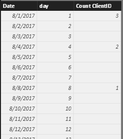
Then, in 'New Table1', add a calculated column:
Count ClientID =
LOOKUPVALUE (
    'New Table2'[count client],
    'New Table2'[Visit time per ID], 'New Table1'[day]
)
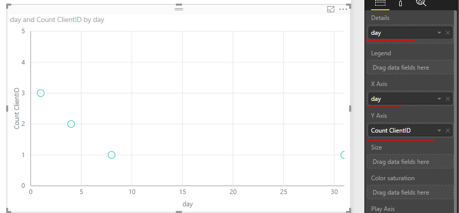
Drag relative fields from 'New Table1' into scatter chart.
Best regards,
Yuliana Gu
If this post helps, then please consider Accept it as the solution to help the other members find it more quickly.
- Mark as New
- Bookmark
- Subscribe
- Mute
- Subscribe to RSS Feed
- Permalink
- Report Inappropriate Content
Thanks @v-yulgu-msft for suggesting this. I'm trying a similar (and hopefully simpler) approach. Measure below creates the table I want in one go:
TableV = SUMMARIZE( SUMMARIZE(FILTER(Visits, Visits[Last Status Action]="Visited"), Visits[Visitor ID], "Days Bucket", DISTINCTCOUNT(Visits[ActionDate])), [Days Bucket], "Count Visiters in Day Bucket", DISTINCTCOUNT(Visits[Visitor ID]))
But I have to slice and dice it on 'other attributes' like Month/Year, Gender of Visitor etc. So my questions are:
1. how can I pass the parramaters to a measure creating a table; I know I can hard code them where I did so for Visits[Last Status Action].
2. how do I use this measure on visualizations
Creating visualization from this table should be simple. Real power of the Power BI would be if I could add those other attributes to analysis and change the table/measure based on slicers and other filters.
Thanks
- Mark as New
- Bookmark
- Subscribe
- Mute
- Subscribe to RSS Feed
- Permalink
- Report Inappropriate Content
Or the simple solution using R... pass the dataset with [Visitor ID], and distinct count of [ActionData]
VisitorCountByBucket <- aggregate(dataset[,1], by=list(dataset[,2]), FUN=length)
plot(VisitorCountByBucket)
And the two lines give the scatter plot which I can change by changing the slicers on the page. But then Why PowerBI can't do such a simple thing?
Helpful resources

Microsoft Fabric Learn Together
Covering the world! 9:00-10:30 AM Sydney, 4:00-5:30 PM CET (Paris/Berlin), 7:00-8:30 PM Mexico City

Power BI Monthly Update - April 2024
Check out the April 2024 Power BI update to learn about new features.

| User | Count |
|---|---|
| 109 | |
| 98 | |
| 77 | |
| 66 | |
| 54 |
| User | Count |
|---|---|
| 144 | |
| 104 | |
| 101 | |
| 86 | |
| 64 |


