- Power BI forums
- Updates
- News & Announcements
- Get Help with Power BI
- Desktop
- Service
- Report Server
- Power Query
- Mobile Apps
- Developer
- DAX Commands and Tips
- Custom Visuals Development Discussion
- Health and Life Sciences
- Power BI Spanish forums
- Translated Spanish Desktop
- Power Platform Integration - Better Together!
- Power Platform Integrations (Read-only)
- Power Platform and Dynamics 365 Integrations (Read-only)
- Training and Consulting
- Instructor Led Training
- Dashboard in a Day for Women, by Women
- Galleries
- Community Connections & How-To Videos
- COVID-19 Data Stories Gallery
- Themes Gallery
- Data Stories Gallery
- R Script Showcase
- Webinars and Video Gallery
- Quick Measures Gallery
- 2021 MSBizAppsSummit Gallery
- 2020 MSBizAppsSummit Gallery
- 2019 MSBizAppsSummit Gallery
- Events
- Ideas
- Custom Visuals Ideas
- Issues
- Issues
- Events
- Upcoming Events
- Community Blog
- Power BI Community Blog
- Custom Visuals Community Blog
- Community Support
- Community Accounts & Registration
- Using the Community
- Community Feedback
Register now to learn Fabric in free live sessions led by the best Microsoft experts. From Apr 16 to May 9, in English and Spanish.
- Power BI forums
- Forums
- Get Help with Power BI
- Desktop
- Scatter Diagram Date on X - Axis Randomized
- Subscribe to RSS Feed
- Mark Topic as New
- Mark Topic as Read
- Float this Topic for Current User
- Bookmark
- Subscribe
- Printer Friendly Page
- Mark as New
- Bookmark
- Subscribe
- Mute
- Subscribe to RSS Feed
- Permalink
- Report Inappropriate Content
Scatter Diagram Date on X - Axis Randomized
Hello everyone!
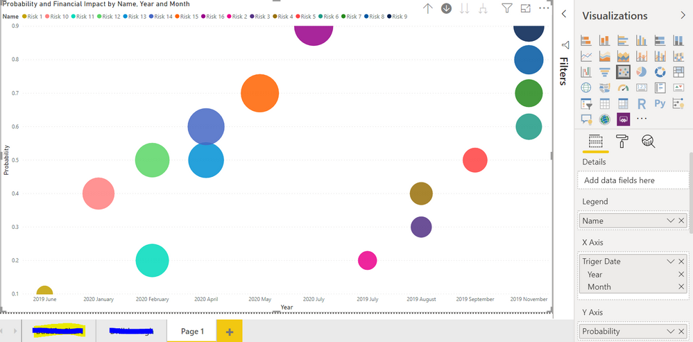
I am trying to create a Scatter (Bubble) Risk Diagram in Power BI, where the Probability of the risk is on the Y - Axis, the Date (Year, Month) is on the X - Axis and the Size of the bubble is the financial impact. I am experiencing dificulties with the Date. As you can see in the picture bellow, my dates are there as i want but they are not in order. I would like for them to be ordered first by year and then by month. I tried the Sorting option but it does not change a thing. Please help!
Solved! Go to Solution.
- Mark as New
- Bookmark
- Subscribe
- Mute
- Subscribe to RSS Feed
- Permalink
- Report Inappropriate Content
Hi @Slavi ,
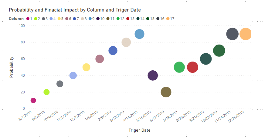
I have found the problem,if you use Risk 1,2...as Y-Axis,it will sort as the following order: Risk 1,Risk 11,Risk 12,Risk 13...etc, as it was a text format,that is why it will show as below:
So the best choice for you is to change the "name" column into a whole number type using a dax expression as below:
Column = SUBSTITUTE('Table (2)'[Name],"Risk ","")
Finally,you will see:
For the related .pbix file,pls click here.
Best Regards,
Kelly
- Mark as New
- Bookmark
- Subscribe
- Mute
- Subscribe to RSS Feed
- Permalink
- Report Inappropriate Content
Hi @Slavi ,
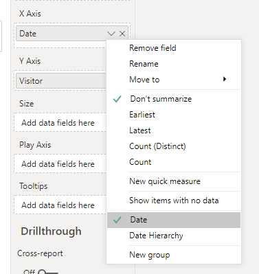
I found that in the X-Axis,you are using date Hierarchy,pls choose date instead of Hierarchy as showed below:
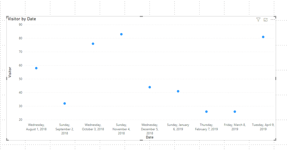
As in here,I choose "Date" in X-Axis,they are ordered acending from left to right.
Best Regards,
Kelly
- Mark as New
- Bookmark
- Subscribe
- Mute
- Subscribe to RSS Feed
- Permalink
- Report Inappropriate Content
Hello @v-kelly-msft and thank you for your response,
Unfortunately, for some reason this does not work for me. I even made a similar graph to yours but the result as you can see from the picture bellow are not what you'd expect. It starts of from 2018, then it goes to 2019 and then to 2018 again.
- Mark as New
- Bookmark
- Subscribe
- Mute
- Subscribe to RSS Feed
- Permalink
- Report Inappropriate Content
Hi @Slavi ,
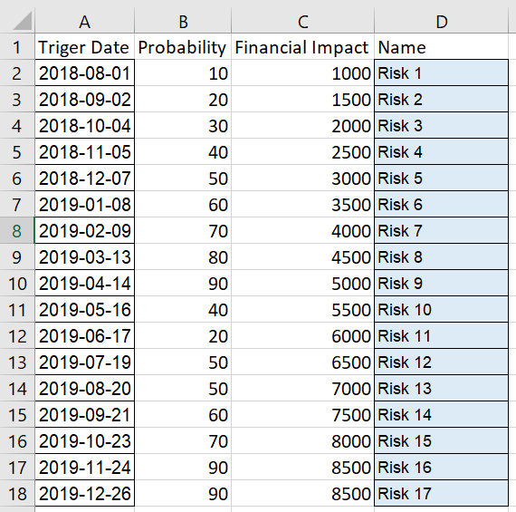
Show me part of your sample and remove the confidential ones,I will test for you.
Best Regards,
Kelly
- Mark as New
- Bookmark
- Subscribe
- Mute
- Subscribe to RSS Feed
- Permalink
- Report Inappropriate Content
- Mark as New
- Bookmark
- Subscribe
- Mute
- Subscribe to RSS Feed
- Permalink
- Report Inappropriate Content
Hi @Slavi ,
I have found the problem,if you use Risk 1,2...as Y-Axis,it will sort as the following order: Risk 1,Risk 11,Risk 12,Risk 13...etc, as it was a text format,that is why it will show as below:
So the best choice for you is to change the "name" column into a whole number type using a dax expression as below:
Column = SUBSTITUTE('Table (2)'[Name],"Risk ","")
Finally,you will see:
For the related .pbix file,pls click here.
Best Regards,
Kelly
- Mark as New
- Bookmark
- Subscribe
- Mute
- Subscribe to RSS Feed
- Permalink
- Report Inappropriate Content
Thank you @v-kelly-msft! It did work. For my primary data i didn't have numerated Risks as names, so i inserted a index column for the Names and then created another Excel Sheet where each name was given a unique number and linked them. This worked and now everything is in order. 🙂
Helpful resources

Microsoft Fabric Learn Together
Covering the world! 9:00-10:30 AM Sydney, 4:00-5:30 PM CET (Paris/Berlin), 7:00-8:30 PM Mexico City

Power BI Monthly Update - April 2024
Check out the April 2024 Power BI update to learn about new features.

| User | Count |
|---|---|
| 114 | |
| 100 | |
| 78 | |
| 75 | |
| 52 |
| User | Count |
|---|---|
| 144 | |
| 109 | |
| 108 | |
| 88 | |
| 61 |
