- Power BI forums
- Updates
- News & Announcements
- Get Help with Power BI
- Desktop
- Service
- Report Server
- Power Query
- Mobile Apps
- Developer
- DAX Commands and Tips
- Custom Visuals Development Discussion
- Health and Life Sciences
- Power BI Spanish forums
- Translated Spanish Desktop
- Power Platform Integration - Better Together!
- Power Platform Integrations (Read-only)
- Power Platform and Dynamics 365 Integrations (Read-only)
- Training and Consulting
- Instructor Led Training
- Dashboard in a Day for Women, by Women
- Galleries
- Community Connections & How-To Videos
- COVID-19 Data Stories Gallery
- Themes Gallery
- Data Stories Gallery
- R Script Showcase
- Webinars and Video Gallery
- Quick Measures Gallery
- 2021 MSBizAppsSummit Gallery
- 2020 MSBizAppsSummit Gallery
- 2019 MSBizAppsSummit Gallery
- Events
- Ideas
- Custom Visuals Ideas
- Issues
- Issues
- Events
- Upcoming Events
- Community Blog
- Power BI Community Blog
- Custom Visuals Community Blog
- Community Support
- Community Accounts & Registration
- Using the Community
- Community Feedback
Register now to learn Fabric in free live sessions led by the best Microsoft experts. From Apr 16 to May 9, in English and Spanish.
- Power BI forums
- Forums
- Get Help with Power BI
- Desktop
- Scatter Chart with two slicers!
- Subscribe to RSS Feed
- Mark Topic as New
- Mark Topic as Read
- Float this Topic for Current User
- Bookmark
- Subscribe
- Printer Friendly Page
- Mark as New
- Bookmark
- Subscribe
- Mute
- Subscribe to RSS Feed
- Permalink
- Report Inappropriate Content
Scatter Chart with two slicers!
Hi,
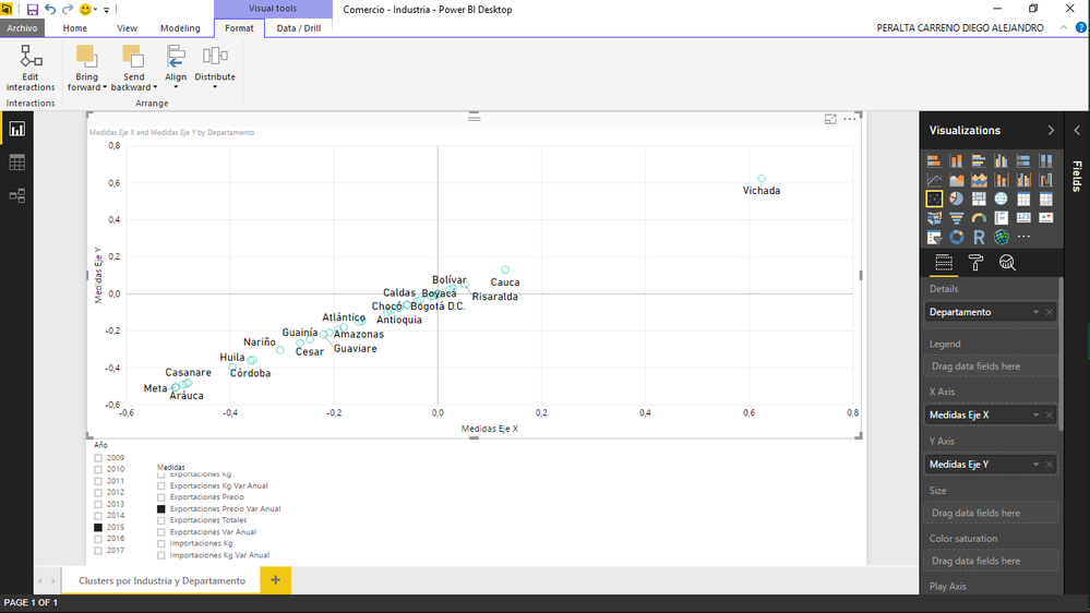
I need some help (again). I made an awesome scatter chart that have all the measures I made before (36). So, I want put all those measures in both axis. So, I create two SWITCH functions that every one have all the measures and I cant switch them quickly through an slicer. These are [Medidas Eje X] and [Medidas Eje Y] (both have all the same 36 measures).
But, I want two different slicers for both axis. Beacuse now I have only one slicer that currently do its job but it changes me both axis at same time and the result is always this: (a perfect correlation).
How can I have two diferent slicers that everyone just filters its respective axis?
Thanks again for read me!
Solved! Go to Solution.
- Mark as New
- Bookmark
- Subscribe
- Mute
- Subscribe to RSS Feed
- Permalink
- Report Inappropriate Content
Hi @AlejandroPCar,
If I understand you correctly, you may need two separate tables("TableX" and "TableY"), each table with a column called "Measure_Name" that contains all your measure names. And you need to change your [Medidas Eje X] and [Medidas Eje Y] to use different columns for the SWITCH function like below.
[Medidas Eje X] = SWITCH ( FIRSTNONBLANK ( TableX[Measure_Name], 1 ), "measure1", [measure1] ...)
[Medidas Eje Y] = SWITCH ( FIRSTNONBLANK ( TableY[Measure_Name], 1 ), "measure1", [measure1] ...)
Then you should be able to use TableX[Measure_Name] and TableY[Measure_Name] column as diferent slicers, so that everyone just filters its respective axis. ![]()
Regards
- Mark as New
- Bookmark
- Subscribe
- Mute
- Subscribe to RSS Feed
- Permalink
- Report Inappropriate Content
Hi! @v-ljerr-msft
It works! Thanks so so so much! But I have another question If I can.
In my SWITCH functions I have too much measures with differents values format. Ej. Some measures are currency values and other ones are general values and others are perentage changes.
But, the SITCH function just show me in the Scatter Chart values as general.
How can I make the SWITCH function shows its respective format value for every measure in the Scatter chart?
Thanks again for the previous answer!
- Mark as New
- Bookmark
- Subscribe
- Mute
- Subscribe to RSS Feed
- Permalink
- Report Inappropriate Content
Hi @AlejandroPCar,
But, the SITCH function just show me in the Scatter Chart values as general.
How can I make the SWITCH function shows its respective format value for every measure in the Scatter chart?
As far as I know, it is not possible to do it currently, as a measure can only be set to a specific format for a numberic value, so the format cannot be changed dynamically in this scenario. ![]()
Regards
- Mark as New
- Bookmark
- Subscribe
- Mute
- Subscribe to RSS Feed
- Permalink
- Report Inappropriate Content
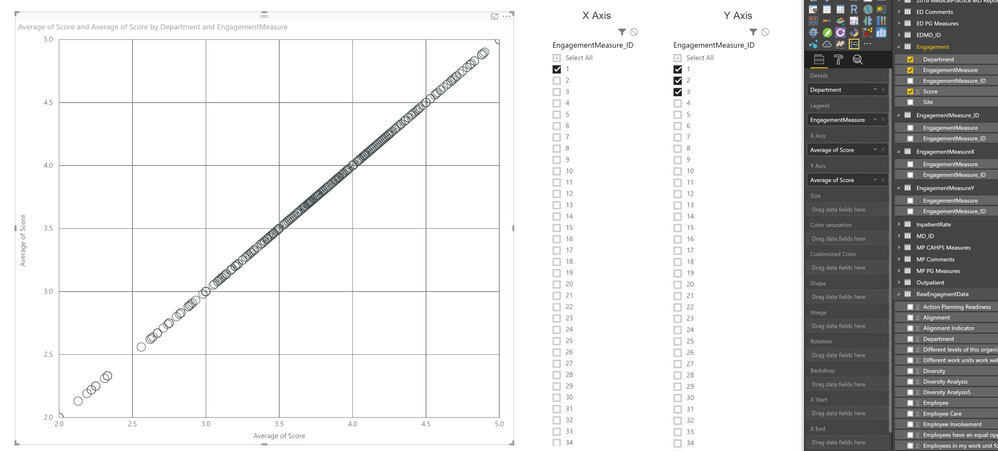
I've been trying to do the same thing for over 12 hours. User can click an option for the x and click an option for the y and see the correlation between the two. I feel like I'm close, but still getting the correlation of 1 issue. Is the SWITCH function necessary if I'm fine with just using numbers, or is SWITCH necessary for the relationship? I built 2 tables, an x and a y. Each x/y table I made has a Measure ID and the Measure in column next to the IDs.
I'm referencing an excel table of employee survey feedback. I'm trying to show which answers correlate with one another and which most strongy/weakly correlate to overall employee engagement.
My main data table is layed out like:
Site | Dept. | EngagementMeasure_ID | EngagementMeasure | Score
Site1 | Dept. 1 | ID-1 | Measure name 1 | #
Site1 | Dept. 1 | ID-2 | Measure name 2 | #
....
Site2 | Dept. 1 | ID-1 | Measure name 1 | #
I also have an engagement measure ID table with the measure name to the right of the ID just like above.
From the looks of how the table is setup, what am I doing wrong? Should I formulate my relationships in a specific way? Are my tables setup wrong? Thanks in advance for any help. I really appreciate it. I hope the image can be enlarged.
- Mark as New
- Bookmark
- Subscribe
- Mute
- Subscribe to RSS Feed
- Permalink
- Report Inappropriate Content
Hi @andyryanh
If you post here your pbix file from onedrive or dorpbox I can help you better if you want.
Helpful resources

Microsoft Fabric Learn Together
Covering the world! 9:00-10:30 AM Sydney, 4:00-5:30 PM CET (Paris/Berlin), 7:00-8:30 PM Mexico City

Power BI Monthly Update - April 2024
Check out the April 2024 Power BI update to learn about new features.

| User | Count |
|---|---|
| 114 | |
| 99 | |
| 83 | |
| 70 | |
| 61 |
| User | Count |
|---|---|
| 149 | |
| 114 | |
| 107 | |
| 89 | |
| 67 |


