- Power BI forums
- Updates
- News & Announcements
- Get Help with Power BI
- Desktop
- Service
- Report Server
- Power Query
- Mobile Apps
- Developer
- DAX Commands and Tips
- Custom Visuals Development Discussion
- Health and Life Sciences
- Power BI Spanish forums
- Translated Spanish Desktop
- Power Platform Integration - Better Together!
- Power Platform Integrations (Read-only)
- Power Platform and Dynamics 365 Integrations (Read-only)
- Training and Consulting
- Instructor Led Training
- Dashboard in a Day for Women, by Women
- Galleries
- Community Connections & How-To Videos
- COVID-19 Data Stories Gallery
- Themes Gallery
- Data Stories Gallery
- R Script Showcase
- Webinars and Video Gallery
- Quick Measures Gallery
- 2021 MSBizAppsSummit Gallery
- 2020 MSBizAppsSummit Gallery
- 2019 MSBizAppsSummit Gallery
- Events
- Ideas
- Custom Visuals Ideas
- Issues
- Issues
- Events
- Upcoming Events
- Community Blog
- Power BI Community Blog
- Custom Visuals Community Blog
- Community Support
- Community Accounts & Registration
- Using the Community
- Community Feedback
Register now to learn Fabric in free live sessions led by the best Microsoft experts. From Apr 16 to May 9, in English and Spanish.
- Power BI forums
- Forums
- Get Help with Power BI
- Desktop
- Scatter Chart ability to manually change color of ...
- Subscribe to RSS Feed
- Mark Topic as New
- Mark Topic as Read
- Float this Topic for Current User
- Bookmark
- Subscribe
- Printer Friendly Page
- Mark as New
- Bookmark
- Subscribe
- Mute
- Subscribe to RSS Feed
- Permalink
- Report Inappropriate Content
Scatter Chart ability to manually change color of dot
I am using a scatter chart.
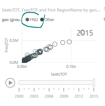
I am utilizing the Play Axis, (date field rolled up to year) and I have a categorical field on the legend that makes my dots one of 3 colors. Whenever I open or close the file, the colors change. Sometimes they are the original teal, red and black, some times yellow, purple, and blue, sometimes black, gray and brown. There is no rhyme or reason to the color changes, and it is very difficult to see the different colors when they change to black, gray and brown.
I don't see an option in the paint brush for "data colors" for me to manually change the colors, so I have to close and open the file hoping the colors will change to something better.
When I take off the "Year" date feild I have on the play axis, the "data colors" option now shows up.
I don't know why this is happening... is this a glitch with the Scatter Plot?
Solved! Go to Solution.
- Mark as New
- Bookmark
- Subscribe
- Mute
- Subscribe to RSS Feed
- Permalink
- Report Inappropriate Content
Hi @ATurek,
It's true that the Data Color feature is not available if we add a field in Play Axis Property with a scatter chart visual. Based on my test, once Play Axis contains a field, data color revert to default and Data Color is missing.
Besides, based on my research, it's a known issue and someone has posted in Power BI Idea forum. Product Team has considered it as a suggestion. If you have any feedback, you can comment on this idea item: Scatter chart data color with play axis.
If you have any question, please feel free to ask.
Best Regards,
Qiuyun Yu
If this post helps, then please consider Accept it as the solution to help the other members find it more quickly.
- Mark as New
- Bookmark
- Subscribe
- Mute
- Subscribe to RSS Feed
- Permalink
- Report Inappropriate Content
I think it is a private forum, any possibility to make the solution public? I am having the same problem and the defaul colours are not that good to differ...
Helpful resources

Microsoft Fabric Learn Together
Covering the world! 9:00-10:30 AM Sydney, 4:00-5:30 PM CET (Paris/Berlin), 7:00-8:30 PM Mexico City

Power BI Monthly Update - April 2024
Check out the April 2024 Power BI update to learn about new features.

| User | Count |
|---|---|
| 110 | |
| 94 | |
| 81 | |
| 66 | |
| 58 |
| User | Count |
|---|---|
| 150 | |
| 119 | |
| 104 | |
| 87 | |
| 67 |

