- Power BI forums
- Updates
- News & Announcements
- Get Help with Power BI
- Desktop
- Service
- Report Server
- Power Query
- Mobile Apps
- Developer
- DAX Commands and Tips
- Custom Visuals Development Discussion
- Health and Life Sciences
- Power BI Spanish forums
- Translated Spanish Desktop
- Power Platform Integration - Better Together!
- Power Platform Integrations (Read-only)
- Power Platform and Dynamics 365 Integrations (Read-only)
- Training and Consulting
- Instructor Led Training
- Dashboard in a Day for Women, by Women
- Galleries
- Community Connections & How-To Videos
- COVID-19 Data Stories Gallery
- Themes Gallery
- Data Stories Gallery
- R Script Showcase
- Webinars and Video Gallery
- Quick Measures Gallery
- 2021 MSBizAppsSummit Gallery
- 2020 MSBizAppsSummit Gallery
- 2019 MSBizAppsSummit Gallery
- Events
- Ideas
- Custom Visuals Ideas
- Issues
- Issues
- Events
- Upcoming Events
- Community Blog
- Power BI Community Blog
- Custom Visuals Community Blog
- Community Support
- Community Accounts & Registration
- Using the Community
- Community Feedback
Register now to learn Fabric in free live sessions led by the best Microsoft experts. From Apr 16 to May 9, in English and Spanish.
- Power BI forums
- Forums
- Get Help with Power BI
- Desktop
- Re: Scatter Chart - Minimum Point Size
- Subscribe to RSS Feed
- Mark Topic as New
- Mark Topic as Read
- Float this Topic for Current User
- Bookmark
- Subscribe
- Printer Friendly Page
- Mark as New
- Bookmark
- Subscribe
- Mute
- Subscribe to RSS Feed
- Permalink
- Report Inappropriate Content
Scatter Chart - Minimum Point Size
Folks,
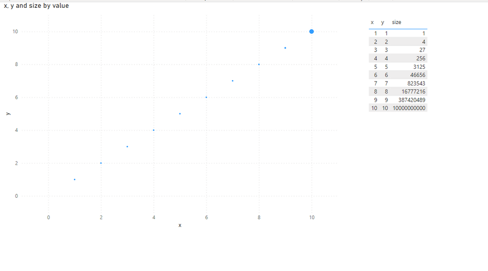
Having a real issue with the scatter chart in PBI. I can't get the smallest value to go smaller than a certain size.
Do we know if this is being worked on by the development team or is there a workaround anyone knows on?
Thanks.
JP
- Mark as New
- Bookmark
- Subscribe
- Mute
- Subscribe to RSS Feed
- Permalink
- Report Inappropriate Content
Dragging up an old thread in case anyone else was still stuck with this issue, looks like the August 2023 update has finally solved this (I have yet to test)
https://powerbi.microsoft.com/en-us/blog/power-bi-august-2023-feature-summary/#post-24381-_Toc142989...
- Mark as New
- Bookmark
- Subscribe
- Mute
- Subscribe to RSS Feed
- Permalink
- Report Inappropriate Content
A colleague of mine Dan has found a solution to this as I was having the same problem. The size property on the visual is your scaling factor, the marker size in the format menu is the start point. What threw me and others above is that the marker size start point when using scaling is different vs not using scaling. That makes little sense to me but anyway... the solution here is that you can actually set the marker size (the start point) to a negative amount, up to minus 30 (-30). That should really help, it did for me 😊.
If this post does help, then please consider 'Accept it as the solution' to help the other members find it more quickly.
- Mark as New
- Bookmark
- Subscribe
- Mute
- Subscribe to RSS Feed
- Permalink
- Report Inappropriate Content
Great spot, this seems to have been an update the original minimum was 5
Edit, it solves the min size issue but the scaling of smallest vs largest still seems to be a problem
- Mark as New
- Bookmark
- Subscribe
- Mute
- Subscribe to RSS Feed
- Permalink
- Report Inappropriate Content
If you have any concern on this feature, you can submit your idea on the link below. If this feature was mentioned by multiple users, product team will consider to add this feature to the future release.
https://ideas.powerbi.com/forums/265200-power-bi-ideas
Regards,
Cherie
If this post helps, then please consider Accept it as the solution to help the other members find it more quickly.
- Mark as New
- Bookmark
- Subscribe
- Mute
- Subscribe to RSS Feed
- Permalink
- Report Inappropriate Content
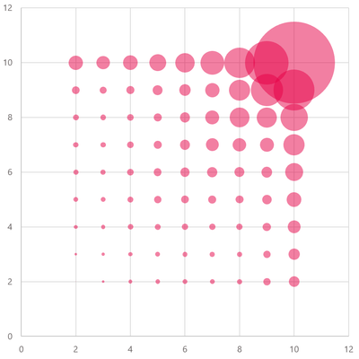
This is a really problematic issue. I have created the same chart in both Power BI and Excel to compare the difference.
The chart in Power BI suffers from the minimum dot sizes being far too large (and so misrepresenting the data).
The version in Excel is a vast improvement, so much clearer...
- Mark as New
- Bookmark
- Subscribe
- Mute
- Subscribe to RSS Feed
- Permalink
- Report Inappropriate Content
- Mark as New
- Bookmark
- Subscribe
- Mute
- Subscribe to RSS Feed
- Permalink
- Report Inappropriate Content
Hi there,
I haven't used it recently, but no, I didn't find a solution at the time. I ended up using Excel for that plot.
Will
Helpful resources

Microsoft Fabric Learn Together
Covering the world! 9:00-10:30 AM Sydney, 4:00-5:30 PM CET (Paris/Berlin), 7:00-8:30 PM Mexico City

Power BI Monthly Update - April 2024
Check out the April 2024 Power BI update to learn about new features.

| User | Count |
|---|---|
| 114 | |
| 100 | |
| 78 | |
| 75 | |
| 50 |
| User | Count |
|---|---|
| 144 | |
| 109 | |
| 108 | |
| 88 | |
| 61 |


