- Power BI forums
- Updates
- News & Announcements
- Get Help with Power BI
- Desktop
- Service
- Report Server
- Power Query
- Mobile Apps
- Developer
- DAX Commands and Tips
- Custom Visuals Development Discussion
- Health and Life Sciences
- Power BI Spanish forums
- Translated Spanish Desktop
- Power Platform Integration - Better Together!
- Power Platform Integrations (Read-only)
- Power Platform and Dynamics 365 Integrations (Read-only)
- Training and Consulting
- Instructor Led Training
- Dashboard in a Day for Women, by Women
- Galleries
- Community Connections & How-To Videos
- COVID-19 Data Stories Gallery
- Themes Gallery
- Data Stories Gallery
- R Script Showcase
- Webinars and Video Gallery
- Quick Measures Gallery
- 2021 MSBizAppsSummit Gallery
- 2020 MSBizAppsSummit Gallery
- 2019 MSBizAppsSummit Gallery
- Events
- Ideas
- Custom Visuals Ideas
- Issues
- Issues
- Events
- Upcoming Events
- Community Blog
- Power BI Community Blog
- Custom Visuals Community Blog
- Community Support
- Community Accounts & Registration
- Using the Community
- Community Feedback
Register now to learn Fabric in free live sessions led by the best Microsoft experts. From Apr 16 to May 9, in English and Spanish.
- Power BI forums
- Forums
- Get Help with Power BI
- Desktop
- Scatter Chart Bubble Size
- Subscribe to RSS Feed
- Mark Topic as New
- Mark Topic as Read
- Float this Topic for Current User
- Bookmark
- Subscribe
- Printer Friendly Page
- Mark as New
- Bookmark
- Subscribe
- Mute
- Subscribe to RSS Feed
- Permalink
- Report Inappropriate Content
Scatter Chart Bubble Size
Hi Guys,
I have a table like so:
| WorkItemID | CycleTimeDays | DaysSinceCompleted |
| 34 | 2 | -1 |
| 35 | 2 | -1 |
| 36 | 6 | -1.25 |
| 37 | 7 | -2 |
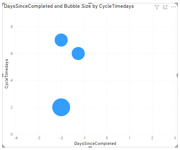
Which is visualised in a scatter chart (CycleTimeDays - Y-Axis / DaysSinceCompleted - X-Axis).
Unfortunately the bubbles overlap for certain ID's (see WorkItemID 34 and 35).
Is there a way to create a measure for the bubble size? I'd like to highlight overlapping items with a larger bubble...
Solved! Go to Solution.
- Mark as New
- Bookmark
- Subscribe
- Mute
- Subscribe to RSS Feed
- Permalink
- Report Inappropriate Content
Hi @FlowViz
Download PBIX with these examples
Yes you can use this measure for bubble size
Bubble Size = CALCULATE(COUNTROWS('Table'), FILTER(ALL('Table'), 'Table'[CycleTimedays] = SELECTEDVALUE('Table'[CycleTimedays]) && 'Table'[DaysSinceCompleted] = SELECTEDVALUE('Table'[DaysSinceCompleted])))
To give this
You might also consider introducing jitter to one of the axes to shift overlapping points slightly.
This measure shifts the x value slightly for points that overlap. It uses the [Bubble Size] measure from above.
Jittered X = IF([Bubble Size] > 1, SELECTEDVALUE('Table'[DaysSinceCompleted])*(RAND()), SELECTEDVALUE('Table'[DaysSinceCompleted]))
Giving this visual. The amount of jitter/shift for each point can be tweaked so it's not shifted too much.
Further info on jitter Jitter in Excel Scatter Charts • My Online Training Hub
Regards
Phil
Did I answer your question? Then please mark my post as the solution.
If I helped you, click on the Thumbs Up to give Kudos.
Blog :: YouTube Channel :: Connect on Linkedin
Proud to be a Super User!
- Mark as New
- Bookmark
- Subscribe
- Mute
- Subscribe to RSS Feed
- Permalink
- Report Inappropriate Content
I think the larger bubble solution works better. DaysSinceCompleted is calculated using NOW()-Closed Date. So over time this will increase and using jitter could skew how many days since it was actually completed.
With the larger bubble, is it possible to do a custom tooltip that would show the data for each item on hover?
- Mark as New
- Bookmark
- Subscribe
- Mute
- Subscribe to RSS Feed
- Permalink
- Report Inappropriate Content
HI @FlowViz,
Perhaps you can take a look at the following link to know more about creating a custom report tooltip page if it is suitable for your requirement.
Create tooltips based on report pages in Power BI Desktop
Regards,
Xiaoxin Sheng
If this post helps, please consider accept as solution to help other members find it more quickly.
- Mark as New
- Bookmark
- Subscribe
- Mute
- Subscribe to RSS Feed
- Permalink
- Report Inappropriate Content
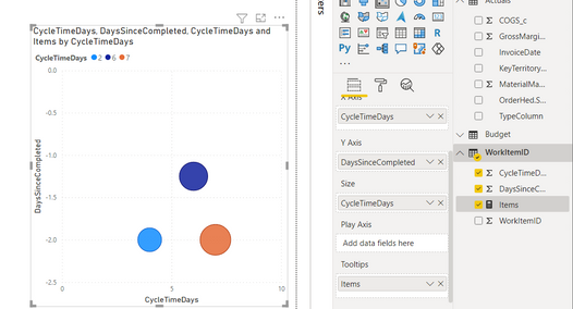
@FlowViz You could create your visual like below
I have create a measure also like below which i have used in tooltip

let me know if it works for you or not. thanks
Did I answer your question? Mark my post as a solution!
Appreciate your Kudos
Proud to be a Super User!
Follow me on linkedin
- Mark as New
- Bookmark
- Subscribe
- Mute
- Subscribe to RSS Feed
- Permalink
- Report Inappropriate Content
Hi @FlowViz
Yes, using jitter for overlapping ponts will avoid the need for larger bubbles.
I'm not sure what your subsequent comment means : over time (as DaysSinceCompleted increases) the jitter won't work as the new measure will give a range of results since it was completed ?
If you aren't going to or can't use jitter, will you just use the larger bubble solution?
Regards
Phil
Did I answer your question? Then please mark my post as the solution.
If I helped you, click on the Thumbs Up to give Kudos.
Blog :: YouTube Channel :: Connect on Linkedin
Proud to be a Super User!
- Mark as New
- Bookmark
- Subscribe
- Mute
- Subscribe to RSS Feed
- Permalink
- Report Inappropriate Content
Hi @FlowViz
Download PBIX with these examples
Yes you can use this measure for bubble size
Bubble Size = CALCULATE(COUNTROWS('Table'), FILTER(ALL('Table'), 'Table'[CycleTimedays] = SELECTEDVALUE('Table'[CycleTimedays]) && 'Table'[DaysSinceCompleted] = SELECTEDVALUE('Table'[DaysSinceCompleted])))
To give this
You might also consider introducing jitter to one of the axes to shift overlapping points slightly.
This measure shifts the x value slightly for points that overlap. It uses the [Bubble Size] measure from above.
Jittered X = IF([Bubble Size] > 1, SELECTEDVALUE('Table'[DaysSinceCompleted])*(RAND()), SELECTEDVALUE('Table'[DaysSinceCompleted]))
Giving this visual. The amount of jitter/shift for each point can be tweaked so it's not shifted too much.
Further info on jitter Jitter in Excel Scatter Charts • My Online Training Hub
Regards
Phil
Did I answer your question? Then please mark my post as the solution.
If I helped you, click on the Thumbs Up to give Kudos.
Blog :: YouTube Channel :: Connect on Linkedin
Proud to be a Super User!
- Mark as New
- Bookmark
- Subscribe
- Mute
- Subscribe to RSS Feed
- Permalink
- Report Inappropriate Content
@PhilipTreacy I know this is an old thread, but I have a similar issue and would like to make a bubble size measure just like this except with field parameters allowing the user to select x and y axis variables. My code is:
- Mark as New
- Bookmark
- Subscribe
- Mute
- Subscribe to RSS Feed
- Permalink
- Report Inappropriate Content
@PhilipTreacy Thanks for a great solution, I had the same issue.
However, my x & y values only range between 1-5, is it possible to use a lower value for the shift? As far as I know RANDBETWEEN doesn't allow for decimals? Any other ideas?
I want as small shift as possible, but still enough so it's noticable
- Mark as New
- Bookmark
- Subscribe
- Mute
- Subscribe to RSS Feed
- Permalink
- Report Inappropriate Content
Thanks Phil - could I use jittering to avoid having the need for a larger bubble size? If so how would I do that?
- Mark as New
- Bookmark
- Subscribe
- Mute
- Subscribe to RSS Feed
- Permalink
- Report Inappropriate Content
Ah I actually realised that over time (as DaysSinceCompleted increases) the jitter won't work as the new measure will give a range of results since it was completed 😞
Helpful resources

Microsoft Fabric Learn Together
Covering the world! 9:00-10:30 AM Sydney, 4:00-5:30 PM CET (Paris/Berlin), 7:00-8:30 PM Mexico City

Power BI Monthly Update - April 2024
Check out the April 2024 Power BI update to learn about new features.

| User | Count |
|---|---|
| 113 | |
| 100 | |
| 78 | |
| 76 | |
| 52 |
| User | Count |
|---|---|
| 146 | |
| 109 | |
| 106 | |
| 88 | |
| 61 |


