- Power BI forums
- Updates
- News & Announcements
- Get Help with Power BI
- Desktop
- Service
- Report Server
- Power Query
- Mobile Apps
- Developer
- DAX Commands and Tips
- Custom Visuals Development Discussion
- Health and Life Sciences
- Power BI Spanish forums
- Translated Spanish Desktop
- Power Platform Integration - Better Together!
- Power Platform Integrations (Read-only)
- Power Platform and Dynamics 365 Integrations (Read-only)
- Training and Consulting
- Instructor Led Training
- Dashboard in a Day for Women, by Women
- Galleries
- Community Connections & How-To Videos
- COVID-19 Data Stories Gallery
- Themes Gallery
- Data Stories Gallery
- R Script Showcase
- Webinars and Video Gallery
- Quick Measures Gallery
- 2021 MSBizAppsSummit Gallery
- 2020 MSBizAppsSummit Gallery
- 2019 MSBizAppsSummit Gallery
- Events
- Ideas
- Custom Visuals Ideas
- Issues
- Issues
- Events
- Upcoming Events
- Community Blog
- Power BI Community Blog
- Custom Visuals Community Blog
- Community Support
- Community Accounts & Registration
- Using the Community
- Community Feedback
Register now to learn Fabric in free live sessions led by the best Microsoft experts. From Apr 16 to May 9, in English and Spanish.
- Power BI forums
- Forums
- Get Help with Power BI
- Desktop
- Scaling X Axis on a line chart so that a full year...
- Subscribe to RSS Feed
- Mark Topic as New
- Mark Topic as Read
- Float this Topic for Current User
- Bookmark
- Subscribe
- Printer Friendly Page
- Mark as New
- Bookmark
- Subscribe
- Mute
- Subscribe to RSS Feed
- Permalink
- Report Inappropriate Content
Scaling X Axis on a line chart so that a full year fits the view
I want to see the historical volumes during a calendar year, where I can easily see the monthly difference between each year. I have found a crude session, but it forces me to use fake dates (I trick the data using a date with a year that is irrelevent and put the data in columns separated by the correct year, stored as text).
To make this chart look good, I use a column for dates with a false year (like 2000) and columns for each of the right years (where the year is stored as text), but then the axis (while looking great!) shows the year 2000, which is false.
To achieve the chart below, here, I have one column for the correct date and another column for the volume value. Then, in the chart details, I can use the hifile date and delete the year to overlap by day of the year. BUT the scale is so big, it doesn't make sense because you have to scroll and scroll and you can't see a year-round snapshot.
Both charts show the same data, the same number of data points. Both display daily values.
Main question: How can I have my chart scale down so that a full year fits the screen with daily data points?
- Mark as New
- Bookmark
- Subscribe
- Mute
- Subscribe to RSS Feed
- Permalink
- Report Inappropriate Content
Hi @amelindah ,
Does that make sense? If so, kindly mark the proper reply as a solution to help others having the similar issue and close the case. If not, let me know and I'll try to help you further.
Best regards
Amy
- Mark as New
- Bookmark
- Subscribe
- Mute
- Subscribe to RSS Feed
- Permalink
- Report Inappropriate Content
Hi @amelindah ,
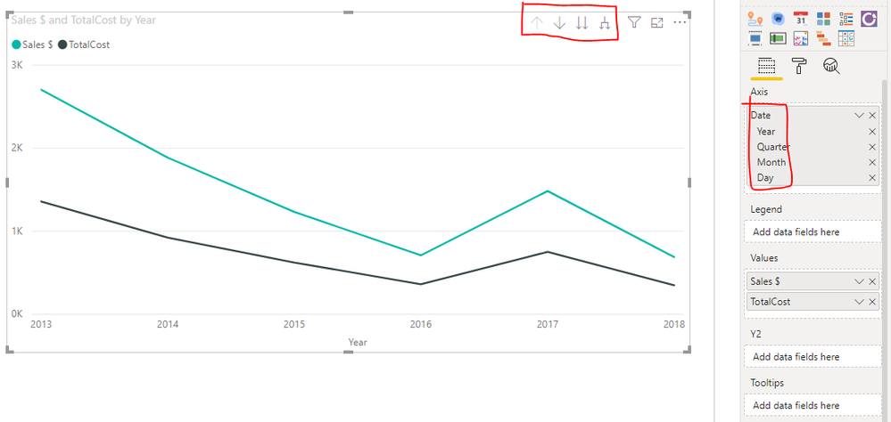
You may create a calendar table, put the calendar[Date] into Axis of line chart. Then if you may click drill up and drill down options to see data of every level date hierarchy.
Calendar=CALENDARAUTO()
Best Regards,
Amy
Community Support Team _ Amy
If this post helps, then please consider Accept it as the solution to help the other members find it more quickly.
- Mark as New
- Bookmark
- Subscribe
- Mute
- Subscribe to RSS Feed
- Permalink
- Report Inappropriate Content
@amelindah
Define a table for the current year. For example 1-1-2020 to 31-12-2020. The column type should be the date.
Then use that column as the X-axis of your line chart and enable Date Hierarchy. As per your snapshot, create 4 measures 2017 total, 2018 total, 2019 total, and 2020 total. Each measure you can apply a filter condition to filter the selected period. Then add these measures into the value field of the line chart.
Now you will get an option for drill-down, expand the next level, expand the full level (Quarterly, Monthly, Daily).
If you can provide sample data set and expected output that will be helpful.
Did I answer your question? Mark my post as a solution!
Appreciate with a kudos 🙂
Helpful resources

Microsoft Fabric Learn Together
Covering the world! 9:00-10:30 AM Sydney, 4:00-5:30 PM CET (Paris/Berlin), 7:00-8:30 PM Mexico City

Power BI Monthly Update - April 2024
Check out the April 2024 Power BI update to learn about new features.

| User | Count |
|---|---|
| 111 | |
| 94 | |
| 83 | |
| 66 | |
| 59 |
| User | Count |
|---|---|
| 151 | |
| 121 | |
| 104 | |
| 87 | |
| 67 |

