- Power BI forums
- Updates
- News & Announcements
- Get Help with Power BI
- Desktop
- Service
- Report Server
- Power Query
- Mobile Apps
- Developer
- DAX Commands and Tips
- Custom Visuals Development Discussion
- Health and Life Sciences
- Power BI Spanish forums
- Translated Spanish Desktop
- Power Platform Integration - Better Together!
- Power Platform Integrations (Read-only)
- Power Platform and Dynamics 365 Integrations (Read-only)
- Training and Consulting
- Instructor Led Training
- Dashboard in a Day for Women, by Women
- Galleries
- Community Connections & How-To Videos
- COVID-19 Data Stories Gallery
- Themes Gallery
- Data Stories Gallery
- R Script Showcase
- Webinars and Video Gallery
- Quick Measures Gallery
- 2021 MSBizAppsSummit Gallery
- 2020 MSBizAppsSummit Gallery
- 2019 MSBizAppsSummit Gallery
- Events
- Ideas
- Custom Visuals Ideas
- Issues
- Issues
- Events
- Upcoming Events
- Community Blog
- Power BI Community Blog
- Custom Visuals Community Blog
- Community Support
- Community Accounts & Registration
- Using the Community
- Community Feedback
Register now to learn Fabric in free live sessions led by the best Microsoft experts. From Apr 16 to May 9, in English and Spanish.
- Power BI forums
- Forums
- Get Help with Power BI
- Desktop
- Sankey visual - prepare data, best practice
- Subscribe to RSS Feed
- Mark Topic as New
- Mark Topic as Read
- Float this Topic for Current User
- Bookmark
- Subscribe
- Printer Friendly Page
- Mark as New
- Bookmark
- Subscribe
- Mute
- Subscribe to RSS Feed
- Permalink
- Report Inappropriate Content
Sankey visual - prepare data, best practice
As a newbie to powerBI I am looking into visualising bookkeeping data into a sankey diagram. mainly to visualize which accounts sum up to all revenue bookings. But I am stuck on how to proceed and would appreciate any hints/thoughts.
The data is basically structured as follows with simple data:
| Journal entry number | Date | Account number | Debet amount | Credit amount |
| 1 | 20180101 | 3000 | 10 000 | |
| 1 | 20180101 | 1500 | 10 000 | |
| 2 | 20180101 | 3010 | 16 000 | |
| 2 | 20180101 | 1500 | 20 000 | |
| 2 | 20180101 | 2600 | 4 000 | |
| 3 | 20180101 | 3020 | 30 000 | |
| 3 | 20180101 | 1500 | 30 000 | |
| 4 | 20180101 | 3000 | 40 000 | |
| 4 | 20180101 | 1500 | 40 000 |
3xxx-accounts are revenue accounts
2600 a VAT account
1500 an accounts receivable account
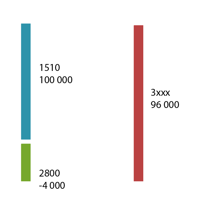
So my goal would be to acheive a diagram for the above showing that total revenue of 10 000 + 16 000 + 30 000 + 40 000 = 96 000 is posted in the bookkeeping with 100 000 against account 1500 and -4 000 against account 2600.
- Mark as New
- Bookmark
- Subscribe
- Mute
- Subscribe to RSS Feed
- Permalink
- Report Inappropriate Content
Hi @kevlin79
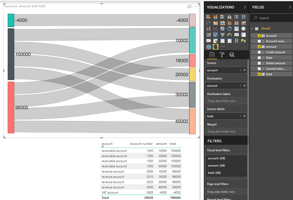
Based on your example dataset and article how to create sankey chart,
I create three calculated columns in your table
category of account number

account =
SWITCH (
    TRUE (),
    LEFT ( [Account number] ) = "3", "revenue account",
    [Account number] = 1500, "receivable account",
    [Account number] = 2600, "VAT account"
)


put amount of each account category from two columns into one column

amount =
SWITCH (
    TRUE (),
    LEFT ( [Account number] ) = "3", [Credit amount],
    [Account number] = 1500, [Debet amount],
    [Account number] = 2600, - [Credit amount]
)


calculate total per account category

total = CALCULATE(SUM(Sheet2[amount]),ALLEXCEPT(Sheet2,Sheet2[account]))
Finally add column to the visual
Best Regards
Maggie
- Mark as New
- Bookmark
- Subscribe
- Mute
- Subscribe to RSS Feed
- Permalink
- Report Inappropriate Content
Many thanks for your answer. Believe I need to do some reading. My goal was to achieve a chart like this (manual illustration). Perhaps I need to create an all new table based on the data in the other table (a consolidated table).
- Mark as New
- Bookmark
- Subscribe
- Mute
- Subscribe to RSS Feed
- Permalink
- Report Inappropriate Content
Hi @kevlin79
Is your problem sloved,
if so, could you share how you do at your convenience or mark my answer as a solution so that others can get help from this thread?
If bot, please don't hesiate to ask me.
Best Regards
Maggie
Helpful resources

Microsoft Fabric Learn Together
Covering the world! 9:00-10:30 AM Sydney, 4:00-5:30 PM CET (Paris/Berlin), 7:00-8:30 PM Mexico City

Power BI Monthly Update - April 2024
Check out the April 2024 Power BI update to learn about new features.

| User | Count |
|---|---|
| 111 | |
| 100 | |
| 80 | |
| 64 | |
| 58 |
| User | Count |
|---|---|
| 146 | |
| 110 | |
| 93 | |
| 84 | |
| 67 |


