- Power BI forums
- Updates
- News & Announcements
- Get Help with Power BI
- Desktop
- Service
- Report Server
- Power Query
- Mobile Apps
- Developer
- DAX Commands and Tips
- Custom Visuals Development Discussion
- Health and Life Sciences
- Power BI Spanish forums
- Translated Spanish Desktop
- Power Platform Integration - Better Together!
- Power Platform Integrations (Read-only)
- Power Platform and Dynamics 365 Integrations (Read-only)
- Training and Consulting
- Instructor Led Training
- Dashboard in a Day for Women, by Women
- Galleries
- Community Connections & How-To Videos
- COVID-19 Data Stories Gallery
- Themes Gallery
- Data Stories Gallery
- R Script Showcase
- Webinars and Video Gallery
- Quick Measures Gallery
- 2021 MSBizAppsSummit Gallery
- 2020 MSBizAppsSummit Gallery
- 2019 MSBizAppsSummit Gallery
- Events
- Ideas
- Custom Visuals Ideas
- Issues
- Issues
- Events
- Upcoming Events
- Community Blog
- Power BI Community Blog
- Custom Visuals Community Blog
- Community Support
- Community Accounts & Registration
- Using the Community
- Community Feedback
Register now to learn Fabric in free live sessions led by the best Microsoft experts. From Apr 16 to May 9, in English and Spanish.
- Power BI forums
- Forums
- Get Help with Power BI
- Desktop
- Sankey diagram - data structure question
- Subscribe to RSS Feed
- Mark Topic as New
- Mark Topic as Read
- Float this Topic for Current User
- Bookmark
- Subscribe
- Printer Friendly Page
- Mark as New
- Bookmark
- Subscribe
- Mute
- Subscribe to RSS Feed
- Permalink
- Report Inappropriate Content
Sankey diagram - data structure question
Hi,
I'm attempting to see if I can use the Sankey visual to illustrate the main user journeys through a website. However I'm not sure what format I need the data in to make this work.
The current format of the data is:
| USER ID | DATETIME | WEBSITE SECTION | POSITION IN JOUNREY |
| 111 | 20/10/2017 09:18:21 | Home | 1 |
| 111 | 20/10/2017 09:18:30 | Search Results | 2 |
| 111 | 20/10/2017 09:19:00 | Article Page | 3 |
| 111 | 20/10/2017 09:19:58 | Article Page | 4 |
| 111 | 01/11/2017 17:19:58 | Article Page | 1 |
| 111 | 01/11/2017 17:22:58 | Home Page | 2 |
| 111 | 01/11/2017 17:23:25 | Article Page | 3 |
| 222 | 07/10/2017 12:14:25 | Home Page | 1 |
| 222 | 07/10/2017 12:15:10 | Search Results | 2 |
| 333 | 24/10/2017 15:15:10 | Home Page | 1 |
| 333 | 24/10/2017 15:15:25 | Article Page | 2 |
| 333 | 24/10/2017 15:16:01 | Home Page | 3 |
The "Position in Journey" column identifies that it was the first, second, etc page to be visited during a visit.
A given user may make multiple visits to the website.
A successful outcome for me would be to show the pages in 'Position 1', with the flows on to the pages in 'Position 2', etc.
If there are better ways than a Sankey visualisation to achieve this, I'm happy to learn! 🙂
Solved! Go to Solution.
- Mark as New
- Bookmark
- Subscribe
- Mute
- Subscribe to RSS Feed
- Permalink
- Report Inappropriate Content
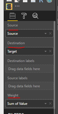
To use Sankey chart, you dataset should have columns like Source, Target, Weight column. It can be like:
It means on row level, you need to have current Position and next Postion info, with some weight. So in your scenario, you need to put Positions into Source and Target. It can be like:
Source                 Target

Home                  Search Results

Search Results        Article Page

Article Page         Article Page
However, this visual currently can't analyze on some other data field level.
As I notice that you also have UserID and DateTime columns in your table, you may create one slicer for User, one slicer for DateTime.
Currently I haven't seen any other published custom visual better on showing flow diagram.
Regards,
Helpful resources

Microsoft Fabric Learn Together
Covering the world! 9:00-10:30 AM Sydney, 4:00-5:30 PM CET (Paris/Berlin), 7:00-8:30 PM Mexico City

Power BI Monthly Update - April 2024
Check out the April 2024 Power BI update to learn about new features.

| User | Count |
|---|---|
| 113 | |
| 100 | |
| 78 | |
| 76 | |
| 52 |
| User | Count |
|---|---|
| 144 | |
| 109 | |
| 108 | |
| 88 | |
| 61 |


