- Power BI forums
- Updates
- News & Announcements
- Get Help with Power BI
- Desktop
- Service
- Report Server
- Power Query
- Mobile Apps
- Developer
- DAX Commands and Tips
- Custom Visuals Development Discussion
- Health and Life Sciences
- Power BI Spanish forums
- Translated Spanish Desktop
- Power Platform Integration - Better Together!
- Power Platform Integrations (Read-only)
- Power Platform and Dynamics 365 Integrations (Read-only)
- Training and Consulting
- Instructor Led Training
- Dashboard in a Day for Women, by Women
- Galleries
- Community Connections & How-To Videos
- COVID-19 Data Stories Gallery
- Themes Gallery
- Data Stories Gallery
- R Script Showcase
- Webinars and Video Gallery
- Quick Measures Gallery
- 2021 MSBizAppsSummit Gallery
- 2020 MSBizAppsSummit Gallery
- 2019 MSBizAppsSummit Gallery
- Events
- Ideas
- Custom Visuals Ideas
- Issues
- Issues
- Events
- Upcoming Events
- Community Blog
- Power BI Community Blog
- Custom Visuals Community Blog
- Community Support
- Community Accounts & Registration
- Using the Community
- Community Feedback
Register now to learn Fabric in free live sessions led by the best Microsoft experts. From Apr 16 to May 9, in English and Spanish.
- Power BI forums
- Forums
- Get Help with Power BI
- Desktop
- Running-totals problem when plotted on a Calendar-...
- Subscribe to RSS Feed
- Mark Topic as New
- Mark Topic as Read
- Float this Topic for Current User
- Bookmark
- Subscribe
- Printer Friendly Page
- Mark as New
- Bookmark
- Subscribe
- Mute
- Subscribe to RSS Feed
- Permalink
- Report Inappropriate Content
Running-totals problem when plotted on a Calendar-based-date set
I have three values with deliverables on specific dates. I need to show all three running-total curves on the same graph. I create a calendar-based measure to create relationships for all three measures so that I can use the Calendar-date-set on graph X-axis. When I plot the running totals against the calendar-based set, they do not show as running totals anymore, they show as daliverables by day.
Steps i take:
- Create Running Totals for each of the 3x values, Planned, Actual, and Recovery. For the Running Totals I use quick measure calculation; Sum of Planned at Base value and Planned Date at Field
- Create Date measure and mark it as the date in model view.
- Create Relationships between Date and the date set from each value, Planned Date, Actual Date, Recovery Date (Forecast)
- Plot a single line graph with Date (calendar) on Axis and the Running totals to have all three curves against the same date set
Showing in snips.
Snip:
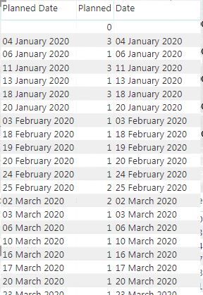
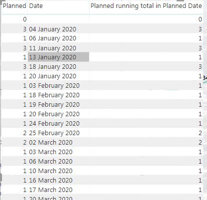
- Planned info: Table showing Planned date, Planned (per date), Running Totals for Planned
- Date alignment: Table shows Planned date, Planned (per date), Date (calendar) aligning neatly with Planned date. This is proof that the relationship works.
- Running info against date misalignment: When I plot Running Total against Date (calendar) the Running totals are actually not running anymore. They go back to Planned (per date).
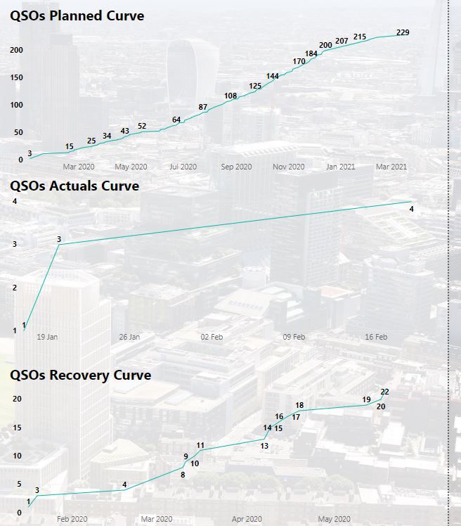
- All 3x Running curves: Each Running column plotted against each own data set. This is what the curves need to look like. These are the curves that I am trying to have on one graph
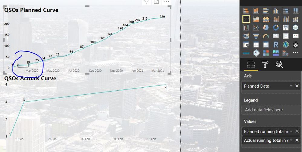
- Planned & Actual Running against Planned Date: This is an experiment. I created a relationship between planned dates and actual dates. Planned curve and Actual curve as per Snip 4. show properly when plotted against their own data sets. Adding Actuals on Planned Curve with Planned dates, shows distorted as you can see. Not the 1, 3, 4 running total. It shows a 2 and 1 In decline.


Solved! Go to Solution.
- Mark as New
- Bookmark
- Subscribe
- Mute
- Subscribe to RSS Feed
- Permalink
- Report Inappropriate Content
hi @Mike_Mace
For your case, you could create three relationship between Calendar table and data table at the same time.
But only one relationship is active, or you could set all them are inactive.
For example:
here is a simple sample.
Then create three measure and use USERELATIONSHIP Function in the formula
REAL AC = CALCULATE(SUM('Table'[PESO]),FILTER(ALLSELECTED('Calendar'[Date]),'Calendar'[Date]<=MAX('Calendar'[Date])))PLAN AC = CALCULATE(SUM('Table'[PESO]),USERELATIONSHIP('Calendar'[Date],'Table'[PECHA PLAN]),FILTER(ALLSELECTED('Calendar'[Date]),'Calendar'[Date]<=MAX('Calendar'[Date])))
Now drag date filed from Calendar table and these measure into a line visual.
here is sample pbix file, please try it.
Regards,
Lin
If this post helps, then please consider Accept it as the solution to help the other members find it more quickly.
- Mark as New
- Bookmark
- Subscribe
- Mute
- Subscribe to RSS Feed
- Permalink
- Report Inappropriate Content
@Mike_Mace so when you created relationship between your data table with date table, one relationship is active and other must be inactive, because you can have only one relationship active between two tables. For the date columns which have inactive relationship, you need to use userrelationship function in your measure to make inactive relation active and after that if you drop date from date table on x-axis and all measures, you will see correct information.
Would appreciate Kudos 🙂 if my solution helped.
Subscribe to the @PowerBIHowTo YT channel for an upcoming video on List and Record functions in Power Query!!
Learn Power BI and Fabric - subscribe to our YT channel - Click here: @PowerBIHowTo
If my solution proved useful, I'd be delighted to receive Kudos. When you put effort into asking a question, it's equally thoughtful to acknowledge and give Kudos to the individual who helped you solve the problem. It's a small gesture that shows appreciation and encouragement! ❤
Did I answer your question? Mark my post as a solution. Proud to be a Super User! Appreciate your Kudos 🙂
Feel free to email me with any of your BI needs.
- Mark as New
- Bookmark
- Subscribe
- Mute
- Subscribe to RSS Feed
- Permalink
- Report Inappropriate Content
Appreciate the point @parry2k on inactive relationships
Issue is, even if i use only one relationship between Date set 1 and calendar dates the information still shows distorted, snip 3.
If you help me with this I'll get the whole office to give you kudos 🙂
- Mark as New
- Bookmark
- Subscribe
- Mute
- Subscribe to RSS Feed
- Permalink
- Report Inappropriate Content
@Mike_Mace send me your pbix with email and I will get it done. remove sensitive information before sharing. my email address is in footer. That is going to be faster and quicker way to get you over the line. cheers!!
Subscribe to the @PowerBIHowTo YT channel for an upcoming video on List and Record functions in Power Query!!
Learn Power BI and Fabric - subscribe to our YT channel - Click here: @PowerBIHowTo
If my solution proved useful, I'd be delighted to receive Kudos. When you put effort into asking a question, it's equally thoughtful to acknowledge and give Kudos to the individual who helped you solve the problem. It's a small gesture that shows appreciation and encouragement! ❤
Did I answer your question? Mark my post as a solution. Proud to be a Super User! Appreciate your Kudos 🙂
Feel free to email me with any of your BI needs.
Helpful resources

Microsoft Fabric Learn Together
Covering the world! 9:00-10:30 AM Sydney, 4:00-5:30 PM CET (Paris/Berlin), 7:00-8:30 PM Mexico City

Power BI Monthly Update - April 2024
Check out the April 2024 Power BI update to learn about new features.

| User | Count |
|---|---|
| 109 | |
| 99 | |
| 77 | |
| 66 | |
| 54 |
| User | Count |
|---|---|
| 144 | |
| 104 | |
| 102 | |
| 87 | |
| 64 |


