- Power BI forums
- Updates
- News & Announcements
- Get Help with Power BI
- Desktop
- Service
- Report Server
- Power Query
- Mobile Apps
- Developer
- DAX Commands and Tips
- Custom Visuals Development Discussion
- Health and Life Sciences
- Power BI Spanish forums
- Translated Spanish Desktop
- Power Platform Integration - Better Together!
- Power Platform Integrations (Read-only)
- Power Platform and Dynamics 365 Integrations (Read-only)
- Training and Consulting
- Instructor Led Training
- Dashboard in a Day for Women, by Women
- Galleries
- Community Connections & How-To Videos
- COVID-19 Data Stories Gallery
- Themes Gallery
- Data Stories Gallery
- R Script Showcase
- Webinars and Video Gallery
- Quick Measures Gallery
- 2021 MSBizAppsSummit Gallery
- 2020 MSBizAppsSummit Gallery
- 2019 MSBizAppsSummit Gallery
- Events
- Ideas
- Custom Visuals Ideas
- Issues
- Issues
- Events
- Upcoming Events
- Community Blog
- Power BI Community Blog
- Custom Visuals Community Blog
- Community Support
- Community Accounts & Registration
- Using the Community
- Community Feedback
Register now to learn Fabric in free live sessions led by the best Microsoft experts. From Apr 16 to May 9, in English and Spanish.
- Power BI forums
- Forums
- Get Help with Power BI
- Desktop
- Re: Running Total Chart over Multiple Years
- Subscribe to RSS Feed
- Mark Topic as New
- Mark Topic as Read
- Float this Topic for Current User
- Bookmark
- Subscribe
- Printer Friendly Page
- Mark as New
- Bookmark
- Subscribe
- Mute
- Subscribe to RSS Feed
- Permalink
- Report Inappropriate Content
Running Total Chart over Multiple Years
Hello all,
Question regarding both DAX and getteing the correct chart.
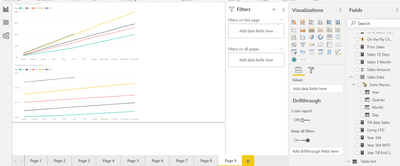
Problem: I want to plot multiple cumulative YTD sales plots on one plot/tile. I have succesfully been able to do that for one FY but that is dependent on having a slicer of filter on it. I'd like to do it for multiple years. The image Below should help illuminate where I am at and where I'd like to go:
The image above shows that I can plot one year of sales data over whatever period I have selected in the slicer. In this case, the 2018-2019FY.
However, I'd like to plot the chart in blue ( I don't care about # of sales each day which is what the green line shows) fo the past five years. Ideally I'd have five line graphs with that same shape on the same plot. Our sales are moving earlier in the fiscal year fall and later in the spring. I'd like to be able to show this visually to executives.
Any help or ideas on how to set this up?
Solved! Go to Solution.
- Mark as New
- Bookmark
- Subscribe
- Mute
- Subscribe to RSS Feed
- Permalink
- Report Inappropriate Content
I tried creating an example of what you need. Can you refer to page and let me know what exactly you are looking for. I created two measures and added them to two graphs. https://www.dropbox.com/s/tu56wooipvoyoy3/CompareRange_timedim_YearTillDate.pbix?dl=0
Microsoft Power BI Learning Resources, 2023 !!
Learn Power BI - Full Course with Dec-2022, with Window, Index, Offset, 100+ Topics !!
Did I answer your question? Mark my post as a solution! Appreciate your Kudos !! Proud to be a Super User! !!
- Mark as New
- Bookmark
- Subscribe
- Mute
- Subscribe to RSS Feed
- Permalink
- Report Inappropriate Content
Can you please share the formula.
Microsoft Power BI Learning Resources, 2023 !!
Learn Power BI - Full Course with Dec-2022, with Window, Index, Offset, 100+ Topics !!
Did I answer your question? Mark my post as a solution! Appreciate your Kudos !! Proud to be a Super User! !!
- Mark as New
- Bookmark
- Subscribe
- Mute
- Subscribe to RSS Feed
- Permalink
- Report Inappropriate Content
Sure. @amitchandak
The code I am using to calculate the running total sales are the following:
Measure = CALCULATE( SUM(SalesPerDate[Initiates]), FILTER (ALLSELECTED(SalesPerDate), SalesPerDate[Date] <= MAX(SalesPerDate[Date])))

- Mark as New
- Bookmark
- Subscribe
- Mute
- Subscribe to RSS Feed
- Permalink
- Report Inappropriate Content
I tried creating an example of what you need. Can you refer to page and let me know what exactly you are looking for. I created two measures and added them to two graphs. https://www.dropbox.com/s/tu56wooipvoyoy3/CompareRange_timedim_YearTillDate.pbix?dl=0
Microsoft Power BI Learning Resources, 2023 !!
Learn Power BI - Full Course with Dec-2022, with Window, Index, Offset, 100+ Topics !!
Did I answer your question? Mark my post as a solution! Appreciate your Kudos !! Proud to be a Super User! !!
- Mark as New
- Bookmark
- Subscribe
- Mute
- Subscribe to RSS Feed
- Permalink
- Report Inappropriate Content
Hello Amit,
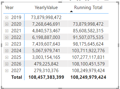
I am trying to produce a running total of a planned payment column from 2019 to 2027.
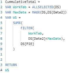
Below is the DAX I used.
But it does not produce the expected result.
1. the staring value is moved from 2019 to 2019 and there is no value in 2019.
2. the running total is not right.
Could you please help?
Below is the link to the power Bi file.
https://1drv.ms/u/s!Asi-_ORlnzgVlnZMQWnBECqvjwPp?e=48WnMU
- Mark as New
- Bookmark
- Subscribe
- Mute
- Subscribe to RSS Feed
- Permalink
- Report Inappropriate Content
Refer page 9
Microsoft Power BI Learning Resources, 2023 !!
Learn Power BI - Full Course with Dec-2022, with Window, Index, Offset, 100+ Topics !!
Did I answer your question? Mark my post as a solution! Appreciate your Kudos !! Proud to be a Super User! !!
- Mark as New
- Bookmark
- Subscribe
- Mute
- Subscribe to RSS Feed
- Permalink
- Report Inappropriate Content
Helpful resources

Microsoft Fabric Learn Together
Covering the world! 9:00-10:30 AM Sydney, 4:00-5:30 PM CET (Paris/Berlin), 7:00-8:30 PM Mexico City

Power BI Monthly Update - April 2024
Check out the April 2024 Power BI update to learn about new features.

| User | Count |
|---|---|
| 118 | |
| 107 | |
| 70 | |
| 70 | |
| 43 |
| User | Count |
|---|---|
| 148 | |
| 105 | |
| 104 | |
| 89 | |
| 65 |


