- Power BI forums
- Updates
- News & Announcements
- Get Help with Power BI
- Desktop
- Service
- Report Server
- Power Query
- Mobile Apps
- Developer
- DAX Commands and Tips
- Custom Visuals Development Discussion
- Health and Life Sciences
- Power BI Spanish forums
- Translated Spanish Desktop
- Power Platform Integration - Better Together!
- Power Platform Integrations (Read-only)
- Power Platform and Dynamics 365 Integrations (Read-only)
- Training and Consulting
- Instructor Led Training
- Dashboard in a Day for Women, by Women
- Galleries
- Community Connections & How-To Videos
- COVID-19 Data Stories Gallery
- Themes Gallery
- Data Stories Gallery
- R Script Showcase
- Webinars and Video Gallery
- Quick Measures Gallery
- 2021 MSBizAppsSummit Gallery
- 2020 MSBizAppsSummit Gallery
- 2019 MSBizAppsSummit Gallery
- Events
- Ideas
- Custom Visuals Ideas
- Issues
- Issues
- Events
- Upcoming Events
- Community Blog
- Power BI Community Blog
- Custom Visuals Community Blog
- Community Support
- Community Accounts & Registration
- Using the Community
- Community Feedback
Register now to learn Fabric in free live sessions led by the best Microsoft experts. From Apr 16 to May 9, in English and Spanish.
- Power BI forums
- Forums
- Get Help with Power BI
- Desktop
- Running Average of Group Data
- Subscribe to RSS Feed
- Mark Topic as New
- Mark Topic as Read
- Float this Topic for Current User
- Bookmark
- Subscribe
- Printer Friendly Page
- Mark as New
- Bookmark
- Subscribe
- Mute
- Subscribe to RSS Feed
- Permalink
- Report Inappropriate Content
Running Average of Group Data
Hello, I am new to Power BI and DAX. I am trying to create a measure for calculating the moving average of 3 monthly sales by shops.
On the dashboard there is a slicer for shops, and also a timeline slicer for date, so the user can analyze the dashboard data for a month or quarter. I want to add a moving average line in the sales bar chart by months. Please advise how should I set the DAX formula.
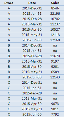
Below a simplified example table:
I have also created a Calendar table from 2014-1-1 to 2016-12-31:
I searched the internet and found below DAX for moving Sum. However, I don't know how to modify it so that it will be done by Shop as well.
[3 Month Moving Sum Sales] =
CALCULATE([Sales],
DATESINPERIOD(Calendar[Date],
LASTDATE(Calendar[Date]),-3, Month
)
Many thanks in advanced!!!
- Mark as New
- Bookmark
- Subscribe
- Mute
- Subscribe to RSS Feed
- Permalink
- Report Inappropriate Content
@desiree This should work... Let me know...
3 Month Moving Sum =
CALCULATE (
    [Sales],
    ALLEXCEPT ( 'Table', 'Table'[Store] ),
    DATESINPERIOD ( 'Calendar'[Date], LASTDATE ( 'Calendar'[Date] ), -3, MONTH )
)
EDIT: You could use the above Measure to also calculate the 3 Month Average below ...
3 Month Moving Avg =
DIVIDE (
    [3 Month Moving Sum],
    CALCULATE (
        DISTINCTCOUNT ( 'Calendar'[Date] ),
        DATESINPERIOD ( 'Calendar'[Date], LASTDATE ( 'Calendar'[Date] ), -3, MONTH )
    ),
    0
)
Hope this helps! Let me know...
- Mark as New
- Bookmark
- Subscribe
- Mute
- Subscribe to RSS Feed
- Permalink
- Report Inappropriate Content
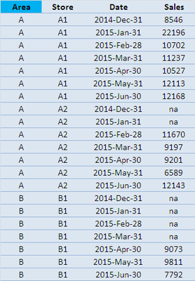
@Sean , Sorry that I just realize my table is as below.. Actually, I need to calcuate the moving average for each Area which is a slicer in my dashbaord... and a area will include many stores. Sorry for confusion. (I am trying to screen capture my dashboard, hope above information helps at this moment)
- Mark as New
- Bookmark
- Subscribe
- Mute
- Subscribe to RSS Feed
- Permalink
- Report Inappropriate Content
So to aggregate at the Area level just substitute [Store] with [Area] in the formula.
- Mark as New
- Bookmark
- Subscribe
- Mute
- Subscribe to RSS Feed
- Permalink
- Report Inappropriate Content
@Sean , Besides Calandar table, shall I create a table include "Store" and "Area" and join it to these 2 fields in my data table?
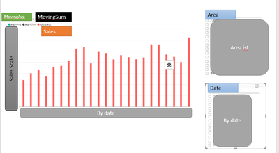
Below is the visual that I applied the MovingAvg(green dot in legend) and MovingSum(black dot in legend). As you can see, there is no barchart in green or black below. Therefore, I wonder I missed something.....
- Mark as New
- Bookmark
- Subscribe
- Mute
- Subscribe to RSS Feed
- Permalink
- Report Inappropriate Content
@Sean , I corrected my Calandar table. Now, the Moving Sum shows the same value for all months. Any ideas?
Thank you in advanced 🙂
- Mark as New
- Bookmark
- Subscribe
- Mute
- Subscribe to RSS Feed
- Permalink
- Report Inappropriate Content
Please refer to steps below:
- In order to rank values, replace “na” sales with 0 in Query Editor.
- Create a new column with following formula:
Year&Month = VAR string = YEAR ( 'Table'[Date] ) & MONTH ( 'Table'[Date] ) RETURN ( VALUE ( string ) ) - Create a measure with following formula:
3 Month Moving Avg = VAR FirstD = FIRSTDATE ( DATESINPERIOD ( 'Calendar'[Date], LASTDATE ( 'Calendar'[Date] ), -3, MONTH ) ) VAR LastD = LASTDATE ( DATESINPERIOD ( 'Calendar'[Date], LASTDATE ( 'Calendar'[Date] ), -3, MONTH ) ) RETURN ( CALCULATE ( SUM ( 'Table'[Sales] ), 'Table'[Date] >= FirstD, 'Table'[Date] <= LastD ) / CALCULATE ( DISTINCTCOUNT ( 'Table'[Year&Month] ), 'Table'[Date] >= FirstD, 'Table'[Date] <= LastD ) ) - Put Hierarchy Slicer, Timeline and “Line and stacked column chart” into the page. Select 'Calendar'[Date] for Timeline. Select Area and Store for Hierarchy Slicer. Select Date(axis), Sales(Column) and 3 Month Moving Avg(Line) for “Line and stacked column chart”
Then the chart will display according to both slicers as below.
Regards,
- Mark as New
- Bookmark
- Subscribe
- Mute
- Subscribe to RSS Feed
- Permalink
- Report Inappropriate Content
I think this solution doesnt meet the request.
We need to running average calculation what the slicer selected on the dashboard. Another description average change when the slicer change. I think There sould be dynamoc filter which select the slicer value.
- Mark as New
- Bookmark
- Subscribe
- Mute
- Subscribe to RSS Feed
- Permalink
- Report Inappropriate Content
@Sean , DAX formula pop error when I used below.
3 Month Moving Sum =
CALCULATE (
    [Sales],
    ALLEXCEPT ( 'Table', 'Table'[Store] ),
    DATESINPERIOD ( 'Calendar'[Date], LASTDATE ( 'Calendar'[Date] ), -3, MONTH )
)
It said I may need to add Sum,Min, Max etc for [Sales]. So, I modified the formula to below.
3 Month Moving Sum =
CALCULATE (
    Sum([Sales]),
    ALLEXCEPT ( 'Table', 'Table'[Store] ),
    DATESINPERIOD ( 'Calendar'[Date], LASTDATE ( 'Calendar'[Date] ), -3, MONTH )
)
and then, create the [3 month moving avg] as per your suggestions.
When I tried to drag this measure to chart, nothing shows. Did I do something wrong?
Sorry that I am really new to Power BI and DAX... would you mind sending me an example (.pbix) if you have time?
- Mark as New
- Bookmark
- Subscribe
- Mute
- Subscribe to RSS Feed
- Permalink
- Report Inappropriate Content
What is the name of your 'Table' - did you change 'Table' and 'Calendar' in the formulas to match your own Table names?
Then do the Measures work when you use in a table or matrix?
Can you post a screenshot of what happens when you use the Measures?
Helpful resources

Microsoft Fabric Learn Together
Covering the world! 9:00-10:30 AM Sydney, 4:00-5:30 PM CET (Paris/Berlin), 7:00-8:30 PM Mexico City

Power BI Monthly Update - April 2024
Check out the April 2024 Power BI update to learn about new features.

| User | Count |
|---|---|
| 112 | |
| 96 | |
| 78 | |
| 68 | |
| 55 |
| User | Count |
|---|---|
| 145 | |
| 105 | |
| 104 | |
| 90 | |
| 63 |


