- Power BI forums
- Updates
- News & Announcements
- Get Help with Power BI
- Desktop
- Service
- Report Server
- Power Query
- Mobile Apps
- Developer
- DAX Commands and Tips
- Custom Visuals Development Discussion
- Health and Life Sciences
- Power BI Spanish forums
- Translated Spanish Desktop
- Power Platform Integration - Better Together!
- Power Platform Integrations (Read-only)
- Power Platform and Dynamics 365 Integrations (Read-only)
- Training and Consulting
- Instructor Led Training
- Dashboard in a Day for Women, by Women
- Galleries
- Community Connections & How-To Videos
- COVID-19 Data Stories Gallery
- Themes Gallery
- Data Stories Gallery
- R Script Showcase
- Webinars and Video Gallery
- Quick Measures Gallery
- 2021 MSBizAppsSummit Gallery
- 2020 MSBizAppsSummit Gallery
- 2019 MSBizAppsSummit Gallery
- Events
- Ideas
- Custom Visuals Ideas
- Issues
- Issues
- Events
- Upcoming Events
- Community Blog
- Power BI Community Blog
- Custom Visuals Community Blog
- Community Support
- Community Accounts & Registration
- Using the Community
- Community Feedback
Register now to learn Fabric in free live sessions led by the best Microsoft experts. From Apr 16 to May 9, in English and Spanish.
- Power BI forums
- Forums
- Get Help with Power BI
- Desktop
- Rules for graph formatting not applied correctely
- Subscribe to RSS Feed
- Mark Topic as New
- Mark Topic as Read
- Float this Topic for Current User
- Bookmark
- Subscribe
- Printer Friendly Page
- Mark as New
- Bookmark
- Subscribe
- Mute
- Subscribe to RSS Feed
- Permalink
- Report Inappropriate Content
Rules for graph formatting not applied correctely
Hi all
I am applying a formatting rule to a visual (a combined bar and line chart) for which the bars have a conditional formatting: The bars should be in blue for values below or equal to a certain threshold and in red for values above it. However the threshold is not applied correctely. Precicely, my threshold is at 16.26%, however two of the bars have the wrong color even though they are above this value (17.26, 19.17%). Only the bar having a value of 21.22% appears in the correct color red. For all values above it also works perfetely fine.
No idea what is going wrong!!
Any idea?
Thanks 🙂
- Mark as New
- Bookmark
- Subscribe
- Mute
- Subscribe to RSS Feed
- Permalink
- Report Inappropriate Content
Hi Rebreg, can you share your DAX in each instance?
If you hover over the bars in the chart, what values do they give?
Pi
- Mark as New
- Bookmark
- Subscribe
- Mute
- Subscribe to RSS Feed
- Permalink
- Report Inappropriate Content
When i hover over the bars, thats when I see that the formatting is not applied correctly. Then it shows the values i mentioned above (17.26, 19.17%). And even though they should appear in red, they appear in blue.
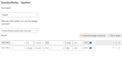
The rule doesn't need any DAX, i put it here:
The measure I am visualizing as bars has the formula
Data for bars =
CALCULATE(
    COUNTROWS('datatable'),
    'datatable'[color] = "Red"
)/
COUNTROWS('datatable')
I am plotting it over another attribute of the data table (a customer key) on the x-axis.
Thanks for your help!
- Mark as New
- Bookmark
- Subscribe
- Mute
- Subscribe to RSS Feed
- Permalink
- Report Inappropriate Content
hi Rebreg
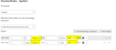
My german is not good, but I've noticed you've got different units for the tolerances. This could be confusing it - maybe this is the issue?
Prozent vs zahl
Pi
- Mark as New
- Bookmark
- Subscribe
- Mute
- Subscribe to RSS Feed
- Permalink
- Report Inappropriate Content
Ah I am sorry, I made an example just for this post where I was sloppy. In my plot all the units are the same (%) and the problem still occurs.
- Mark as New
- Bookmark
- Subscribe
- Mute
- Subscribe to RSS Feed
- Permalink
- Report Inappropriate Content
Hi - this is very strange. I was able to recreate the issue locally.
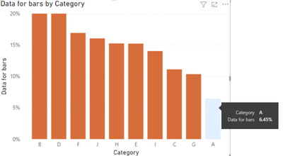
When I set the tolerances as % - the formatting in the chart is wrong:
However when I change it to Numbers it starts to work:
I'm not sure why that is - I can only think it might be some sort of bug? Because the % values are accurate in the bars!
I used the same DAX, almost word for word
Pi
- Mark as New
- Bookmark
- Subscribe
- Mute
- Subscribe to RSS Feed
- Permalink
- Report Inappropriate Content
@Anonymous , I have just figured it out!
According to the guidance, the % values in conditional formatting refer to the the bar's value as a percent of the overall range of bars
So it does not refer to the value of the individual bar itself.
Please refer to : https://learn.microsoft.com/en-us/power-bi/create-reports/desktop-conditional-table-formatting#color-by-rules
Unfortunately this is not intuitive, hopefully microsoft can make this clearer in future releases!
Pi
- Mark as New
- Bookmark
- Subscribe
- Mute
- Subscribe to RSS Feed
- Permalink
- Report Inappropriate Content
Haha woooow, thanks so much for the reserach! This is really not intuitive at all 😛 Thanks for the help!
Can this be placed somewhere as a change request?
- Mark as New
- Bookmark
- Subscribe
- Mute
- Subscribe to RSS Feed
- Permalink
- Report Inappropriate Content
I was just taking a look at this site here: https://ideas.powerbi.com/ideas/search-ideas/?q=conditional%20formatting%20bars&forum=+%22Power%20BI...
Looks like it's not been proposed yet, so I have submitted mine:
https://ideas.powerbi.com/ideas/idea/?ideaid=99042846-4e75-ed11-a76e-501ac524925c
Helpful resources

Microsoft Fabric Learn Together
Covering the world! 9:00-10:30 AM Sydney, 4:00-5:30 PM CET (Paris/Berlin), 7:00-8:30 PM Mexico City

Power BI Monthly Update - April 2024
Check out the April 2024 Power BI update to learn about new features.

| User | Count |
|---|---|
| 109 | |
| 96 | |
| 77 | |
| 66 | |
| 53 |
| User | Count |
|---|---|
| 144 | |
| 105 | |
| 102 | |
| 89 | |
| 63 |


