- Power BI forums
- Updates
- News & Announcements
- Get Help with Power BI
- Desktop
- Service
- Report Server
- Power Query
- Mobile Apps
- Developer
- DAX Commands and Tips
- Custom Visuals Development Discussion
- Health and Life Sciences
- Power BI Spanish forums
- Translated Spanish Desktop
- Power Platform Integration - Better Together!
- Power Platform Integrations (Read-only)
- Power Platform and Dynamics 365 Integrations (Read-only)
- Training and Consulting
- Instructor Led Training
- Dashboard in a Day for Women, by Women
- Galleries
- Community Connections & How-To Videos
- COVID-19 Data Stories Gallery
- Themes Gallery
- Data Stories Gallery
- R Script Showcase
- Webinars and Video Gallery
- Quick Measures Gallery
- 2021 MSBizAppsSummit Gallery
- 2020 MSBizAppsSummit Gallery
- 2019 MSBizAppsSummit Gallery
- Events
- Ideas
- Custom Visuals Ideas
- Issues
- Issues
- Events
- Upcoming Events
- Community Blog
- Power BI Community Blog
- Custom Visuals Community Blog
- Community Support
- Community Accounts & Registration
- Using the Community
- Community Feedback
Register now to learn Fabric in free live sessions led by the best Microsoft experts. From Apr 16 to May 9, in English and Spanish.
- Power BI forums
- Forums
- Get Help with Power BI
- Desktop
- Rounding up Issue
- Subscribe to RSS Feed
- Mark Topic as New
- Mark Topic as Read
- Float this Topic for Current User
- Bookmark
- Subscribe
- Printer Friendly Page
- Mark as New
- Bookmark
- Subscribe
- Mute
- Subscribe to RSS Feed
- Permalink
- Report Inappropriate Content
Rounding up Issue
Hi,
I have a clustered column chart representing a set of values, however, the graph displays all values as 100%. I do not seem to understand whats wrong. Please see the screenshot attached below:
The original values that Formco Metals should have are:
| 80.00 - Jan | 86.67 - Feb | 100.00 - March | 88.57 - April | 80.00 - May | 91.30 - June | 100.00 - July | 100.00 - Aug |
But the graph displays all values as 100.
Please help.
Solved! Go to Solution.
- Mark as New
- Bookmark
- Subscribe
- Mute
- Subscribe to RSS Feed
- Permalink
- Report Inappropriate Content
The problem is that your monthly values are stored as Text. They need to be a Numeric datatype. Then you will be able to display the values, instead of counts.
I tried to change to numeric, but there are apparently some "NA" values -
To Do:
1. Clean up "NA" values by replacing them with null values.
2. Change datatypes to Decimal or Fixed Decimal Number.
3. Re-add the fields to the visual, using the appropriate summarization - "First" should probably work.
Hope This Helps,
Nathan
- Mark as New
- Bookmark
- Subscribe
- Mute
- Subscribe to RSS Feed
- Permalink
- Report Inappropriate Content
HI, @Anonymous
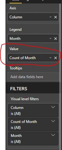
If you could what is the field in your Value of this visual. is this like yours?
please check if the Value field is correct. if not your case, could share your sample pbix file for us to have a test?
Best Regards,
Lin
If this post helps, then please consider Accept it as the solution to help the other members find it more quickly.
- Mark as New
- Bookmark
- Subscribe
- Mute
- Subscribe to RSS Feed
- Permalink
- Report Inappropriate Content
Thanks for your reply Lin.
The value field is indeed correct. I'd like to send you the file. Can you please tell me how I can attach/send it to you? I am unable to see an option here.
@v-lili6-msft wrote:HI, @Anonymous
If you could what is the field in your Value of this visual. is this like yours?
please check if the Value field is correct. if not your case, could share your sample pbix file for us to have a test?
Best Regards,
Lin
Please note that I am using the supplier performance from jan - aug. to be represented in power BI using clustered column bar chart.
Kindly help me fix it. Somehow all the suppliers get 100% even if the actual data is 80s or 90s for each month.
- Mark as New
- Bookmark
- Subscribe
- Mute
- Subscribe to RSS Feed
- Permalink
- Report Inappropriate Content
hi, @Anonymous
From the screenshot, we could not find out the exact cause of it. If there is something wrong with relationship? is the cross filter direction should be "Both"?
If possible, could you share your sample report for us have a test?
Best Regards,
Lin
If this post helps, then please consider Accept it as the solution to help the other members find it more quickly.
- Mark as New
- Bookmark
- Subscribe
- Mute
- Subscribe to RSS Feed
- Permalink
- Report Inappropriate Content
Lin,
Please access the file via: https://drive.google.com/file/d/1y832EnzJT4rop_wP6x_4RZEncu2mVsbt/view?usp=sharing
You can see that the actual data is different, but when you select each individual "Supplier ID" from the slicer, somehow the bar graph gives everyone a 100%.
Please let me know if you need more information. Thanks.
- Mark as New
- Bookmark
- Subscribe
- Mute
- Subscribe to RSS Feed
- Permalink
- Report Inappropriate Content
The problem is that your monthly values are stored as Text. They need to be a Numeric datatype. Then you will be able to display the values, instead of counts.
I tried to change to numeric, but there are apparently some "NA" values -
To Do:
1. Clean up "NA" values by replacing them with null values.
2. Change datatypes to Decimal or Fixed Decimal Number.
3. Re-add the fields to the visual, using the appropriate summarization - "First" should probably work.
Hope This Helps,
Nathan
- Mark as New
- Bookmark
- Subscribe
- Mute
- Subscribe to RSS Feed
- Permalink
- Report Inappropriate Content
Thank you very much for your help.
Could you possible help me with denoting the numbers as percentages?
My base excel source has everything in percentage - which translate into plain numbers into power bi. And if I use power bi "percentage" formatting for the numbers, they gain 10^2 (Eg: 100% in excel = 100 in power BI = 10000%).
Is there a way to add percentage just as a unit at the end of original 100 in power bi? I do not wish to change my excel source entirely and have it divide by 100 just so that I can get it right in power BI.
- Mark as New
- Bookmark
- Subscribe
- Mute
- Subscribe to RSS Feed
- Permalink
- Report Inappropriate Content
@Anonymous - You will need to divide by 100 somewhere. Your options are:
1. In your source
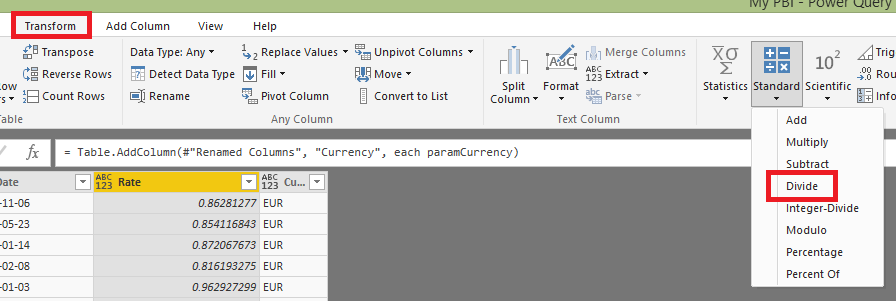
2. In Power Query, select your columns and then divide them:

Hope this helps,
Nathan
Helpful resources

Microsoft Fabric Learn Together
Covering the world! 9:00-10:30 AM Sydney, 4:00-5:30 PM CET (Paris/Berlin), 7:00-8:30 PM Mexico City

Power BI Monthly Update - April 2024
Check out the April 2024 Power BI update to learn about new features.

| User | Count |
|---|---|
| 107 | |
| 93 | |
| 77 | |
| 65 | |
| 53 |
| User | Count |
|---|---|
| 147 | |
| 106 | |
| 104 | |
| 87 | |
| 61 |


