- Power BI forums
- Updates
- News & Announcements
- Get Help with Power BI
- Desktop
- Service
- Report Server
- Power Query
- Mobile Apps
- Developer
- DAX Commands and Tips
- Custom Visuals Development Discussion
- Health and Life Sciences
- Power BI Spanish forums
- Translated Spanish Desktop
- Power Platform Integration - Better Together!
- Power Platform Integrations (Read-only)
- Power Platform and Dynamics 365 Integrations (Read-only)
- Training and Consulting
- Instructor Led Training
- Dashboard in a Day for Women, by Women
- Galleries
- Community Connections & How-To Videos
- COVID-19 Data Stories Gallery
- Themes Gallery
- Data Stories Gallery
- R Script Showcase
- Webinars and Video Gallery
- Quick Measures Gallery
- 2021 MSBizAppsSummit Gallery
- 2020 MSBizAppsSummit Gallery
- 2019 MSBizAppsSummit Gallery
- Events
- Ideas
- Custom Visuals Ideas
- Issues
- Issues
- Events
- Upcoming Events
- Community Blog
- Power BI Community Blog
- Custom Visuals Community Blog
- Community Support
- Community Accounts & Registration
- Using the Community
- Community Feedback
Register now to learn Fabric in free live sessions led by the best Microsoft experts. From Apr 16 to May 9, in English and Spanish.
- Power BI forums
- Forums
- Get Help with Power BI
- Desktop
- Re: Rotating the angle of x-axis ?
- Subscribe to RSS Feed
- Mark Topic as New
- Mark Topic as Read
- Float this Topic for Current User
- Bookmark
- Subscribe
- Printer Friendly Page
- Mark as New
- Bookmark
- Subscribe
- Mute
- Subscribe to RSS Feed
- Permalink
- Report Inappropriate Content
Rotating the angle of x-axis ?
Hi, all I want to rotate the label on the left horizontally like the visual right. The right one has the same data almost but I don't understand why the other graph is giving the x-label at this angle.
- I have tried concatenating labels.
So maybe other options, please ??
- Mark as New
- Bookmark
- Subscribe
- Mute
- Subscribe to RSS Feed
- Permalink
- Report Inappropriate Content
Hi @Anonymous,
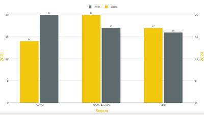
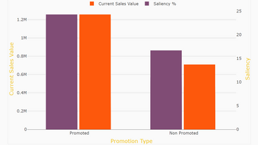
Here is Column Chart create with PBIVizEdit, which will help you to customised axis label angles, you can set it at any degrees. Hope this helps you.


Download link for the custom visual file in this page,
https://pbivizedit.com/gallery/dual-y-axis-column-chart
This was made with our Custom Visual creator tool PBIVizEdit.com. With this tool,
- anyone, irrespective of technical skills, can create their own visuals
- 15 minutes to create a visual from scratch
- opens up many additional attributes to edit (for e.g. labels, tooltips, legends position, etc)
Give this a shot and let us know if you face any problem/errors.
You can use the editor to modify your visual further (some modifications cannot be done in Power BI window and have to be in editor).
Thanks,
Team PBIVizEdit
- Mark as New
- Bookmark
- Subscribe
- Mute
- Subscribe to RSS Feed
- Permalink
- Report Inappropriate Content
Hi @Anonymous
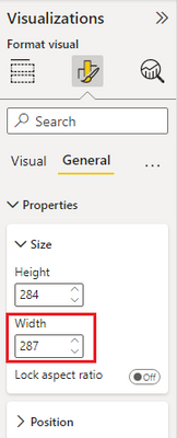
There is no such option to change the angle of x-axis labels. This is decided by the visual automatically. You can enlarge the width size of the column chart visual to show them horizontally. Or use short month names "Jan, Feb, Mar..." on the x-axis, which occupys less horizontal space.
Best Regards,
Community Support Team _ Jing
If this post helps, please Accept it as Solution to help other members find it.
- Mark as New
- Bookmark
- Subscribe
- Mute
- Subscribe to RSS Feed
- Permalink
- Report Inappropriate Content
I'm afraid there's no formatting option for that and that it only depends on the size of the visual and how much space the visual thinks it needs to display the labels either tilted or horizontally.
Helpful resources

Microsoft Fabric Learn Together
Covering the world! 9:00-10:30 AM Sydney, 4:00-5:30 PM CET (Paris/Berlin), 7:00-8:30 PM Mexico City

Power BI Monthly Update - April 2024
Check out the April 2024 Power BI update to learn about new features.

| User | Count |
|---|---|
| 110 | |
| 94 | |
| 82 | |
| 66 | |
| 58 |
| User | Count |
|---|---|
| 151 | |
| 121 | |
| 104 | |
| 87 | |
| 67 |


