- Power BI forums
- Updates
- News & Announcements
- Get Help with Power BI
- Desktop
- Service
- Report Server
- Power Query
- Mobile Apps
- Developer
- DAX Commands and Tips
- Custom Visuals Development Discussion
- Health and Life Sciences
- Power BI Spanish forums
- Translated Spanish Desktop
- Power Platform Integration - Better Together!
- Power Platform Integrations (Read-only)
- Power Platform and Dynamics 365 Integrations (Read-only)
- Training and Consulting
- Instructor Led Training
- Dashboard in a Day for Women, by Women
- Galleries
- Community Connections & How-To Videos
- COVID-19 Data Stories Gallery
- Themes Gallery
- Data Stories Gallery
- R Script Showcase
- Webinars and Video Gallery
- Quick Measures Gallery
- 2021 MSBizAppsSummit Gallery
- 2020 MSBizAppsSummit Gallery
- 2019 MSBizAppsSummit Gallery
- Events
- Ideas
- Custom Visuals Ideas
- Issues
- Issues
- Events
- Upcoming Events
- Community Blog
- Power BI Community Blog
- Custom Visuals Community Blog
- Community Support
- Community Accounts & Registration
- Using the Community
- Community Feedback
Register now to learn Fabric in free live sessions led by the best Microsoft experts. From Apr 16 to May 9, in English and Spanish.
- Power BI forums
- Forums
- Get Help with Power BI
- Desktop
- Re: Reversed Single line chart with 2 TEXT Y AXIS ...
- Subscribe to RSS Feed
- Mark Topic as New
- Mark Topic as Read
- Float this Topic for Current User
- Bookmark
- Subscribe
- Printer Friendly Page
- Mark as New
- Bookmark
- Subscribe
- Mute
- Subscribe to RSS Feed
- Permalink
- Report Inappropriate Content
Reversed Single line chart with 2 TEXT Y AXIS LABELS and numeric X axis
Hello,
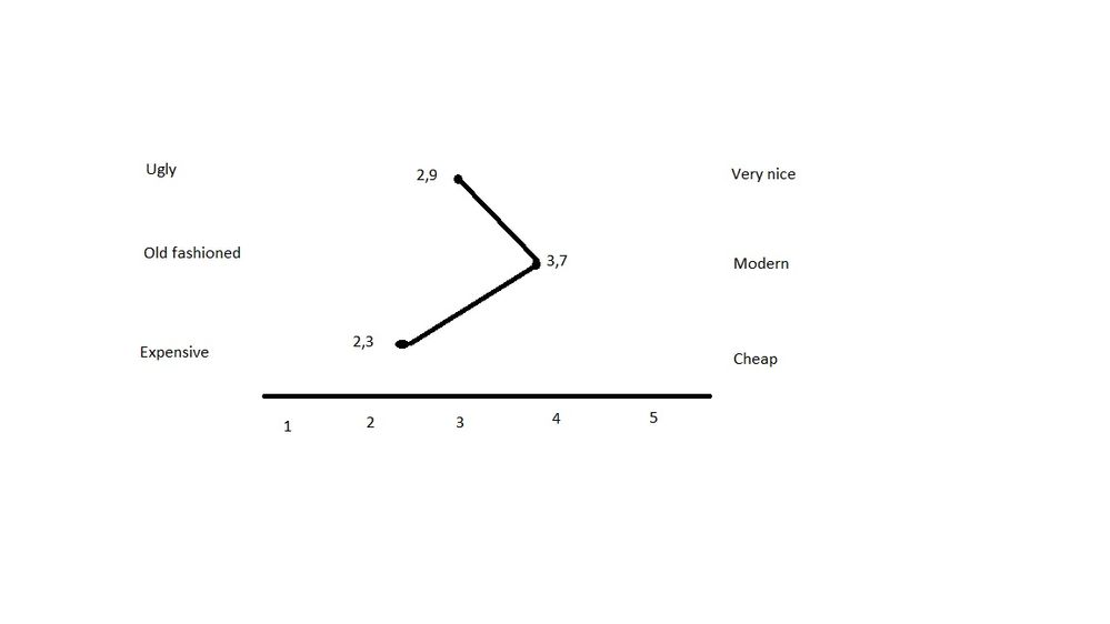
our customer asks for report, where he wants to see single line chart describing service satisfaction in 3 categories from 1 to 5
How modern is service ? From 1 to 5 (Old fashioned to Very modern)
Graphical design ? From 1 to 5 (Ugly to Very nice)
How expensive it is ? From 1 to 5 (Expensive to Cheap)
And he wants to see single line chart where 1 to 5 will be on X axis and on Y axis will be on left Y axis will be text label for 1 and on right Y axis will be text label for 5.
To be honest I have no clue how to achieve it
Attaching picture how it should look like.
Data are not important, I am able to do any kind of transformation, it is right now only about how to achieve visualization.
thanks
Solved! Go to Solution.
- Mark as New
- Bookmark
- Subscribe
- Mute
- Subscribe to RSS Feed
- Permalink
- Report Inappropriate Content
Maybe possible using Charticulator?
Did I answer your question? Mark my post as a solution!
In doing so, you are also helping me. Thank you!
Proud to be a Super User!
Paul on Linkedin.
- Mark as New
- Bookmark
- Subscribe
- Mute
- Subscribe to RSS Feed
- Permalink
- Report Inappropriate Content
Hello,
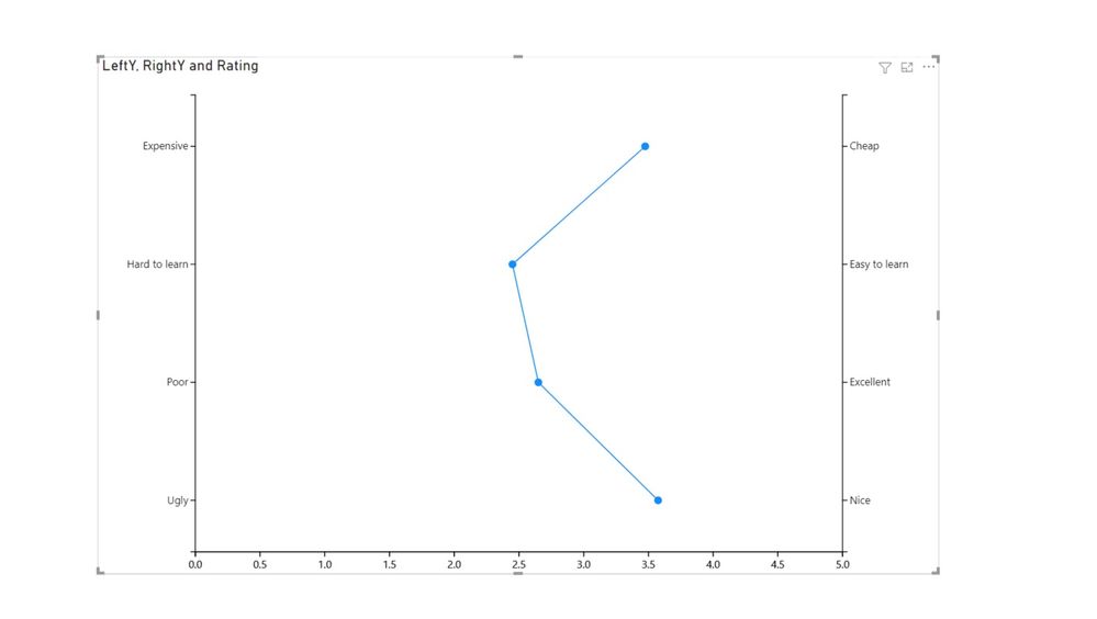
problem solved. I have used Charticulator.
First I prepared data to have description on Left and Right Y-axis in one row + on same row Rating (0-5) created by each customer (ID). Rating value has summarization type "Average"
| ID | Left Y axis | Right Y axis | Rating |
| 1 | Poor | Excellent | 1.3 |
| 1 | Expensive | Cheap | 2.8 |
| 1 | Ugly | Nice | 3.7 |
| 1 | Hard to learn | Easy to learn | 2.5 |
| 2 | Poor | Excellent | 3.6 |
| 2 | Expensive | Cheap | 4.8 |
| 2 | Ugly | Nice | 2.1 |
| 2 | Hard to learn | Easy to learn | 2.5 |
| 3 | Poor | Excellent | 3.5 |
| 3 | Expensive | Cheap | 3.0 |
| 3 | Ugly | Nice | 4.0 |
| 3 | Hard to learn | Easy to learn | 2.0 |
| 4 | Poor | Excellent | 2.2 |
| 4 | Expensive | Cheap | 3.3 |
| 4 | Ugly | Nice | 4.5 |
| 4 | Hard to learn | Easy to learn | 2.8 |
Then in Charticulator I used trick described by another guy at Youtube. I have created 2 PLOT SEGMENTS.
Both of them have on X-axis Rating value, one plot segment has on Y-axis value "Left Y axis" and second plot segment has on Y-axis value "Right Y axis" . Second plot segment Y-axis apperance is set to "Opposite" and the trick is, that those 2 Plot segments are then set to be completely overlapping, because data in both of them are completely same.
Result is as follows, sorry I was not still playing with formatting.....
- Mark as New
- Bookmark
- Subscribe
- Mute
- Subscribe to RSS Feed
- Permalink
- Report Inappropriate Content
Maybe possible using Charticulator?
Did I answer your question? Mark my post as a solution!
In doing so, you are also helping me. Thank you!
Proud to be a Super User!
Paul on Linkedin.
- Mark as New
- Bookmark
- Subscribe
- Mute
- Subscribe to RSS Feed
- Permalink
- Report Inappropriate Content
you made my day sir, I did not catch info about this tool, after 2 hours of playing, I have job done !
- Mark as New
- Bookmark
- Subscribe
- Mute
- Subscribe to RSS Feed
- Permalink
- Report Inappropriate Content
It would be fantastic, and a important contribution to the community, if you could showcase how you achieved the visual (some screenshots maybe?)
Did I answer your question? Mark my post as a solution!
In doing so, you are also helping me. Thank you!
Proud to be a Super User!
Paul on Linkedin.
Helpful resources

Microsoft Fabric Learn Together
Covering the world! 9:00-10:30 AM Sydney, 4:00-5:30 PM CET (Paris/Berlin), 7:00-8:30 PM Mexico City

Power BI Monthly Update - April 2024
Check out the April 2024 Power BI update to learn about new features.

| User | Count |
|---|---|
| 109 | |
| 99 | |
| 77 | |
| 66 | |
| 54 |
| User | Count |
|---|---|
| 144 | |
| 104 | |
| 102 | |
| 87 | |
| 64 |


