- Power BI forums
- Updates
- News & Announcements
- Get Help with Power BI
- Desktop
- Service
- Report Server
- Power Query
- Mobile Apps
- Developer
- DAX Commands and Tips
- Custom Visuals Development Discussion
- Health and Life Sciences
- Power BI Spanish forums
- Translated Spanish Desktop
- Power Platform Integration - Better Together!
- Power Platform Integrations (Read-only)
- Power Platform and Dynamics 365 Integrations (Read-only)
- Training and Consulting
- Instructor Led Training
- Dashboard in a Day for Women, by Women
- Galleries
- Community Connections & How-To Videos
- COVID-19 Data Stories Gallery
- Themes Gallery
- Data Stories Gallery
- R Script Showcase
- Webinars and Video Gallery
- Quick Measures Gallery
- 2021 MSBizAppsSummit Gallery
- 2020 MSBizAppsSummit Gallery
- 2019 MSBizAppsSummit Gallery
- Events
- Ideas
- Custom Visuals Ideas
- Issues
- Issues
- Events
- Upcoming Events
- Community Blog
- Power BI Community Blog
- Custom Visuals Community Blog
- Community Support
- Community Accounts & Registration
- Using the Community
- Community Feedback
Register now to learn Fabric in free live sessions led by the best Microsoft experts. From Apr 16 to May 9, in English and Spanish.
- Power BI forums
- Forums
- Get Help with Power BI
- Desktop
- Return MAX of monthly Headcount by Site
- Subscribe to RSS Feed
- Mark Topic as New
- Mark Topic as Read
- Float this Topic for Current User
- Bookmark
- Subscribe
- Printer Friendly Page
- Mark as New
- Bookmark
- Subscribe
- Mute
- Subscribe to RSS Feed
- Permalink
- Report Inappropriate Content
Return MAX of monthly Headcount by Site
Hi folks. I've got a measure Muster = SUM(Prison_Muster[Muster_Number]) that simply counts the number of prisoners in a prison, and currently I'm displaying these in a line chart by month and by prison site. The muster data happens to be monthly, and I've got a field called MMM-YY from my calander table on a slicer, so users can limit the amount of data shown.
I'd like to write a measure that returns the peak (i.e. MAX) number of prisoners in any one month for each site. I imagine I have to use something like the SUMMARIZE function, but I'm hopelessly lost.
Can anyone assist me with the syntax?
Solved! Go to Solution.
- Mark as New
- Bookmark
- Subscribe
- Mute
- Subscribe to RSS Feed
- Permalink
- Report Inappropriate Content
Here’s what I’m trying to do, by the way.
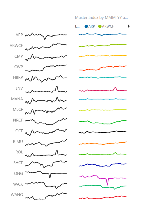
On the left is the Sparkline vis from the Office Store. On the right is my reworked Sparkline, using a Line Graph. The difference between them is scaling: the sparklines on the left get automatically scaled, so that the trends are effectively drawn to an invisible y axis that runs from the min of each series to the max of each series. Which is great if you want to exaggerate trends, but is dangerous if you have precious little absolute change. Whereas my version on the right still has that invisible Y axis set to zero. This lets you see the trend relative to the actual level of whatever it is you are looking at. (In this case, it’s prison muster by site). The left – by virtue of that automatic scaling – is alarmist. The right is realist.
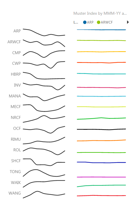
Watch what happens now when I change the timeline to show just 6 months worth of data: The left Sparkline effectively becomes so alarmist that it is useless. The right shows what’s actually happening: not much.
I’m just taking the data, scaling it by the max value for each series in the time period (which gives a percentage), and then adding integers to each series to evenly space them, so I can then display them all on a graph.
Muster = sum(Prison_Muster[Muster_Number])
Max Muster = MAXX(Dates,[Muster])
Muster Index = ([Muster] / CALCULATE([Max Muster],ALL(Dates)))+MIN(SitePosition[Position])
Note that I’m not saying that sparklines should *always* display relative to a zero baseline. *Sometimes* you might want to overemphasise trends. But more often, you don’t. For example, say I’m plotting changes in heartrate for a bunch of patients. If a patient’s heartbeat increases by as little as 1-2 beats per minute over a timeseries, the sparkline should reflect the fact that they have an incredibly stable heartbeat. But if you don’t use 0 as a baseline, then the sparkline is going to look like they’re having a heart attack. And that really defeats the purpose of sparklines: because you can no longer scan large numbers of sparklines as you need to check what the individual min and max points are for *each and every* sparkline in order to form some kind of judgement about the trends being shown.
Same goes for sales data, or any other kind of data you might want to plot.
- Mark as New
- Bookmark
- Subscribe
- Mute
- Subscribe to RSS Feed
- Permalink
- Report Inappropriate Content
Hi @jeffreyweir
From your description, the muster data is a monthly data by month and prison site.
Your current measure returns the count of prisoners in a month. Therefore the number that is displayed for each month by prison site by itself is the maximum in that month for a site.
Let me know if what you are looking at is different. If possible share your current line chart and the output you are expecting for max in a month.
Cheers
CheeenuSing
Proud to be a Datanaut!
- Mark as New
- Bookmark
- Subscribe
- Mute
- Subscribe to RSS Feed
- Permalink
- Report Inappropriate Content
Sorry, in hindsight my question wording is not clear enough.
- The muster data is reported monthly, but is disaggregated. So I need to aggregate it by month.
- I then want to extract the MAX value for each site across all the months that my Slicer is set up to show.
So in other words, if there was just one site - and if my slicer was set to only show data for January 2017 to March 2017, then if that site had 190 prisoners in Jan 2017, 200 prisoners in Feb 2017, and 195 prisoners in March 2017 I need the measure to return 200.
- Mark as New
- Bookmark
- Subscribe
- Mute
- Subscribe to RSS Feed
- Permalink
- Report Inappropriate Content
Okay, I see from talking to my pal Chandoo that I need to use my Dates table as the Table parameter of a MAXX to do this. Being a complete newbie, I was trying to use the Muster table.
So this works just fine:
Max Muster = MAXX(Dates,[Muster])
I'd used things like SUMX before, but never on a Dates table. My head is still hard-wired to Excel and VBA, and DAX is requiring me to think very differently from what I am used to 🙂
- Mark as New
- Bookmark
- Subscribe
- Mute
- Subscribe to RSS Feed
- Permalink
- Report Inappropriate Content
Hi @jeffreyweir
Glad to note you have found a solution. Curious to know what was the visual you used for the output. Was it matrix tabe showing individual months total and the max during the period.
It will greatly help the community if you can share . You mask the names of the site to post an image.
Cheers
CheenuSing
Proud to be a Datanaut!
- Mark as New
- Bookmark
- Subscribe
- Mute
- Subscribe to RSS Feed
- Permalink
- Report Inappropriate Content
I'm going to divide Muster by Max of Muster, to create an index that is scaled from 0 to 1 for each site. Will upload a visual when I've done it to explain further.
- Mark as New
- Bookmark
- Subscribe
- Mute
- Subscribe to RSS Feed
- Permalink
- Report Inappropriate Content
Here’s what I’m trying to do, by the way.
On the left is the Sparkline vis from the Office Store. On the right is my reworked Sparkline, using a Line Graph. The difference between them is scaling: the sparklines on the left get automatically scaled, so that the trends are effectively drawn to an invisible y axis that runs from the min of each series to the max of each series. Which is great if you want to exaggerate trends, but is dangerous if you have precious little absolute change. Whereas my version on the right still has that invisible Y axis set to zero. This lets you see the trend relative to the actual level of whatever it is you are looking at. (In this case, it’s prison muster by site). The left – by virtue of that automatic scaling – is alarmist. The right is realist.
Watch what happens now when I change the timeline to show just 6 months worth of data: The left Sparkline effectively becomes so alarmist that it is useless. The right shows what’s actually happening: not much.
I’m just taking the data, scaling it by the max value for each series in the time period (which gives a percentage), and then adding integers to each series to evenly space them, so I can then display them all on a graph.
Muster = sum(Prison_Muster[Muster_Number])
Max Muster = MAXX(Dates,[Muster])
Muster Index = ([Muster] / CALCULATE([Max Muster],ALL(Dates)))+MIN(SitePosition[Position])
Note that I’m not saying that sparklines should *always* display relative to a zero baseline. *Sometimes* you might want to overemphasise trends. But more often, you don’t. For example, say I’m plotting changes in heartrate for a bunch of patients. If a patient’s heartbeat increases by as little as 1-2 beats per minute over a timeseries, the sparkline should reflect the fact that they have an incredibly stable heartbeat. But if you don’t use 0 as a baseline, then the sparkline is going to look like they’re having a heart attack. And that really defeats the purpose of sparklines: because you can no longer scan large numbers of sparklines as you need to check what the individual min and max points are for *each and every* sparkline in order to form some kind of judgement about the trends being shown.
Same goes for sales data, or any other kind of data you might want to plot.
- Mark as New
- Bookmark
- Subscribe
- Mute
- Subscribe to RSS Feed
- Permalink
- Report Inappropriate Content
Hi @jeffreyweir
Great work. Thanks for sharing.
Cheers
CheenuSing
Proud to be a Datanaut!
Helpful resources

Microsoft Fabric Learn Together
Covering the world! 9:00-10:30 AM Sydney, 4:00-5:30 PM CET (Paris/Berlin), 7:00-8:30 PM Mexico City

Power BI Monthly Update - April 2024
Check out the April 2024 Power BI update to learn about new features.

| User | Count |
|---|---|
| 109 | |
| 98 | |
| 77 | |
| 66 | |
| 54 |
| User | Count |
|---|---|
| 144 | |
| 104 | |
| 100 | |
| 86 | |
| 64 |


