- Power BI forums
- Updates
- News & Announcements
- Get Help with Power BI
- Desktop
- Service
- Report Server
- Power Query
- Mobile Apps
- Developer
- DAX Commands and Tips
- Custom Visuals Development Discussion
- Health and Life Sciences
- Power BI Spanish forums
- Translated Spanish Desktop
- Power Platform Integration - Better Together!
- Power Platform Integrations (Read-only)
- Power Platform and Dynamics 365 Integrations (Read-only)
- Training and Consulting
- Instructor Led Training
- Dashboard in a Day for Women, by Women
- Galleries
- Community Connections & How-To Videos
- COVID-19 Data Stories Gallery
- Themes Gallery
- Data Stories Gallery
- R Script Showcase
- Webinars and Video Gallery
- Quick Measures Gallery
- 2021 MSBizAppsSummit Gallery
- 2020 MSBizAppsSummit Gallery
- 2019 MSBizAppsSummit Gallery
- Events
- Ideas
- Custom Visuals Ideas
- Issues
- Issues
- Events
- Upcoming Events
- Community Blog
- Power BI Community Blog
- Custom Visuals Community Blog
- Community Support
- Community Accounts & Registration
- Using the Community
- Community Feedback
Register now to learn Fabric in free live sessions led by the best Microsoft experts. From Apr 16 to May 9, in English and Spanish.
- Power BI forums
- Forums
- Get Help with Power BI
- Desktop
- Re: Results against Date Graph (Scatter or Line)
- Subscribe to RSS Feed
- Mark Topic as New
- Mark Topic as Read
- Float this Topic for Current User
- Bookmark
- Subscribe
- Printer Friendly Page
- Mark as New
- Bookmark
- Subscribe
- Mute
- Subscribe to RSS Feed
- Permalink
- Report Inappropriate Content
Results against Date Graph (Scatter or Line)
Hi,
I recently started working on a Power BI project assigned to me. Basically what I have to do is to plot results on the y-axis and date-time on the x-axis. However, I have been having trouble doing so. When I plot a line graph, the 'Don't Summarize' option did not appear and when I plot the scatter chart, Power BI tells me that my x and y-axis values aren't playing together nicely. The data I am using is one I have pulled from ODBC and it looks something like this:
| Product | Type | Minimum | Maximum | Result | Date |
| A | 1 | <=5 | 3 | 1/11/2019 3:19:20 PM | |
| A | 2 | >=8 | 10 | 1/11/2019 3:19:20 PM | |
| A | 3 | 5 | 9 | 7 | 1/11/2019 3:19:20 PM |
| A | 4 | 4 | 10 | 7 | 2/11/2019 4:20:07 AM |
| B | 1 | <=5 | 2 | 2/11/2019 4:20:07 AM | |
| B | 2 | >=8 | 9 | 2/11/2019 4:20:07 AM |
I have thousands of rows similar to this. May I ask how should I go about plotting the raw data Results against Date-time? Any help would be fully appreciated. Thank you.
Solved! Go to Solution.
- Mark as New
- Bookmark
- Subscribe
- Mute
- Subscribe to RSS Feed
- Permalink
- Report Inappropriate Content
Hi @7ea8ea,
The line chart is not meant to handle multiple datapoints on the Y-axis while on the same X-axis value.
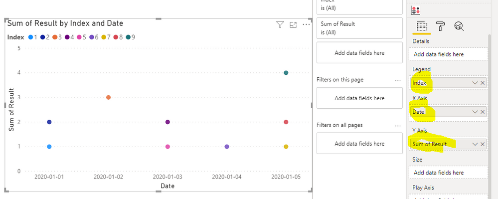
You can achieve this with a scatter chart but it requires you to use an idex column as a legend, meaning that every dot will have a different color by default:
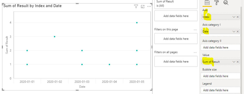
Instead I would advice you to use the custom visual, "Dot Plot, by MAQ software". Here you wont have the same issue with colors:
Br,
J
Connect on LinkedIn
- Mark as New
- Bookmark
- Subscribe
- Mute
- Subscribe to RSS Feed
- Permalink
- Report Inappropriate Content
Hi J,
Is it possible to plot target lines in Dot Plot? I also want to plot the maximum and minimum lines for each type. Thank you
- Mark as New
- Bookmark
- Subscribe
- Mute
- Subscribe to RSS Feed
- Permalink
- Report Inappropriate Content
Hi J,
Thank you for the clarification. However, I see that the y-axis in your example is still in 'sum'. For my data, 'sum' would be undesirable as I do need the raw data to be plotted. However, when I do change 'sum' to 'Don't summarize', Power BI says that my x and y-axis don't play well together. Any idea how do I fix that? Thank you very much.
Best Regards,
T
- Mark as New
- Bookmark
- Subscribe
- Mute
- Subscribe to RSS Feed
- Permalink
- Report Inappropriate Content
The Y-axis / Value in the visuals will require an aggregation. To get around this you need to use an index or other unique identifier to seperate the datapoints. There will still be an aggregation, but the aggregation will only contain a single row of data meaning that you should always get the individual datapoint even if you're performing an aggregation.
As to the target lines im not quite sure. I'm not too familiar with the visual from MAQ Software so i'm not sure if they offer the functionality. I can take a closer look later this week but I'm not too hopefull sadly!
Br,
J
Connect on LinkedIn
- Mark as New
- Bookmark
- Subscribe
- Mute
- Subscribe to RSS Feed
- Permalink
- Report Inappropriate Content
Hi J,
Thanks for the help.
Best Regards,
T
Helpful resources

Microsoft Fabric Learn Together
Covering the world! 9:00-10:30 AM Sydney, 4:00-5:30 PM CET (Paris/Berlin), 7:00-8:30 PM Mexico City

Power BI Monthly Update - April 2024
Check out the April 2024 Power BI update to learn about new features.

| User | Count |
|---|---|
| 118 | |
| 107 | |
| 70 | |
| 70 | |
| 43 |
| User | Count |
|---|---|
| 148 | |
| 105 | |
| 104 | |
| 89 | |
| 65 |


