- Power BI forums
- Updates
- News & Announcements
- Get Help with Power BI
- Desktop
- Service
- Report Server
- Power Query
- Mobile Apps
- Developer
- DAX Commands and Tips
- Custom Visuals Development Discussion
- Health and Life Sciences
- Power BI Spanish forums
- Translated Spanish Desktop
- Power Platform Integration - Better Together!
- Power Platform Integrations (Read-only)
- Power Platform and Dynamics 365 Integrations (Read-only)
- Training and Consulting
- Instructor Led Training
- Dashboard in a Day for Women, by Women
- Galleries
- Community Connections & How-To Videos
- COVID-19 Data Stories Gallery
- Themes Gallery
- Data Stories Gallery
- R Script Showcase
- Webinars and Video Gallery
- Quick Measures Gallery
- 2021 MSBizAppsSummit Gallery
- 2020 MSBizAppsSummit Gallery
- 2019 MSBizAppsSummit Gallery
- Events
- Ideas
- Custom Visuals Ideas
- Issues
- Issues
- Events
- Upcoming Events
- Community Blog
- Power BI Community Blog
- Custom Visuals Community Blog
- Community Support
- Community Accounts & Registration
- Using the Community
- Community Feedback
Register now to learn Fabric in free live sessions led by the best Microsoft experts. From Apr 16 to May 9, in English and Spanish.
- Power BI forums
- Forums
- Get Help with Power BI
- Desktop
- Request Help Optimizing Donut Chart
- Subscribe to RSS Feed
- Mark Topic as New
- Mark Topic as Read
- Float this Topic for Current User
- Bookmark
- Subscribe
- Printer Friendly Page
- Mark as New
- Bookmark
- Subscribe
- Mute
- Subscribe to RSS Feed
- Permalink
- Report Inappropriate Content
Request Help Optimizing Donut Chart
Hello Power BI guru's,
Thanks for your continued sharing of expertise and helping out us little guys to become the proficient business intelligence experts we so desire to be!
PROBLEM: I have a bunch of labor data composed of different "activities" or tasks. I want to display a donut chart that reflects the percentage of that activity's labor to total labor for all activities. On this same report page, I have a labor hours over time bar chart, to see trends in total labor for each activity, SO, I have an activity slicer, so that you can select whichever activity and view the trends.
WANT: I want the donut chart to change, in addition to the trend bar chart, whenever I change the activity slicer, so that the donut chart shows ONLY the selected activity vs all other labor hours. Here is a picture of what I want vs what I have.
The only way I was able to create the one on the left, was to select the "Data Entry" activity, right click and say "Create Group." Then, it's Data Entry vs all Other. However, I would have to create a seperate column for EVERY activity so each one would be in it's own group, but then the slicer wouldn't work because it's just for activitiy general.
Can anyone help me out? I'm sure it's something simple. Please don't tell me to just not use a donut chart. lol.
Thanks again!
Solved! Go to Solution.
- Mark as New
- Bookmark
- Subscribe
- Mute
- Subscribe to RSS Feed
- Permalink
- Report Inappropriate Content
I hope this will do it
https://drive.google.com/file/d/1Yt2BYEM8mrM5IqVrC7PAFIN4TI64-Wk5/view?usp=sharing
Subscribe to the @PowerBIHowTo YT channel for an upcoming video on List and Record functions in Power Query!!
Learn Power BI and Fabric - subscribe to our YT channel - Click here: @PowerBIHowTo
If my solution proved useful, I'd be delighted to receive Kudos. When you put effort into asking a question, it's equally thoughtful to acknowledge and give Kudos to the individual who helped you solve the problem. It's a small gesture that shows appreciation and encouragement! ❤
Did I answer your question? Mark my post as a solution. Proud to be a Super User! Appreciate your Kudos 🙂
Feel free to email me with any of your BI needs.
- Mark as New
- Bookmark
- Subscribe
- Mute
- Subscribe to RSS Feed
- Permalink
- Report Inappropriate Content
Ok. I could suggest a solution close to what you want.
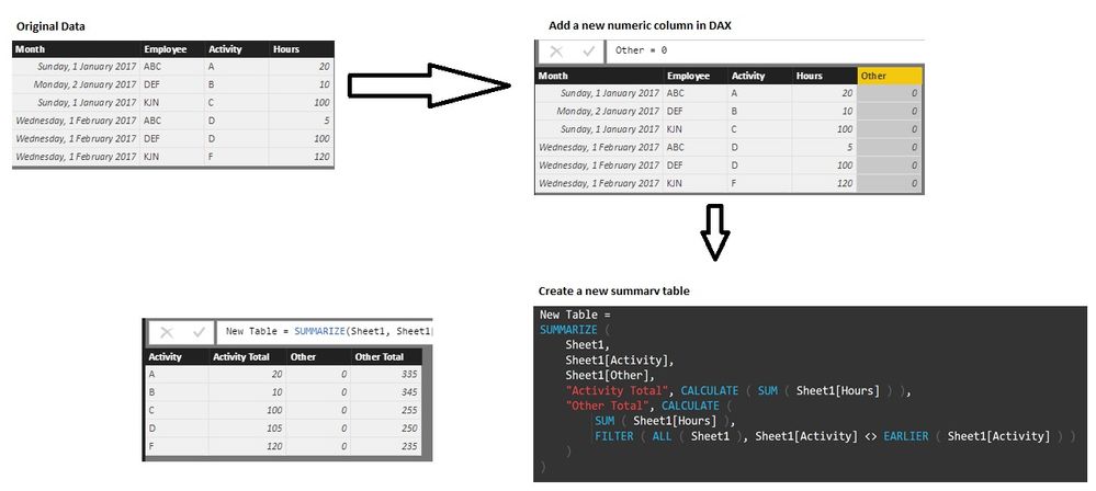
From your data set I added a new numeric column. Then I created a new summary table as below.
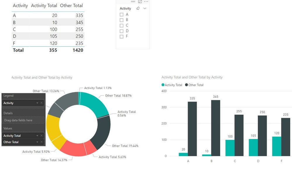
The visualisation from the new summary table is below.
As you can see the bar chart shows details in a meaningful way. The donut chart is not that useful when no filters is selected.
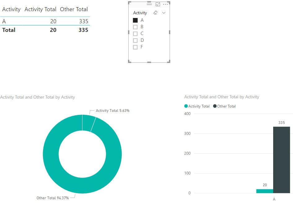
When you select an activity from the slicer, the donut chart is 'some what' useful but I cannot think of a way to display the selected activity from the slicer in donut chart label.
You can display a text filed with the selected activity an display at the top of the donut chart. Google for "power bi dynamic text on selection" and there is plenty of help ont his from experts.
May be this gives you some idea though it does not totally fulfill your requirements.
Hope it helps.
- Mark as New
- Bookmark
- Subscribe
- Mute
- Subscribe to RSS Feed
- Permalink
- Report Inappropriate Content
anandav,
That definitely gives me some food for thought! Thanks for working so hard and taking the time to provide such a detailed walkthrough with screenshots, that really helped me conceptualize what you were doing.
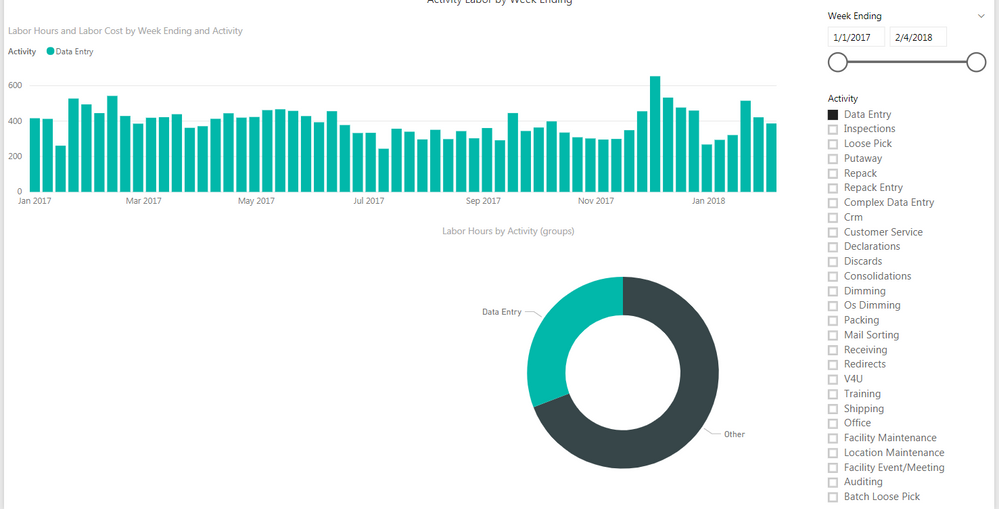
I want to post another example of what I'm trying to achieve in case I didn't explain it sufficiently before. So, my report is like this:
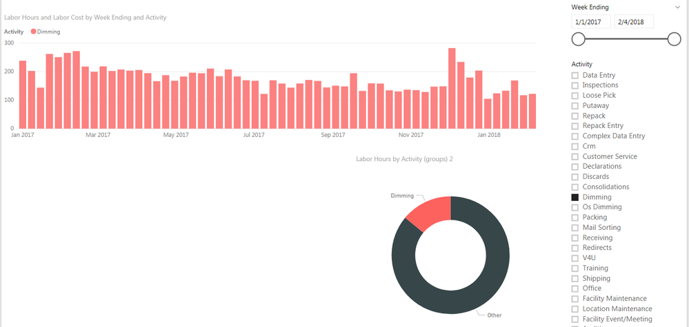
The bar chart shows the sum of labor hours, filtered by activity through the slicer, by week ending periods. The pie chart shows the sum of labor hours for the selected activity, versus, the sum of labor hours for all other activities. (A bonus would be if you clicked on a bar in the chart, it would filter the totals in the donut chart for just that week ending period)
Then when a user selects another activity from the slicer, the donut will show, again, the selected activity vs. all other. Like so:
It's almost like a "dynamic grouping" or something, I dunno.
What do y'all think?
- Mark as New
- Bookmark
- Subscribe
- Mute
- Subscribe to RSS Feed
- Permalink
- Report Inappropriate Content
Not sure whether I am missing somthing but what you explained is what I have suggested - only the donut chart and slicer (igoniring other visuals for simplicity).
Selected acitivity hours vs. all other activity displayed as a % in the donut chart.
- Mark as New
- Bookmark
- Subscribe
- Mute
- Subscribe to RSS Feed
- Permalink
- Report Inappropriate Content
Subscribe to the @PowerBIHowTo YT channel for an upcoming video on List and Record functions in Power Query!!
Learn Power BI and Fabric - subscribe to our YT channel - Click here: @PowerBIHowTo
If my solution proved useful, I'd be delighted to receive Kudos. When you put effort into asking a question, it's equally thoughtful to acknowledge and give Kudos to the individual who helped you solve the problem. It's a small gesture that shows appreciation and encouragement! ❤
Did I answer your question? Mark my post as a solution. Proud to be a Super User! Appreciate your Kudos 🙂
Feel free to email me with any of your BI needs.
- Mark as New
- Bookmark
- Subscribe
- Mute
- Subscribe to RSS Feed
- Permalink
- Report Inappropriate Content
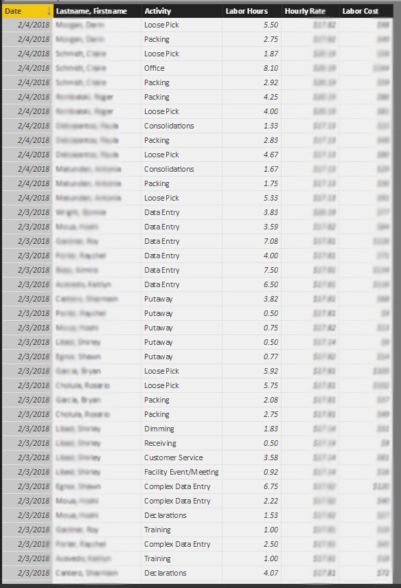
Great! Here's some screenshots and an example doc.

- Mark as New
- Bookmark
- Subscribe
- Mute
- Subscribe to RSS Feed
- Permalink
- Report Inappropriate Content
Did you tried the measures I posted here, I assume that will do it.
Subscribe to the @PowerBIHowTo YT channel for an upcoming video on List and Record functions in Power Query!!
Learn Power BI and Fabric - subscribe to our YT channel - Click here: @PowerBIHowTo
If my solution proved useful, I'd be delighted to receive Kudos. When you put effort into asking a question, it's equally thoughtful to acknowledge and give Kudos to the individual who helped you solve the problem. It's a small gesture that shows appreciation and encouragement! ❤
Did I answer your question? Mark my post as a solution. Proud to be a Super User! Appreciate your Kudos 🙂
Feel free to email me with any of your BI needs.
- Mark as New
- Bookmark
- Subscribe
- Mute
- Subscribe to RSS Feed
- Permalink
- Report Inappropriate Content
I tried what you said, but it doesn't work and I'm thinking I misunderstood what you said because what I'm doing doesn't seem logical.
Activity table:
Table Name: Activity
Column 1: Activity Number
Column 2: Activity
Labor table:
Table Name: Labor-ALL Activities
Column 1: Date
Column 2: Lastname, Firstname
Column 3: Activity
Column 4: Labor Hours
Column 5: Labor Cost
The measures I wrote:
Selected Activity = SUM(Activity[Activity]) (Which doesn't make sense to me, because you can't sum text)
Other Activities = CALCULATE(SUM(Activity[Activity]), ALL(Activity)) - [Selected Activity]
I probably did that all wrong, huh?
- Mark as New
- Bookmark
- Subscribe
- Mute
- Subscribe to RSS Feed
- Permalink
- Report Inappropriate Content
no you are right, what you trying to show in donut chart?
Total Activities or Total Hours?
Didn't read your thread in detail but I just posted the solution but what you are trying to do is not something which cannot be done.
Subscribe to the @PowerBIHowTo YT channel for an upcoming video on List and Record functions in Power Query!!
Learn Power BI and Fabric - subscribe to our YT channel - Click here: @PowerBIHowTo
If my solution proved useful, I'd be delighted to receive Kudos. When you put effort into asking a question, it's equally thoughtful to acknowledge and give Kudos to the individual who helped you solve the problem. It's a small gesture that shows appreciation and encouragement! ❤
Did I answer your question? Mark my post as a solution. Proud to be a Super User! Appreciate your Kudos 🙂
Feel free to email me with any of your BI needs.
- Mark as New
- Bookmark
- Subscribe
- Mute
- Subscribe to RSS Feed
- Permalink
- Report Inappropriate Content
Total hours.
So,
Total Hours = SUM(Labor-ALL Activities[Labor Hours])
Then, when the slicer filters per activity, it would become:
Total Hours of "Selected Activity" = CALCULATE([Total Hours], Activity[Activity] = "Selected Activity")
...where "Selected Activity" is Data Entry, or Dimming, or whatever.
I want my donut chart to show:
Total Hours of Selected Activity vs. Total Hours
For instance, if the total hours equals 73,660, and Data Entry is 22,740, the donut chart would show Data Entry as 31% of Total Labor.
Does this make sense, or are you saying that this cannot be done?
- Mark as New
- Bookmark
- Subscribe
- Mute
- Subscribe to RSS Feed
- Permalink
- Report Inappropriate Content
Add two measures, one for selected value and another for others
Selected Activities = SUM(Table[Activities]

Other Activities = CALCULATE(SUM(Table[Activities]), ALL(Table)) - [Selected Activities]
Drop donut chart and these two measures in the values.
Subscribe to the @PowerBIHowTo YT channel for an upcoming video on List and Record functions in Power Query!!
Learn Power BI and Fabric - subscribe to our YT channel - Click here: @PowerBIHowTo
If my solution proved useful, I'd be delighted to receive Kudos. When you put effort into asking a question, it's equally thoughtful to acknowledge and give Kudos to the individual who helped you solve the problem. It's a small gesture that shows appreciation and encouragement! ❤
Did I answer your question? Mark my post as a solution. Proud to be a Super User! Appreciate your Kudos 🙂
Feel free to email me with any of your BI needs.
- Mark as New
- Bookmark
- Subscribe
- Mute
- Subscribe to RSS Feed
- Permalink
- Report Inappropriate Content
Your mesaures are a very simple way to do what I have suggested (replacing teh activity with hours). Very efficient solution (for me).
- Mark as New
- Bookmark
- Subscribe
- Mute
- Subscribe to RSS Feed
- Permalink
- Report Inappropriate Content
It's almost like I need to dynamically define what the "Other Total" should be...?
- Mark as New
- Bookmark
- Subscribe
- Mute
- Subscribe to RSS Feed
- Permalink
- Report Inappropriate Content
@CoreyP as mentioned earlier, can you share your data in excel using google drive or onedrive what ever works for you
Subscribe to the @PowerBIHowTo YT channel for an upcoming video on List and Record functions in Power Query!!
Learn Power BI and Fabric - subscribe to our YT channel - Click here: @PowerBIHowTo
If my solution proved useful, I'd be delighted to receive Kudos. When you put effort into asking a question, it's equally thoughtful to acknowledge and give Kudos to the individual who helped you solve the problem. It's a small gesture that shows appreciation and encouragement! ❤
Did I answer your question? Mark my post as a solution. Proud to be a Super User! Appreciate your Kudos 🙂
Feel free to email me with any of your BI needs.
- Mark as New
- Bookmark
- Subscribe
- Mute
- Subscribe to RSS Feed
- Permalink
- Report Inappropriate Content
Click Here for *.xlsx of my tables
Note: I removed the employee name field, as well as the hourly rate and labor cost fields because that information in confidential, and not needed in this example, i don't htink.
- Mark as New
- Bookmark
- Subscribe
- Mute
- Subscribe to RSS Feed
- Permalink
- Report Inappropriate Content
Sounds good. stay tuned.
Subscribe to the @PowerBIHowTo YT channel for an upcoming video on List and Record functions in Power Query!!
Learn Power BI and Fabric - subscribe to our YT channel - Click here: @PowerBIHowTo
If my solution proved useful, I'd be delighted to receive Kudos. When you put effort into asking a question, it's equally thoughtful to acknowledge and give Kudos to the individual who helped you solve the problem. It's a small gesture that shows appreciation and encouragement! ❤
Did I answer your question? Mark my post as a solution. Proud to be a Super User! Appreciate your Kudos 🙂
Feel free to email me with any of your BI needs.
- Mark as New
- Bookmark
- Subscribe
- Mute
- Subscribe to RSS Feed
- Permalink
- Report Inappropriate Content
Thank you again so much for all your help.
- Mark as New
- Bookmark
- Subscribe
- Mute
- Subscribe to RSS Feed
- Permalink
- Report Inappropriate Content
I hope this will do it
https://drive.google.com/file/d/1Yt2BYEM8mrM5IqVrC7PAFIN4TI64-Wk5/view?usp=sharing
Subscribe to the @PowerBIHowTo YT channel for an upcoming video on List and Record functions in Power Query!!
Learn Power BI and Fabric - subscribe to our YT channel - Click here: @PowerBIHowTo
If my solution proved useful, I'd be delighted to receive Kudos. When you put effort into asking a question, it's equally thoughtful to acknowledge and give Kudos to the individual who helped you solve the problem. It's a small gesture that shows appreciation and encouragement! ❤
Did I answer your question? Mark my post as a solution. Proud to be a Super User! Appreciate your Kudos 🙂
Feel free to email me with any of your BI needs.
- Mark as New
- Bookmark
- Subscribe
- Mute
- Subscribe to RSS Feed
- Permalink
- Report Inappropriate Content
It works SO well. And such a simple, elegant solution. I knew it would be something easy like that.
- Mark as New
- Bookmark
- Subscribe
- Mute
- Subscribe to RSS Feed
- Permalink
- Report Inappropriate Content
Good to hear that it met your requirement. Have fun!!!
Subscribe to the @PowerBIHowTo YT channel for an upcoming video on List and Record functions in Power Query!!
Learn Power BI and Fabric - subscribe to our YT channel - Click here: @PowerBIHowTo
If my solution proved useful, I'd be delighted to receive Kudos. When you put effort into asking a question, it's equally thoughtful to acknowledge and give Kudos to the individual who helped you solve the problem. It's a small gesture that shows appreciation and encouragement! ❤
Did I answer your question? Mark my post as a solution. Proud to be a Super User! Appreciate your Kudos 🙂
Feel free to email me with any of your BI needs.
- Mark as New
- Bookmark
- Subscribe
- Mute
- Subscribe to RSS Feed
- Permalink
- Report Inappropriate Content
Clearly, I'm a novice with Power BI... I discovered PBI about 2 months ago and have been cramming and learning as much as possible.
Fun? YOU BET! This is the coolest thing I've ever done. It incorporates some of my favorite things/top skills such as math & forumlas, and coding, with graphic design/ability to be creative, and story telling into one amazingly powerful business intelligence program.
I've actually decided this will be my niche, and I plan on making a career as a Business Intelligence Analyst. 🙂
...You haven't seen the last of me yet.
Helpful resources

Microsoft Fabric Learn Together
Covering the world! 9:00-10:30 AM Sydney, 4:00-5:30 PM CET (Paris/Berlin), 7:00-8:30 PM Mexico City

Power BI Monthly Update - April 2024
Check out the April 2024 Power BI update to learn about new features.

| User | Count |
|---|---|
| 110 | |
| 100 | |
| 80 | |
| 64 | |
| 58 |
| User | Count |
|---|---|
| 148 | |
| 111 | |
| 94 | |
| 84 | |
| 67 |
