- Power BI forums
- Updates
- News & Announcements
- Get Help with Power BI
- Desktop
- Service
- Report Server
- Power Query
- Mobile Apps
- Developer
- DAX Commands and Tips
- Custom Visuals Development Discussion
- Health and Life Sciences
- Power BI Spanish forums
- Translated Spanish Desktop
- Power Platform Integration - Better Together!
- Power Platform Integrations (Read-only)
- Power Platform and Dynamics 365 Integrations (Read-only)
- Training and Consulting
- Instructor Led Training
- Dashboard in a Day for Women, by Women
- Galleries
- Community Connections & How-To Videos
- COVID-19 Data Stories Gallery
- Themes Gallery
- Data Stories Gallery
- R Script Showcase
- Webinars and Video Gallery
- Quick Measures Gallery
- 2021 MSBizAppsSummit Gallery
- 2020 MSBizAppsSummit Gallery
- 2019 MSBizAppsSummit Gallery
- Events
- Ideas
- Custom Visuals Ideas
- Issues
- Issues
- Events
- Upcoming Events
- Community Blog
- Power BI Community Blog
- Custom Visuals Community Blog
- Community Support
- Community Accounts & Registration
- Using the Community
- Community Feedback
Register now to learn Fabric in free live sessions led by the best Microsoft experts. From Apr 16 to May 9, in English and Spanish.
- Power BI forums
- Forums
- Get Help with Power BI
- Desktop
- Reporting Performance to Target
- Subscribe to RSS Feed
- Mark Topic as New
- Mark Topic as Read
- Float this Topic for Current User
- Bookmark
- Subscribe
- Printer Friendly Page
- Mark as New
- Bookmark
- Subscribe
- Mute
- Subscribe to RSS Feed
- Permalink
- Report Inappropriate Content
Reporting Performance to Target
Dear Community,
Hope my message finds you well and healthy!
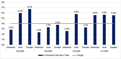
I am reporting performance to target on a monthly basis like shown below:
As you can see my target must be below 4%, everything above that is considered as defect.
To give you some more context I am reporting past due balances. To have the % overdue From Row Total i created 2 measures
1. Total overdue = sum of all the past due balances
2. Total open balance = sum of all the open balances
3. I divided Total overdue by Total open balance and done - these are the clustered columns.
To get the Target (the constant line) i created the following measure: Total overdue*(4/100) and put it into a pivot table (note I am using power pivot)
However, the business people in my organization are telling me the target must be dynamic.
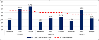
For example in 08-2020 it should be 5.5%, in 09-2020 it must be 5.0%, in 10-2020 must be 4.5%, in 11-2020 and 12-2020 must be 4.0%. It has to depict a slope.
Can you please help me understand how I can get that done?
Any help will be appreciated.
All due respect,
Atanas
Solved! Go to Solution.
- Mark as New
- Bookmark
- Subscribe
- Mute
- Subscribe to RSS Feed
- Permalink
- Report Inappropriate Content
I managed to do it. Please see below:
1. I created calculated column only for my past due balances.
2. After that another one I named "Fraction of the Overdue" with few nested ifs. If month =9 then overdue column * 0.055, if month = 10 then overdue column * 0.05 etc.
3. I created 3rd column dividing the Fraction of the Overdue to the Overdue column.
4. Put it in the pivot table, but summerizing the value to Average
5. Done.
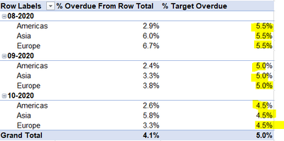
This is how my pivot looks now. Exactly as I wanted it.
@negi007 I would really want to thank you for your guidance and support.
Wish you nothing but the best.
Take care and stay safe.
All due respect,
Atanas
- Mark as New
- Bookmark
- Subscribe
- Mute
- Subscribe to RSS Feed
- Permalink
- Report Inappropriate Content
@Anonymous It is my pleasure if I have been able to guide you towards the solution. Cheers!!!
You can always follow me here
https://www.linkedin.com/in/pramod-negi-1858aa15/
Did I answer your question? Mark my post as a solution!
Appreciate your Kudos
Proud to be a Super User!
Follow me on linkedin
- Mark as New
- Bookmark
- Subscribe
- Mute
- Subscribe to RSS Feed
- Permalink
- Report Inappropriate Content
@Anonymous You can get option to "Analyze in excel" in power bi services as well. Once you have published the databoard on the powerbi services, you get the option to "Analyze in excel", it remains connected to your dataset.
Refer to this link for help
Analyze in Excel for Power BI - Power BI | Microsoft Docs
Did I answer your question? Mark my post as a solution!
Appreciate your Kudos
Proud to be a Super User!
Follow me on linkedin
- Mark as New
- Bookmark
- Subscribe
- Mute
- Subscribe to RSS Feed
- Permalink
- Report Inappropriate Content
I managed to do it. Please see below:
1. I created calculated column only for my past due balances.
2. After that another one I named "Fraction of the Overdue" with few nested ifs. If month =9 then overdue column * 0.055, if month = 10 then overdue column * 0.05 etc.
3. I created 3rd column dividing the Fraction of the Overdue to the Overdue column.
4. Put it in the pivot table, but summerizing the value to Average
5. Done.
This is how my pivot looks now. Exactly as I wanted it.
@negi007 I would really want to thank you for your guidance and support.
Wish you nothing but the best.
Take care and stay safe.
All due respect,
Atanas
- Mark as New
- Bookmark
- Subscribe
- Mute
- Subscribe to RSS Feed
- Permalink
- Report Inappropriate Content
@Anonymous Yes it is a feature of PowerBi. it allows you to connect to your dataset from excel using powerpivot feature. You can create your chart or visual using the powerbi dataset from excel.
Introducing Analyze in Excel for Power BI Desktop - SQLBI
Analyze in Excel for Power BI - Power BI | Microsoft Docs
Did I answer your question? Mark my post as a solution!
Appreciate your Kudos
Proud to be a Super User!
Follow me on linkedin
- Mark as New
- Bookmark
- Subscribe
- Mute
- Subscribe to RSS Feed
- Permalink
- Report Inappropriate Content
@negi007 ,
Thank you, but when power BI is closed the connection with excel disappears as well.
I am really struggling with that one... It doesn't appear to have some easy solution for it...
The idea is to keep everything in Power Pivot, so the business can interact with the dashboard.
- Mark as New
- Bookmark
- Subscribe
- Mute
- Subscribe to RSS Feed
- Permalink
- Report Inappropriate Content
@Anonymous Once you create the target table as mentioned above, you should be able to create above chart using power pivot. You can always analyze your model in excel using "Analyze in Excel" feature then create the chart you wish to have. Please try this option, you should be able to achieve it.
Did I answer your question? Mark my post as a solution!
Appreciate your Kudos
Proud to be a Super User!
Follow me on linkedin
- Mark as New
- Bookmark
- Subscribe
- Mute
- Subscribe to RSS Feed
- Permalink
- Report Inappropriate Content
Thank you one more time. Will try and let you know asap. "Analyze in Excel" - is this a feature of PBI?
One more time i apologize if i sound incoherent, but i am working with PBI and power pivot since April 2020. Still pretty new to me...
Atanas
- Mark as New
- Bookmark
- Subscribe
- Mute
- Subscribe to RSS Feed
- Permalink
- Report Inappropriate Content
@Anonymous
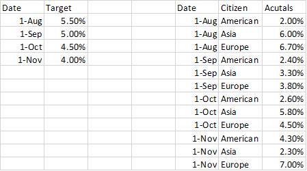
In this case you will need to create one more table for target values. let say below are two tables you have one is actual value and one is target value table. In target table mentioned value against first day of the month.
2. You create one date table, in case you do not have it like below
3. link your target and actual value table using date field
4. You can create below visual once your data is ready
Did I answer your question? Mark my post as a solution!
Appreciate your Kudos
Proud to be a Super User!
Follow me on linkedin
- Mark as New
- Bookmark
- Subscribe
- Mute
- Subscribe to RSS Feed
- Permalink
- Report Inappropriate Content
Is it possible if every citizen's column is gived a target per month?
- Mark as New
- Bookmark
- Subscribe
- Mute
- Subscribe to RSS Feed
- Permalink
- Report Inappropriate Content
Thank you very much for the answer and the suggestion!
I don't know if you noticed, but as of now I am using Power Pivot and not Power BI.
At this point I cannot create the same chart as you did in PBI.
This is how my pivot looks as of now in order to create the chart from my original post:
I was wondring if not possible to change the target with DAX functionallity so the Pivot shows the target as below (please note i added the new numbers manually)
Do you have any suggestion about that?
Thank you one more time,
Atanas
Helpful resources

Microsoft Fabric Learn Together
Covering the world! 9:00-10:30 AM Sydney, 4:00-5:30 PM CET (Paris/Berlin), 7:00-8:30 PM Mexico City

Power BI Monthly Update - April 2024
Check out the April 2024 Power BI update to learn about new features.

| User | Count |
|---|---|
| 109 | |
| 98 | |
| 77 | |
| 66 | |
| 54 |
| User | Count |
|---|---|
| 144 | |
| 104 | |
| 100 | |
| 86 | |
| 64 |


