- Power BI forums
- Updates
- News & Announcements
- Get Help with Power BI
- Desktop
- Service
- Report Server
- Power Query
- Mobile Apps
- Developer
- DAX Commands and Tips
- Custom Visuals Development Discussion
- Health and Life Sciences
- Power BI Spanish forums
- Translated Spanish Desktop
- Power Platform Integration - Better Together!
- Power Platform Integrations (Read-only)
- Power Platform and Dynamics 365 Integrations (Read-only)
- Training and Consulting
- Instructor Led Training
- Dashboard in a Day for Women, by Women
- Galleries
- Community Connections & How-To Videos
- COVID-19 Data Stories Gallery
- Themes Gallery
- Data Stories Gallery
- R Script Showcase
- Webinars and Video Gallery
- Quick Measures Gallery
- 2021 MSBizAppsSummit Gallery
- 2020 MSBizAppsSummit Gallery
- 2019 MSBizAppsSummit Gallery
- Events
- Ideas
- Custom Visuals Ideas
- Issues
- Issues
- Events
- Upcoming Events
- Community Blog
- Power BI Community Blog
- Custom Visuals Community Blog
- Community Support
- Community Accounts & Registration
- Using the Community
- Community Feedback
Register now to learn Fabric in free live sessions led by the best Microsoft experts. From Apr 16 to May 9, in English and Spanish.
- Power BI forums
- Forums
- Get Help with Power BI
- Desktop
- Report for Planned percentage vs Goal percentage
- Subscribe to RSS Feed
- Mark Topic as New
- Mark Topic as Read
- Float this Topic for Current User
- Bookmark
- Subscribe
- Printer Friendly Page
- Mark as New
- Bookmark
- Subscribe
- Mute
- Subscribe to RSS Feed
- Permalink
- Report Inappropriate Content
Report for Planned percentage vs Goal percentage
Hi,
I do have a table with Project name and multiple columns related to testing attributes in percentage. I want to plot graph agains the testing attribute as achieved in percentage against the Goal percentage (which is not in the table but just the goal to follow for all projects). How can i draw report in chart where i can show the percentage achieved vs the goal percentage against each project?
Also these columns has some unwanted values like null, not applciable, tbc etc.
Solved! Go to Solution.
- Mark as New
- Bookmark
- Subscribe
- Mute
- Subscribe to RSS Feed
- Permalink
- Report Inappropriate Content
Hi @vikasmca05,
PFB the link for the pbix file
https://1drv.ms/u/s!Ahd9tZ6Q55jya-aEQworKoKQXCU
If you are good with the solution, don't forgot accept as solution and give kudos for the same
- Mark as New
- Bookmark
- Subscribe
- Mute
- Subscribe to RSS Feed
- Permalink
- Report Inappropriate Content
Hi @vikasmca05,
If you say that your goal will be different for each of the projects, then you should definitely need a column with goal value for each project.
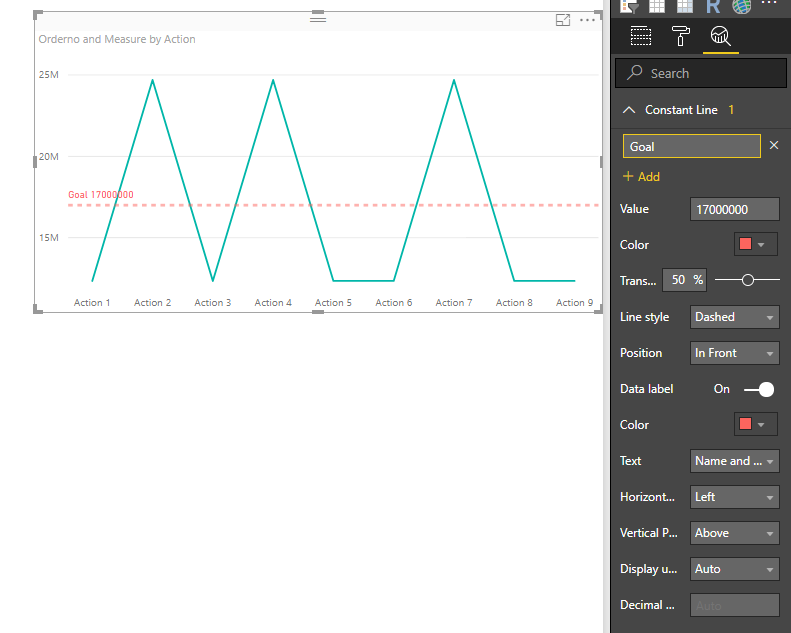
Otherwise, If you say that the Goal will be the same for all the projects, (i.e. It will be a constant value for all projects), then you can add a new constant line that will act as your goal percentage value in your graph
Something like the one below

- Mark as New
- Bookmark
- Subscribe
- Mute
- Subscribe to RSS Feed
- Permalink
- Report Inappropriate Content
Hi,
Thanks for reply.
I do have constant goal for all project.
But i do have multiple project rows and each row has 3 different column for property of QA. Each QA property has fixed constant goal percentage.
Now I want to show the graph per partner against all three attributes. How can i create that report?
Also can you please let me know how you created above visual? (sorry if it very basic question, but it throws me an error that Analytics is not enabled for my visual type)
- Mark as New
- Bookmark
- Subscribe
- Mute
- Subscribe to RSS Feed
- Permalink
- Report Inappropriate Content
Hi @vikasmca05,
Can you share your table design with some sample data, so that it will be easy to help you out.?
For that Visual, I used simple line chart and used the 3rd option (Analytics). Nothing special with that
- Mark as New
- Bookmark
- Subscribe
- Mute
- Subscribe to RSS Feed
- Permalink
- Report Inappropriate Content
Project Code Review Peer Review Defects
ID 1 100% 40% 30%
ID 2 80% 35% 10%
ID 3 85% 15% 20%
ID 4 TBC
ID 5 N/A
ID 6 null
Code Review Goal - 100%
Peer Review Goal - 45%
Defects Goal - 25%
Now I want to create table per project to show the attributes and deviation.
Also some Project ID will have null data/TBC data/Not Applicable data which I want to filter out.
Thanks for help.
- Mark as New
- Bookmark
- Subscribe
- Mute
- Subscribe to RSS Feed
- Permalink
- Report Inappropriate Content
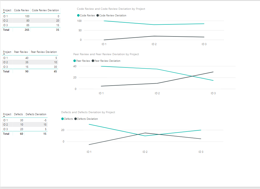
Is this what you mean?
- Mark as New
- Bookmark
- Subscribe
- Mute
- Subscribe to RSS Feed
- Permalink
- Report Inappropriate Content
First of all many thanks for reply.
I would like to keep individual graph per project. And show the goal only.
i.e. 1 table to show only this data -
Project Code Review Peer Review Defects
ID 1 100% 40% 30%
And goal can be single line.
Also please send me the steps to create the report. (including how to remove Null / unwanted values from the rows)
Thanks,
/vikas
- Mark as New
- Bookmark
- Subscribe
- Mute
- Subscribe to RSS Feed
- Permalink
- Report Inappropriate Content
Hi,
I am not very clear with what you need.
I understand that you need a table for each project and goals as constant line. But It is that you cannot use constant lines with tables. Constant lines can be used with selective visuals only
But the challenge I see with this is it will be a highly manual activity. If you are fine with it, below is the dashboard
So I used a Clustered bar chart to show this as given below

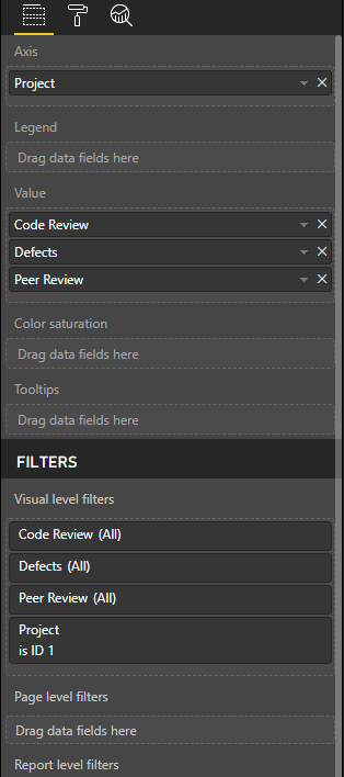
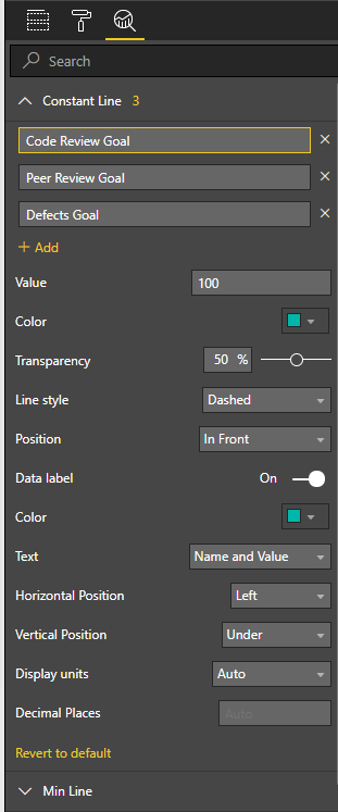
For Filtering out the nulls/blanks/ texts in the review% values, you can should filter them in the Power Query and to make each graph specific for a project, use the visual filter of that visual

for Constant Lines, Do the following

Alternatively, having all the projects in the same graph is a better approach, which would look like as follows
Atleast you can avoid creating a separate graph whenever a new project gets added
- Mark as New
- Bookmark
- Subscribe
- Mute
- Subscribe to RSS Feed
- Permalink
- Report Inappropriate Content
Thanks. I think you are right. I will show all in one graph.
Can you please send me your test pbix file?
- Mark as New
- Bookmark
- Subscribe
- Mute
- Subscribe to RSS Feed
- Permalink
- Report Inappropriate Content
Hi @vikasmca05,
PFB the link for the pbix file
https://1drv.ms/u/s!Ahd9tZ6Q55jya-aEQworKoKQXCU
If you are good with the solution, don't forgot accept as solution and give kudos for the same
- Mark as New
- Bookmark
- Subscribe
- Mute
- Subscribe to RSS Feed
- Permalink
- Report Inappropriate Content
Thanks for sending details. You have been very helpful.
I will let you know, if I have any more question.
Helpful resources

Microsoft Fabric Learn Together
Covering the world! 9:00-10:30 AM Sydney, 4:00-5:30 PM CET (Paris/Berlin), 7:00-8:30 PM Mexico City

Power BI Monthly Update - April 2024
Check out the April 2024 Power BI update to learn about new features.

| User | Count |
|---|---|
| 114 | |
| 100 | |
| 81 | |
| 70 | |
| 62 |
| User | Count |
|---|---|
| 148 | |
| 116 | |
| 104 | |
| 90 | |
| 65 |


