- Power BI forums
- Updates
- News & Announcements
- Get Help with Power BI
- Desktop
- Service
- Report Server
- Power Query
- Mobile Apps
- Developer
- DAX Commands and Tips
- Custom Visuals Development Discussion
- Health and Life Sciences
- Power BI Spanish forums
- Translated Spanish Desktop
- Power Platform Integration - Better Together!
- Power Platform Integrations (Read-only)
- Power Platform and Dynamics 365 Integrations (Read-only)
- Training and Consulting
- Instructor Led Training
- Dashboard in a Day for Women, by Women
- Galleries
- Community Connections & How-To Videos
- COVID-19 Data Stories Gallery
- Themes Gallery
- Data Stories Gallery
- R Script Showcase
- Webinars and Video Gallery
- Quick Measures Gallery
- 2021 MSBizAppsSummit Gallery
- 2020 MSBizAppsSummit Gallery
- 2019 MSBizAppsSummit Gallery
- Events
- Ideas
- Custom Visuals Ideas
- Issues
- Issues
- Events
- Upcoming Events
- Community Blog
- Power BI Community Blog
- Custom Visuals Community Blog
- Community Support
- Community Accounts & Registration
- Using the Community
- Community Feedback
Register now to learn Fabric in free live sessions led by the best Microsoft experts. From Apr 16 to May 9, in English and Spanish.
- Power BI forums
- Forums
- Get Help with Power BI
- Desktop
- Replicating a Tableau Visual
- Subscribe to RSS Feed
- Mark Topic as New
- Mark Topic as Read
- Float this Topic for Current User
- Bookmark
- Subscribe
- Printer Friendly Page
- Mark as New
- Bookmark
- Subscribe
- Mute
- Subscribe to RSS Feed
- Permalink
- Report Inappropriate Content
Replicating a Tableau Visual
Hi There, I am trying to replicate a visualization on PowerBi:
Here's a picture of it:
https://drive.google.com/open?id=1WHpG2ng-7w1LhoAV6pvr6qwEtFCjsu_T
The data is very simple. We have on particular item sold at $21.60 at a quantity of 35. That same item is also sold at $22.45 at a quantity of 10. That item is also sold at $23.50 at a quantity of 20. The "Unit Price - Invoices" is the field that contains the price data while the "Quantity" field (not shown in picture) contains the quantity.
The Average Selling Price, OP, COGS, Full Margin, and Standard Cost are all dynamic fields that vary based on the Material. The OP, COGS, Full Margin, and Standard Cost are all related to the specific product's cost.
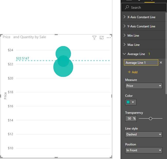
I plot the price points on the Y axis and make sure to put the quantity as the size. Then I add the dynamic reference lines that give a reference of where that material is priced relative to the other costs.
That's all I do on Tableau, and I get this nice visual. Is there any way to duplicate/re-perform this analysis in PowerBi? It is essential to have the reference lines.
Thank you
- Mark as New
- Bookmark
- Subscribe
- Mute
- Subscribe to RSS Feed
- Permalink
- Report Inappropriate Content
Hi @Anonymous
You may have a look at below articles to create the lines. If you need further help, please list your sample data and explain more about your expected output.
https://docs.microsoft.com/en-us/power-bi/desktop-analytics-pane
https://docs.microsoft.com/en-us/power-bi/service-analytics-pane
Regards,
Cherie
If this post helps, then please consider Accept it as the solution to help the other members find it more quickly.
- Mark as New
- Bookmark
- Subscribe
- Mute
- Subscribe to RSS Feed
- Permalink
- Report Inappropriate Content
Below is the data:
| Price | Quantity | |
| Sale 1 | $ 21.60 | 35 |
| Sale 2 | $ 22.45 | 10 |
| Sale 3 | $ 23.50 | 20 |
| Average Selling Price: | $ 22.32 | |
| OP | $ 20.32 | |
| COGS | $ 16.32 | |
| Full Margin | $ 14.20 | |
| Standard Cost | $ 12.30 |
I don't want to manually imput the Average Selling Price, OP, COGS, Full Margin, and Standard Cost, as they all change based on the material and are formulas/fields in PowerBi.
I need the expected output to plot those 3 sales with prices on the Y axis and the Material (item) on the X axis. This item is called Material "XYZ". I need there to be horizontal lines that are the same values as the Average Selling Price, OP, COGS, Full Margin, and Standard Cost. These lines need to change based on the material that is depicted. Another material would have different prices and costs. I also need the size of the bubble to be proportional to the quantity sold.
- Mark as New
- Bookmark
- Subscribe
- Mute
- Subscribe to RSS Feed
- Permalink
- Report Inappropriate Content
Hi @Anonymous
I'm afraid you may not add so many dynamic lines for scatter chart. Please vote for this similar idea and wait for this feature.
Regards,
Cherie
If this post helps, then please consider Accept it as the solution to help the other members find it more quickly.
Helpful resources

Microsoft Fabric Learn Together
Covering the world! 9:00-10:30 AM Sydney, 4:00-5:30 PM CET (Paris/Berlin), 7:00-8:30 PM Mexico City

Power BI Monthly Update - April 2024
Check out the April 2024 Power BI update to learn about new features.

| User | Count |
|---|---|
| 110 | |
| 94 | |
| 80 | |
| 67 | |
| 59 |
| User | Count |
|---|---|
| 150 | |
| 119 | |
| 104 | |
| 87 | |
| 67 |

