- Power BI forums
- Updates
- News & Announcements
- Get Help with Power BI
- Desktop
- Service
- Report Server
- Power Query
- Mobile Apps
- Developer
- DAX Commands and Tips
- Custom Visuals Development Discussion
- Health and Life Sciences
- Power BI Spanish forums
- Translated Spanish Desktop
- Power Platform Integration - Better Together!
- Power Platform Integrations (Read-only)
- Power Platform and Dynamics 365 Integrations (Read-only)
- Training and Consulting
- Instructor Led Training
- Dashboard in a Day for Women, by Women
- Galleries
- Community Connections & How-To Videos
- COVID-19 Data Stories Gallery
- Themes Gallery
- Data Stories Gallery
- R Script Showcase
- Webinars and Video Gallery
- Quick Measures Gallery
- 2021 MSBizAppsSummit Gallery
- 2020 MSBizAppsSummit Gallery
- 2019 MSBizAppsSummit Gallery
- Events
- Ideas
- Custom Visuals Ideas
- Issues
- Issues
- Events
- Upcoming Events
- Community Blog
- Power BI Community Blog
- Custom Visuals Community Blog
- Community Support
- Community Accounts & Registration
- Using the Community
- Community Feedback
Register now to learn Fabric in free live sessions led by the best Microsoft experts. From Apr 16 to May 9, in English and Spanish.
- Power BI forums
- Forums
- Get Help with Power BI
- Desktop
- Re: Relationships and Displaying Data
- Subscribe to RSS Feed
- Mark Topic as New
- Mark Topic as Read
- Float this Topic for Current User
- Bookmark
- Subscribe
- Printer Friendly Page
- Mark as New
- Bookmark
- Subscribe
- Mute
- Subscribe to RSS Feed
- Permalink
- Report Inappropriate Content
Relationships and Displaying Data
Hello,
I have two questions, one probably easier than the other. I'm creating a report that involves importing data from a SharePoint List which contains multiple single lines of text and multiple lines of text columns. I split the multiple lines of text columns by delimeter so each value within the column so they're in their own rows. These are now their own queries which some of them are merged to create larger queries.
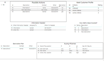
1. Based on the creation of the new larger merged queries, what's the best visualization besides a table would display this data efficiently? The tables are combinations of text, numbers, and dates. I have attached a screenshot below.
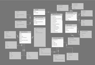
2. So due this high level of queries that are all connected based off of the ID value from SharePoint to make sure I can filter the information on that, I am struggling to get the relationships right. I have attached a screenshot below of what I have so far.
What I want to happen is the main query (Customer Relationship Management (2)) which is the SharePoint List will have an active relationship to either the merged queries (Non-grayed out queries) that I use within the report or the single column queries (the grayed out queries) based on the ID obtaine from SharePoint. The relationship between the Merged queries and the single column queries is based on the index column that was needed to merge the single column queries. This is a 1:1 relationship. But the relationship from the main query to the smaller queries is a 1 to many and due to this I can't refresh the dataset since the values aren't unique so I deleted them. What can I do to get around this?
Thank you for the help.


- Mark as New
- Bookmark
- Subscribe
- Mute
- Subscribe to RSS Feed
- Permalink
- Report Inappropriate Content
Hi @leanns ,
1. Many visuals can hold large amount of data, mainly depending on what you want to highlight. If you want the visual like a table, you can try matrix.
2. Did you try to change the cross filter direction of relationship from single to both? On my opinion, I think the data was filterd according to the single direction so that it displayed some data.
If you could post the dummy pbix file, we can try the best to solve it.
Best Regards,
Xue Ding
If this post helps, then please consider Accept it as the solution to help the other members find it more quickly.
Xue Ding
If this post helps, then please consider Accept it as the solution to help the other members find it more quickly.
- Mark as New
- Bookmark
- Subscribe
- Mute
- Subscribe to RSS Feed
- Permalink
- Report Inappropriate Content
Hello @v-xuding-msft ,
Thank you for the suggestions.
1. I guess I'm stuck with using a table to showcase each query of information.
2. I believe I did try this and it didn't like it either. But I attached a copy of the file for you to take a look through and try out different solutions. All the data is fake and is imported to the SharePoint List through a PowerApps App that I created which I won't mess with until after I hear back from you.
Thanks for the help!
- Mark as New
- Bookmark
- Subscribe
- Mute
- Subscribe to RSS Feed
- Permalink
- Report Inappropriate Content
Hello @v-xuding-msft ,
I was wondering if you had a chance to look at my file and see if you could help me?
Thanks!
Helpful resources

Microsoft Fabric Learn Together
Covering the world! 9:00-10:30 AM Sydney, 4:00-5:30 PM CET (Paris/Berlin), 7:00-8:30 PM Mexico City

Power BI Monthly Update - April 2024
Check out the April 2024 Power BI update to learn about new features.

| User | Count |
|---|---|
| 109 | |
| 96 | |
| 77 | |
| 66 | |
| 54 |
| User | Count |
|---|---|
| 144 | |
| 104 | |
| 102 | |
| 88 | |
| 63 |
