- Power BI forums
- Updates
- News & Announcements
- Get Help with Power BI
- Desktop
- Service
- Report Server
- Power Query
- Mobile Apps
- Developer
- DAX Commands and Tips
- Custom Visuals Development Discussion
- Health and Life Sciences
- Power BI Spanish forums
- Translated Spanish Desktop
- Power Platform Integration - Better Together!
- Power Platform Integrations (Read-only)
- Power Platform and Dynamics 365 Integrations (Read-only)
- Training and Consulting
- Instructor Led Training
- Dashboard in a Day for Women, by Women
- Galleries
- Community Connections & How-To Videos
- COVID-19 Data Stories Gallery
- Themes Gallery
- Data Stories Gallery
- R Script Showcase
- Webinars and Video Gallery
- Quick Measures Gallery
- 2021 MSBizAppsSummit Gallery
- 2020 MSBizAppsSummit Gallery
- 2019 MSBizAppsSummit Gallery
- Events
- Ideas
- Custom Visuals Ideas
- Issues
- Issues
- Events
- Upcoming Events
- Community Blog
- Power BI Community Blog
- Custom Visuals Community Blog
- Community Support
- Community Accounts & Registration
- Using the Community
- Community Feedback
Register now to learn Fabric in free live sessions led by the best Microsoft experts. From Apr 16 to May 9, in English and Spanish.
- Power BI forums
- Forums
- Get Help with Power BI
- Desktop
- Relationship between KPIs and Targets on multiple ...
- Subscribe to RSS Feed
- Mark Topic as New
- Mark Topic as Read
- Float this Topic for Current User
- Bookmark
- Subscribe
- Printer Friendly Page
- Mark as New
- Bookmark
- Subscribe
- Mute
- Subscribe to RSS Feed
- Permalink
- Report Inappropriate Content
Relationship between KPIs and Targets on multiple sheets
I have target data for the KPIs in the different sheet as shown below. I don't know how to build relations between the both in PowerBI data model. I am trying to use the targets as dots on the Bar charts.
| Sheet 1 | Actual Data | ||||
| Plants | Freq | KPI 1 | KPI2 | KPI3 | |
| ABC | Week1 | 83% | 83% | 88% | |
| XYZ | Week1 | 75% | 85% | 84% | |
| TEST | Week1 | 76% | 90% | 98% | |
| ABC | Week2 | 71% | 93% | 100% | |
| XYZ | Week2 | 68% | 97% | 98% | |
| TEST | Week2 | 64% | 100% | 100% | |
| Sheet 2 | Target | ||||
| Plants | KPI 1 | KPI2 | KPI3 | ||
| ABC | 83% | 85% | 90% | ||
| XYZ | 75% | 86% | 95% | ||
| TEST | 76% | 88% | 92% |
Solved! Go to Solution.
- Mark as New
- Bookmark
- Subscribe
- Mute
- Subscribe to RSS Feed
- Permalink
- Report Inappropriate Content
Hi, @lotus22
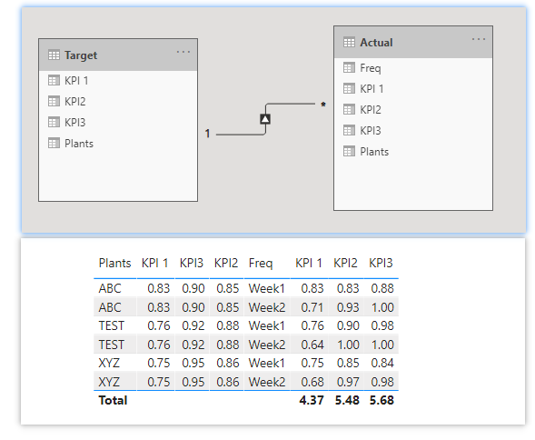
According to your description, the two sheets have 1*many relationship.
Like this:
I made a sample here. Hope it will help.
If it doesn’t solve your problem, please feel free to ask me.
Best Regards
Janey Guo
If this post helps, then please consider Accept it as the solution to help the other members find it more quickly.
Helpful resources

Microsoft Fabric Learn Together
Covering the world! 9:00-10:30 AM Sydney, 4:00-5:30 PM CET (Paris/Berlin), 7:00-8:30 PM Mexico City

Power BI Monthly Update - April 2024
Check out the April 2024 Power BI update to learn about new features.

| User | Count |
|---|---|
| 107 | |
| 93 | |
| 77 | |
| 65 | |
| 53 |
| User | Count |
|---|---|
| 147 | |
| 106 | |
| 104 | |
| 87 | |
| 61 |


