- Power BI forums
- Updates
- News & Announcements
- Get Help with Power BI
- Desktop
- Service
- Report Server
- Power Query
- Mobile Apps
- Developer
- DAX Commands and Tips
- Custom Visuals Development Discussion
- Health and Life Sciences
- Power BI Spanish forums
- Translated Spanish Desktop
- Power Platform Integration - Better Together!
- Power Platform Integrations (Read-only)
- Power Platform and Dynamics 365 Integrations (Read-only)
- Training and Consulting
- Instructor Led Training
- Dashboard in a Day for Women, by Women
- Galleries
- Community Connections & How-To Videos
- COVID-19 Data Stories Gallery
- Themes Gallery
- Data Stories Gallery
- R Script Showcase
- Webinars and Video Gallery
- Quick Measures Gallery
- 2021 MSBizAppsSummit Gallery
- 2020 MSBizAppsSummit Gallery
- 2019 MSBizAppsSummit Gallery
- Events
- Ideas
- Custom Visuals Ideas
- Issues
- Issues
- Events
- Upcoming Events
- Community Blog
- Power BI Community Blog
- Custom Visuals Community Blog
- Community Support
- Community Accounts & Registration
- Using the Community
- Community Feedback
Register now to learn Fabric in free live sessions led by the best Microsoft experts. From Apr 16 to May 9, in English and Spanish.
- Power BI forums
- Forums
- Get Help with Power BI
- Desktop
- Re: Reference line for Clustered Column chart
- Subscribe to RSS Feed
- Mark Topic as New
- Mark Topic as Read
- Float this Topic for Current User
- Bookmark
- Subscribe
- Printer Friendly Page
- Mark as New
- Bookmark
- Subscribe
- Mute
- Subscribe to RSS Feed
- Permalink
- Report Inappropriate Content
Reference line for Clustered Column chart
Hi All,
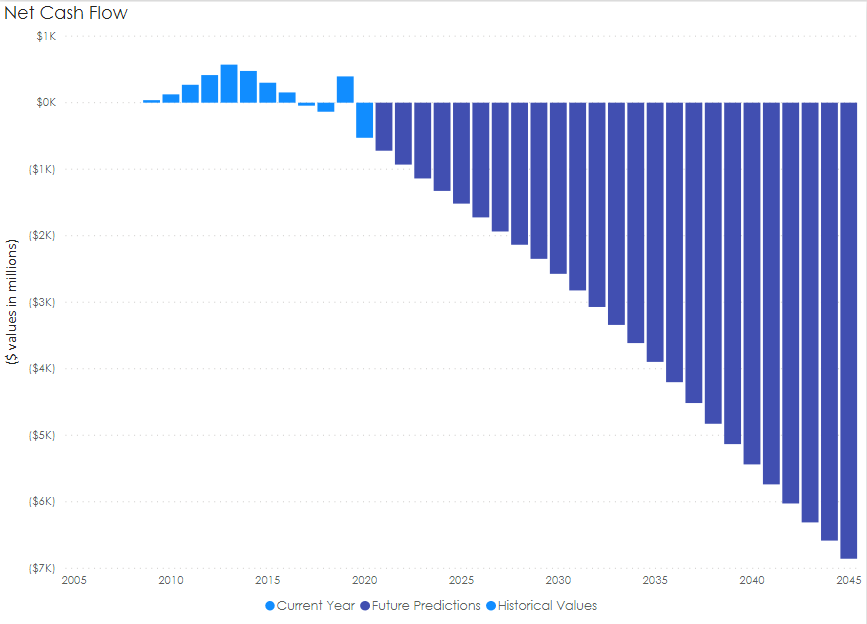
I am trying to add a reference line after year 2020 in below clustered column chart to differentiate Past Present and Future values.
Y axis contains $ vale in year and X contains years.
I am not able to find a way to do this. Please help!
- Mark as New
- Bookmark
- Subscribe
- Mute
- Subscribe to RSS Feed
- Permalink
- Report Inappropriate Content
hi @Anonymous
You could try this way as below:
Create a measure as this logic
Avg after 2020 = IF(SELECTEDVALUE('Table'[Year])>=2020,CALCULATE(AVERAGE('Table'[Net Flow]),FILTER(ALLSELECTED('Table'),'Table'[Year]>=2020)))In line and clustered chart visualizations, drag this measure in line values
and here is sample pbix file, please try it.
Regards,
Lin
If this post helps, then please consider Accept it as the solution to help the other members find it more quickly.
- Mark as New
- Bookmark
- Subscribe
- Mute
- Subscribe to RSS Feed
- Permalink
- Report Inappropriate Content
Have you tried a line and Stacked Chart or line and clustered chart visualizations?
- Mark as New
- Bookmark
- Subscribe
- Mute
- Subscribe to RSS Feed
- Permalink
- Report Inappropriate Content
Yes, I have tried line and stacked Chart but couldn't get the reference line after coloumn 2020.
- Mark as New
- Bookmark
- Subscribe
- Mute
- Subscribe to RSS Feed
- Permalink
- Report Inappropriate Content
Can you post a representative table of your data?
- Mark as New
- Bookmark
- Subscribe
- Mute
- Subscribe to RSS Feed
- Permalink
- Report Inappropriate Content
Thank you for the reply.
- Mark as New
- Bookmark
- Subscribe
- Mute
- Subscribe to RSS Feed
- Permalink
- Report Inappropriate Content
can you post it as a table, so I can copy the data.
- Mark as New
- Bookmark
- Subscribe
- Mute
- Subscribe to RSS Feed
- Permalink
- Report Inappropriate Content
| Year | Net Flow |
| 2005 | -111 |
| 2006 | 2.89 |
| 2007 | 4.7 |
| 2008 | -33 |
| 2009 | 125 |
| 2010 | 270 |
| 2011 | 410 |
| 2012 | 422 |
| 2013 | 544 |
| 2014 | 455 |
| 2015 | 377 |
| 2016 | 154 |
| 2017 | -45 |
| 2018 | -136 |
| 2019 | 395 |
| 2020 | -527 |
| 2021 | -777 |
| 2022 | -980 |
| 2023 | -1100 |
| 2024 | -1336 |
| 2025 | -1570 |
| 2026 | -1780 |
| 2027 | -1800 |
| 2028 | -2103 |
| 2029 | -2388 |
| 2030 | -2400 |
| 2031 | -2970 |
| 2032 | -3100 |
| 2033 | -3300 |
| 2034 | -3590 |
| 2035 | -3650 |
| 2036 | -3900 |
| 2037 | -4120 |
| 2038 | -4300 |
| 2039 | -5160 |
| 2040 | -5371 |
| 2041 | -5365 |
| 2042 | -5464 |
| 2043 | -6310 |
| 2044 | -6,564 |
| 2045 | -6,856 |
| 2046 | -6900 |
| 2047 | -7150 |
| 2048 | -7330 |
| 2049 | -7500 |
| 2050 | -7680 |
- Mark as New
- Bookmark
- Subscribe
- Mute
- Subscribe to RSS Feed
- Permalink
- Report Inappropriate Content
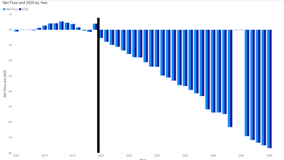
I figured out one way of doing it, it is more a work around than anything, but you can create your normal clustered chart, and then create another clustered chart and have one data point in the table date: 2020 and net flow: -8000. you can then place the original chart in the back and place the 2nd chart on tom and then move to the correct position on the chart. You then shrink the chart as small as you can in width and place it over the 2020 date.
you also would need to turn off all the titles, and informtion for the 2nd table so they do not show up. If you turn off the responsive you can make the line thinner.
I am going to continue working on a more elegant solution, but if you like this answer then please accept this as the solution.
Helpful resources

Microsoft Fabric Learn Together
Covering the world! 9:00-10:30 AM Sydney, 4:00-5:30 PM CET (Paris/Berlin), 7:00-8:30 PM Mexico City

Power BI Monthly Update - April 2024
Check out the April 2024 Power BI update to learn about new features.

| User | Count |
|---|---|
| 117 | |
| 107 | |
| 69 | |
| 68 | |
| 43 |
| User | Count |
|---|---|
| 148 | |
| 104 | |
| 102 | |
| 89 | |
| 66 |


