- Power BI forums
- Updates
- News & Announcements
- Get Help with Power BI
- Desktop
- Service
- Report Server
- Power Query
- Mobile Apps
- Developer
- DAX Commands and Tips
- Custom Visuals Development Discussion
- Health and Life Sciences
- Power BI Spanish forums
- Translated Spanish Desktop
- Power Platform Integration - Better Together!
- Power Platform Integrations (Read-only)
- Power Platform and Dynamics 365 Integrations (Read-only)
- Training and Consulting
- Instructor Led Training
- Dashboard in a Day for Women, by Women
- Galleries
- Community Connections & How-To Videos
- COVID-19 Data Stories Gallery
- Themes Gallery
- Data Stories Gallery
- R Script Showcase
- Webinars and Video Gallery
- Quick Measures Gallery
- 2021 MSBizAppsSummit Gallery
- 2020 MSBizAppsSummit Gallery
- 2019 MSBizAppsSummit Gallery
- Events
- Ideas
- Custom Visuals Ideas
- Issues
- Issues
- Events
- Upcoming Events
- Community Blog
- Power BI Community Blog
- Custom Visuals Community Blog
- Community Support
- Community Accounts & Registration
- Using the Community
- Community Feedback
Register now to learn Fabric in free live sessions led by the best Microsoft experts. From Apr 16 to May 9, in English and Spanish.
- Power BI forums
- Forums
- Get Help with Power BI
- Desktop
- Re: Classify multiple measures into a single chart
- Subscribe to RSS Feed
- Mark Topic as New
- Mark Topic as Read
- Float this Topic for Current User
- Bookmark
- Subscribe
- Printer Friendly Page
- Mark as New
- Bookmark
- Subscribe
- Mute
- Subscribe to RSS Feed
- Permalink
- Report Inappropriate Content
Rank multiple measures in a single graph
Hi, all!
I am struggling to find a way to rank different measures in a graph.
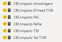
I have these measures, each one with a different formula but all of them are percentile values.
I am trying to order descending in a graph. So, for example, the bar chart below should be from top to bottom value: 0.66%, 0.26%, 0.20%, 0.05%, -0.01% and -0.08%. And, if possible, conditionally formatting them too: green for positive values and red for negative ones.
Is there any way to do this?
Thanks,
Matheus
- Mark as New
- Bookmark
- Subscribe
- Mute
- Subscribe to RSS Feed
- Permalink
- Report Inappropriate Content
To give you the order of the measures is only to add them in the graph in the values section in the order in which you want them to appear.
For the color theme:
- When you have only one measure in the graph, you can set conditional formatting to apply colors as needed.
- When you have multiple measures in the same graph, you can NOT apply conditional formatting to colors.
- Mark as New
- Bookmark
- Subscribe
- Mute
- Subscribe to RSS Feed
- Permalink
- Report Inappropriate Content
Thanks for replying @jairoaol!
I guess I wasn't clear enough, sorry. I don't want to do this everytime, it suppose to be dynamic. When the values change, the order also changes.
And thanks for the info about the color theme!
Regards.
- Mark as New
- Bookmark
- Subscribe
- Mute
- Subscribe to RSS Feed
- Permalink
- Report Inappropriate Content
Hi @Anonymous ,
You could change the Y axis type to categorical to have a try. Then you could sort descending by one of measures. Because there are many measure in your visual, please try the way to check if it can be a workaround.
For contional formatting axis, unfortunately, it is not supported for now. There is a similar one. You could vote it up or you could submit a new one.
https://ideas.powerbi.com/ideas/idea/?ideaid=299f0cbf-b628-48e5-833e-d4cc8dbc6718
Xue Ding
If this post helps, then please consider Accept it as the solution to help the other members find it more quickly.
- Mark as New
- Bookmark
- Subscribe
- Mute
- Subscribe to RSS Feed
- Permalink
- Report Inappropriate Content
Hi, @v-xuding-msft!
First, thanks for replying. I tried this and unfortunately didn't work. I decided not to make this graph anymore.
But I will vote it up and submit a new one, it may help me in the future.
Thanks again and best regards!
Matheus
- Mark as New
- Bookmark
- Subscribe
- Mute
- Subscribe to RSS Feed
- Permalink
- Report Inappropriate Content
Hi @Anonymous ,
If you have submit a new idea, you could update the link here and accept your answer as solution. Others who need the requirement will find the answer quickly and vote the idea up as well. Hope it can be implemented as soon as possible.
Xue Ding
If this post helps, then please consider Accept it as the solution to help the other members find it more quickly.
- Mark as New
- Bookmark
- Subscribe
- Mute
- Subscribe to RSS Feed
- Permalink
- Report Inappropriate Content
because graph only uses measurements, you can't sort it dynamically as you require.
you must have some category field to sort (text fields, for example) according to the measure applied.
Helpful resources

Microsoft Fabric Learn Together
Covering the world! 9:00-10:30 AM Sydney, 4:00-5:30 PM CET (Paris/Berlin), 7:00-8:30 PM Mexico City

Power BI Monthly Update - April 2024
Check out the April 2024 Power BI update to learn about new features.

| User | Count |
|---|---|
| 110 | |
| 94 | |
| 82 | |
| 66 | |
| 58 |
| User | Count |
|---|---|
| 151 | |
| 121 | |
| 104 | |
| 87 | |
| 67 |


