- Power BI forums
- Updates
- News & Announcements
- Get Help with Power BI
- Desktop
- Service
- Report Server
- Power Query
- Mobile Apps
- Developer
- DAX Commands and Tips
- Custom Visuals Development Discussion
- Health and Life Sciences
- Power BI Spanish forums
- Translated Spanish Desktop
- Power Platform Integration - Better Together!
- Power Platform Integrations (Read-only)
- Power Platform and Dynamics 365 Integrations (Read-only)
- Training and Consulting
- Instructor Led Training
- Dashboard in a Day for Women, by Women
- Galleries
- Community Connections & How-To Videos
- COVID-19 Data Stories Gallery
- Themes Gallery
- Data Stories Gallery
- R Script Showcase
- Webinars and Video Gallery
- Quick Measures Gallery
- 2021 MSBizAppsSummit Gallery
- 2020 MSBizAppsSummit Gallery
- 2019 MSBizAppsSummit Gallery
- Events
- Ideas
- Custom Visuals Ideas
- Issues
- Issues
- Events
- Upcoming Events
- Community Blog
- Power BI Community Blog
- Custom Visuals Community Blog
- Community Support
- Community Accounts & Registration
- Using the Community
- Community Feedback
Register now to learn Fabric in free live sessions led by the best Microsoft experts. From Apr 16 to May 9, in English and Spanish.
- Power BI forums
- Forums
- Get Help with Power BI
- Desktop
- Re: Radial Gauge: can “baseline” be lower than “ta...
- Subscribe to RSS Feed
- Mark Topic as New
- Mark Topic as Read
- Float this Topic for Current User
- Bookmark
- Subscribe
- Printer Friendly Page
- Mark as New
- Bookmark
- Subscribe
- Mute
- Subscribe to RSS Feed
- Permalink
- Report Inappropriate Content
Radial Gauge: can “baseline” be lower than “target”
We are using the gauges in a dashboard where a few KPIs are about reducing numbers, not increasing them, and it would be great for this to be visually similar to the “standard” assumption that higher is better.
The Tachometer seems to handle this, but it does not display well when small.
- Mark as New
- Bookmark
- Subscribe
- Mute
- Subscribe to RSS Feed
- Permalink
- Report Inappropriate Content
Hi @Vi12 ,
Could you please post some simple sample data and your desired result to have a test if possible?
You could see this post regarding How to Get Your Question Answered Quickly: https://community.powerbi.com/t5/Community-Blog/How-to-Get-Your-Question-Answered-Quickly/ba-p/38490
Regards,
Daniel He
If this post helps, then please consider Accept it as the solution to help the other members find it more quickly.
- Mark as New
- Bookmark
- Subscribe
- Mute
- Subscribe to RSS Feed
- Permalink
- Report Inappropriate Content
Thank you for the link to the useful " How to Get Your Question Answered Quickly" post. As newcomer in a forum like this I apologize for newbie errors.
Here is the sample CSV data for the Pictures below (with headers!):
Actual,Baseline,EOY target,YTD target
175,200,100,165
What I want to display: I want to use the Gauge to display progress from a higher start value (200) to a lower end value (100). This is relevant for example when targeting lower costs.
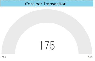
Picture 1: shows how the Visual Gauge looks like when I try to do this. It requires the start value to be lower than the end value. So it does not display any actual value (175) or current target (165)

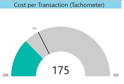
Picture 2: I found a custom visual called the "Tachometer" that can be designed to almost look like the gauge and that displays what I want:

However the tachometer has some limitations such as inadequate size/scaling for my needs compared to the standard Gauge, so I cannot use it.
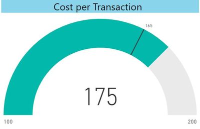
Picture 3: I can of course use the standard Gauge to indicate decline "from right to left. However I want to use it in a dashboard with a number of gauges where almost all the ther gauges display progress from "Start" to "End", so having a few gauges that progress in the opposite direction makes it difficult to understand and ruins the simple "at a glance" impression of the dashboard.

So in a nutshell I would really appreciate if the standard Visual Gauge could work like the Tachometer in Picture 2. Is this possible?
- Mark as New
- Bookmark
- Subscribe
- Mute
- Subscribe to RSS Feed
- Permalink
- Report Inappropriate Content
Hi @Vi12 ,
Based on my research, I am afraid you could not achieve this feature currently, I suggest you may submit an idea in ideas forum:
Power BI Ideas: Hot (13793 ideas) – Microsoft Power BI
Regards,
Daniel He
If this post helps, then please consider Accept it as the solution to help the other members find it more quickly.
- Mark as New
- Bookmark
- Subscribe
- Mute
- Subscribe to RSS Feed
- Permalink
- Report Inappropriate Content
Helpful resources

Microsoft Fabric Learn Together
Covering the world! 9:00-10:30 AM Sydney, 4:00-5:30 PM CET (Paris/Berlin), 7:00-8:30 PM Mexico City

Power BI Monthly Update - April 2024
Check out the April 2024 Power BI update to learn about new features.

| User | Count |
|---|---|
| 110 | |
| 94 | |
| 82 | |
| 66 | |
| 58 |
| User | Count |
|---|---|
| 151 | |
| 121 | |
| 104 | |
| 87 | |
| 67 |
