- Power BI forums
- Updates
- News & Announcements
- Get Help with Power BI
- Desktop
- Service
- Report Server
- Power Query
- Mobile Apps
- Developer
- DAX Commands and Tips
- Custom Visuals Development Discussion
- Health and Life Sciences
- Power BI Spanish forums
- Translated Spanish Desktop
- Power Platform Integration - Better Together!
- Power Platform Integrations (Read-only)
- Power Platform and Dynamics 365 Integrations (Read-only)
- Training and Consulting
- Instructor Led Training
- Dashboard in a Day for Women, by Women
- Galleries
- Community Connections & How-To Videos
- COVID-19 Data Stories Gallery
- Themes Gallery
- Data Stories Gallery
- R Script Showcase
- Webinars and Video Gallery
- Quick Measures Gallery
- 2021 MSBizAppsSummit Gallery
- 2020 MSBizAppsSummit Gallery
- 2019 MSBizAppsSummit Gallery
- Events
- Ideas
- Custom Visuals Ideas
- Issues
- Issues
- Events
- Upcoming Events
- Community Blog
- Power BI Community Blog
- Custom Visuals Community Blog
- Community Support
- Community Accounts & Registration
- Using the Community
- Community Feedback
Register now to learn Fabric in free live sessions led by the best Microsoft experts. From Apr 16 to May 9, in English and Spanish.
- Power BI forums
- Forums
- Get Help with Power BI
- Desktop
- Re: Radar chart
- Subscribe to RSS Feed
- Mark Topic as New
- Mark Topic as Read
- Float this Topic for Current User
- Bookmark
- Subscribe
- Printer Friendly Page
- Mark as New
- Bookmark
- Subscribe
- Mute
- Subscribe to RSS Feed
- Permalink
- Report Inappropriate Content
Radar chart
Hey everybody,
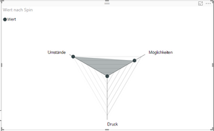
I try to create a radar chart with Power BI. It should look like this:

However, the scale is so small that the point of the category "Druck" is in the middle of the chart. How can I change that?
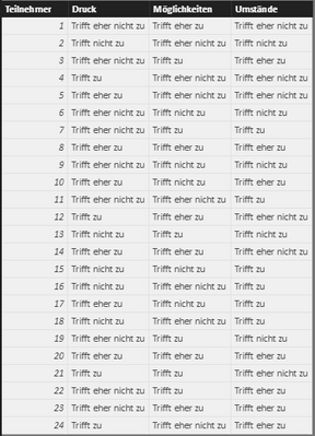
Moreover, the origin data table looks like this:
I try to visualize this table with a radar chart. In my imagination the middle point of the radar chart should represent "Trifft nich zu" = 0 and the outward line should represent "Trifft zu" = 3. And then I will illustrate the average decision of the responders to the points "Umstände", "Möglichkeiten" and "Druck". Anybody an idea, how I can implement that?
Best,
Tobias
- Mark as New
- Bookmark
- Subscribe
- Mute
- Subscribe to RSS Feed
- Permalink
- Report Inappropriate Content
Hi @tdanzeisen,
If seems you place the Spin in Category and Wert in Y Axis of the Radar chart, the result what you get is expected. It has nothing to do with the original data table. You can take a look at the sample of that Radar chart.
Best Regards,
Qiuyun Yu
If this post helps, then please consider Accept it as the solution to help the other members find it more quickly.
- Mark as New
- Bookmark
- Subscribe
- Mute
- Subscribe to RSS Feed
- Permalink
- Report Inappropriate Content
Hi @v-qiuyu-msft, thank you for your response.
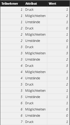
I transformed the data of the original table into integers: 0 = "Trifft nicht zu", 1 = "Trifft eher nicht zu", 2 = "Triffer eher zu" and 3 = "Trifft zu". Then I unpivot these columns and I got this:
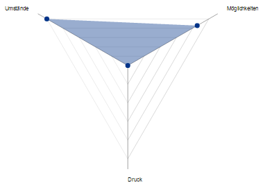
So I could create this Radar Chart with the average values:
So far, all is right. But I want to change the scale of this chart. The middle point should be 0. The first line should be 1, the second 2 and the third 3. But I can't find any options to change this scale. The scale is always automatic and changes if I made a selection. Can anybody help me with this issue?
Helpful resources

Microsoft Fabric Learn Together
Covering the world! 9:00-10:30 AM Sydney, 4:00-5:30 PM CET (Paris/Berlin), 7:00-8:30 PM Mexico City

Power BI Monthly Update - April 2024
Check out the April 2024 Power BI update to learn about new features.

| User | Count |
|---|---|
| 113 | |
| 99 | |
| 82 | |
| 70 | |
| 60 |
| User | Count |
|---|---|
| 149 | |
| 114 | |
| 107 | |
| 89 | |
| 67 |


