- Power BI forums
- Updates
- News & Announcements
- Get Help with Power BI
- Desktop
- Service
- Report Server
- Power Query
- Mobile Apps
- Developer
- DAX Commands and Tips
- Custom Visuals Development Discussion
- Health and Life Sciences
- Power BI Spanish forums
- Translated Spanish Desktop
- Power Platform Integration - Better Together!
- Power Platform Integrations (Read-only)
- Power Platform and Dynamics 365 Integrations (Read-only)
- Training and Consulting
- Instructor Led Training
- Dashboard in a Day for Women, by Women
- Galleries
- Community Connections & How-To Videos
- COVID-19 Data Stories Gallery
- Themes Gallery
- Data Stories Gallery
- R Script Showcase
- Webinars and Video Gallery
- Quick Measures Gallery
- 2021 MSBizAppsSummit Gallery
- 2020 MSBizAppsSummit Gallery
- 2019 MSBizAppsSummit Gallery
- Events
- Ideas
- Custom Visuals Ideas
- Issues
- Issues
- Events
- Upcoming Events
- Community Blog
- Power BI Community Blog
- Custom Visuals Community Blog
- Community Support
- Community Accounts & Registration
- Using the Community
- Community Feedback
Register now to learn Fabric in free live sessions led by the best Microsoft experts. From Apr 16 to May 9, in English and Spanish.
- Power BI forums
- Forums
- Get Help with Power BI
- Desktop
- Radar Chart
- Subscribe to RSS Feed
- Mark Topic as New
- Mark Topic as Read
- Float this Topic for Current User
- Bookmark
- Subscribe
- Printer Friendly Page
- Mark as New
- Bookmark
- Subscribe
- Mute
- Subscribe to RSS Feed
- Permalink
- Report Inappropriate Content
Radar Chart
Hi,
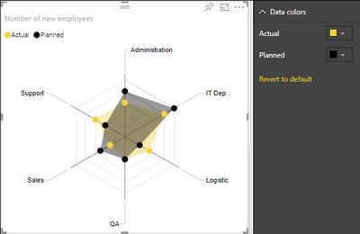
I'm trying to plot a radar chart similar to this one from the native visual documentation. (GitHub - microsoft/PowerBI-visuals-RadarChart: Repo for Power BI Radar Chart custom visual)
The problem I'm facing is that the KPIs I'd like to use as categories are in different measures, not in tables as the documentation indicates.
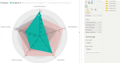
Another option I found, is using the MAQ Software Radar Chart. I could use the separate measures in this version, but I'd need to create a new table for Actual and Planned. It seems to me that this is an inverse approach compared to the native visual.
Anyway, first I would like to know what would be the preferable way of accomplishing this.
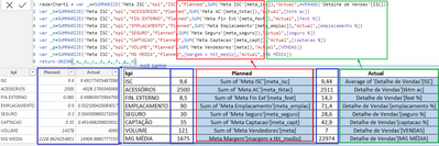
Also, in the native option, I think I'd need to convert the measures to a new table. Am I correct? Column 1 = KPIs, column 2 = Planned and Column 3 = Actual. Something like this:
(This image is not my data. It's from a similar question I found on the forum. Solved: Creating a column in a new table with measure valu... - Microsoft Power BI Community)
And in the second option, would I have to create a table for Planned and Actual instead of Company and link it somehow to the measures? Probably having to convert to a table too?
Thanks in advance.
Solved! Go to Solution.
- Mark as New
- Bookmark
- Subscribe
- Mute
- Subscribe to RSS Feed
- Permalink
- Report Inappropriate Content
Hi, @toyolexparvi ;
You could create a new table as follows:
radarChart1 = var _a=SUMMARIZE('Meta ISC',"kpi","ISC","Planned",SUM('Meta ISC'[meta_isc]),"Actual",AVERAGE('Detalhe de Vendas'[ISC]))
var _b=SUMMARIZE('Meta ISC',"kpi","ACESSORIOS","Planned",SUM('Meta AC'[meta_tktac]),"Actual",[tktm ac])
var _c=SUMMARIZE('Meta ISC',"kpi","FIN.EXTERNO","Planned",SUM('Meta Fin Ext'[meta_fext]),"Actual",[fext %])
var _d=SUMMARIZE('Meta ISC',"kpi","EMPLACAMENTO","Planned",SUM('Meta Emplacamento'[meta_emplac]),"Actual",[emplacamento %])
var _e=SUMMARIZE('Meta ISC',"kpi","SEGURO","Planned",SUM('Meta Seguro'[meta_seguro]),"Actual",[seguro %])
var _f=SUMMARIZE('Meta ISC',"kpi","CAPTACAO","Planned",SUM('Meta Captacao'[meta_capt]),"Actual",[captacao %])
var _g=SUMMARIZE('Meta ISC',"kpi","VOLUME","Planned",SUM('Meta Vendedores'[meta]),"Actual",[VENDAS])
var _h=SUMMARIZE('Meta ISC',"kpi","MG MEDIA","Planned",[margem x tkt_medio],"Actual",[MG MÉDIA])
return UNION(_a,_b,_c,_d,_e,_f,_g,_h)
The final output is shown below:(and as we can see, I used the formula in your blue box, but the numerical result is different from yours)
Then if we create a radar chart ,Because the difference between these numbers is too large (for example, from 0.085-14378), the display of the radar chart will not be obvious, as follows:
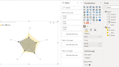
However, if there is no significant difference between our data, the radar chart will be more successful. For example, when we use some of the data, the effect of building a radar chart is as follows:
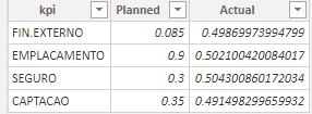
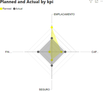
So, I think you can take my approach and modify the data a little bit to make the radar chart more beautiful.
Best Regards,
Community Support Team_ Yalan Wu
If this post helps, then please consider Accept it as the solution to help the other members find it more quickly.
- Mark as New
- Bookmark
- Subscribe
- Mute
- Subscribe to RSS Feed
- Permalink
- Report Inappropriate Content
Hi, @toyolexparvi ;
You could create a new table as follows:
radarChart1 = var _a=SUMMARIZE('Meta ISC',"kpi","ISC","Planned",SUM('Meta ISC'[meta_isc]),"Actual",AVERAGE('Detalhe de Vendas'[ISC]))
var _b=SUMMARIZE('Meta ISC',"kpi","ACESSORIOS","Planned",SUM('Meta AC'[meta_tktac]),"Actual",[tktm ac])
var _c=SUMMARIZE('Meta ISC',"kpi","FIN.EXTERNO","Planned",SUM('Meta Fin Ext'[meta_fext]),"Actual",[fext %])
var _d=SUMMARIZE('Meta ISC',"kpi","EMPLACAMENTO","Planned",SUM('Meta Emplacamento'[meta_emplac]),"Actual",[emplacamento %])
var _e=SUMMARIZE('Meta ISC',"kpi","SEGURO","Planned",SUM('Meta Seguro'[meta_seguro]),"Actual",[seguro %])
var _f=SUMMARIZE('Meta ISC',"kpi","CAPTACAO","Planned",SUM('Meta Captacao'[meta_capt]),"Actual",[captacao %])
var _g=SUMMARIZE('Meta ISC',"kpi","VOLUME","Planned",SUM('Meta Vendedores'[meta]),"Actual",[VENDAS])
var _h=SUMMARIZE('Meta ISC',"kpi","MG MEDIA","Planned",[margem x tkt_medio],"Actual",[MG MÉDIA])
return UNION(_a,_b,_c,_d,_e,_f,_g,_h)
The final output is shown below:(and as we can see, I used the formula in your blue box, but the numerical result is different from yours)
Then if we create a radar chart ,Because the difference between these numbers is too large (for example, from 0.085-14378), the display of the radar chart will not be obvious, as follows:
However, if there is no significant difference between our data, the radar chart will be more successful. For example, when we use some of the data, the effect of building a radar chart is as follows:


So, I think you can take my approach and modify the data a little bit to make the radar chart more beautiful.
Best Regards,
Community Support Team_ Yalan Wu
If this post helps, then please consider Accept it as the solution to help the other members find it more quickly.
- Mark as New
- Bookmark
- Subscribe
- Mute
- Subscribe to RSS Feed
- Permalink
- Report Inappropriate Content
I have a similar requirement to create a Radar (we know it as TADPOLE) but our data is transposed, where we have the Primary field as the project name (200 or so projects) and 7 variables against each project. Data is very simple, but is pulled from a much larger table. Below is a basic extract for 2 projects, we will be using a slicer to select an individual project as part of an overall project review so would end up with 2 different radars, depending upon which project we were reviewing. It's easy in Excel, but I can't get it to show anything but a straight line in Power BI
| Project Name | Tech | Appl | Data | Process | Org | Loc'n | Env |
| Digital Supplier | 2 | 2 | 3 | 3 | 4 | 4 | 1 |
| EUC & Networks | 2 | 3 | 4 | 1 | 2 | 3 | 2 |
Any suggestions gratefully received
Regards
Fred
- Mark as New
- Bookmark
- Subscribe
- Mute
- Subscribe to RSS Feed
- Permalink
- Report Inappropriate Content
Thank you very much. You're my hero. 😁
The difference between our data is that mine was filtered by salesperson and first quarter of 2021.
I'll now try to figure out how to link the radarChart1 to my date table and salespeople IDs.
- Mark as New
- Bookmark
- Subscribe
- Mute
- Subscribe to RSS Feed
- Permalink
- Report Inappropriate Content
Hi, @toyolexparvi ;
you could try calculate table using dax. SUMMARIZE() and UNION() more suitable for you. then use Radar Chart , KPIs as category, Planned and Actual as Y-axis.
If it doesn’t solve your problem, can you share more about your data model or a simple sample .pbix without any sesentive information.
Best Regards,
Community Support Team_ Yalan Wu
If this post helps, then please consider Accept it as the solution to help the other members find it more quickly.
- Mark as New
- Bookmark
- Subscribe
- Mute
- Subscribe to RSS Feed
- Permalink
- Report Inappropriate Content
Hi, @v-yalanwu-msft
Thanks. Yes, I can share. This is a training project with no sensitive data.
I don't even know if it's possible, but considering what you said, I would need to achieve this following table, right? However, many measures have different calculations, and some are fixed values. Is it possible to put together theses values in a table?
I inserted the blue columns just to show you the sources quickly.
Helpful resources

Microsoft Fabric Learn Together
Covering the world! 9:00-10:30 AM Sydney, 4:00-5:30 PM CET (Paris/Berlin), 7:00-8:30 PM Mexico City

Power BI Monthly Update - April 2024
Check out the April 2024 Power BI update to learn about new features.

| User | Count |
|---|---|
| 114 | |
| 100 | |
| 78 | |
| 75 | |
| 50 |
| User | Count |
|---|---|
| 144 | |
| 109 | |
| 108 | |
| 88 | |
| 61 |
