Go To
- Power BI forums
- Updates
- News & Announcements
- Get Help with Power BI
- Desktop
- Service
- Report Server
- Power Query
- Mobile Apps
- Developer
- DAX Commands and Tips
- Custom Visuals Development Discussion
- Health and Life Sciences
- Power BI Spanish forums
- Translated Spanish Desktop
- Power Platform Integration - Better Together!
- Power Platform Integrations (Read-only)
- Power Platform and Dynamics 365 Integrations (Read-only)
- Training and Consulting
- Instructor Led Training
- Dashboard in a Day for Women, by Women
- Galleries
- Community Connections & How-To Videos
- COVID-19 Data Stories Gallery
- Themes Gallery
- Data Stories Gallery
- R Script Showcase
- Webinars and Video Gallery
- Quick Measures Gallery
- 2021 MSBizAppsSummit Gallery
- 2020 MSBizAppsSummit Gallery
- 2019 MSBizAppsSummit Gallery
- Events
- Ideas
- Custom Visuals Ideas
- Issues
- Issues
- Events
- Upcoming Events
- Community Blog
- Power BI Community Blog
- Custom Visuals Community Blog
- Community Support
- Community Accounts & Registration
- Using the Community
- Community Feedback
Turn on suggestions
Auto-suggest helps you quickly narrow down your search results by suggesting possible matches as you type.
Showing results for
Register now to learn Fabric in free live sessions led by the best Microsoft experts. From Apr 16 to May 9, in English and Spanish.
- Power BI forums
- Forums
- Get Help with Power BI
- Desktop
- R script that plot perfectly in Rstudio dose not p...
Reply
Topic Options
- Subscribe to RSS Feed
- Mark Topic as New
- Mark Topic as Read
- Float this Topic for Current User
- Bookmark
- Subscribe
- Printer Friendly Page
- Mark as New
- Bookmark
- Subscribe
- Mute
- Subscribe to RSS Feed
- Permalink
- Report Inappropriate Content
R script that plot perfectly in Rstudio dose not plot completely in PBI
07-18-2016
02:25 AM
Hello,
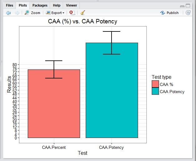
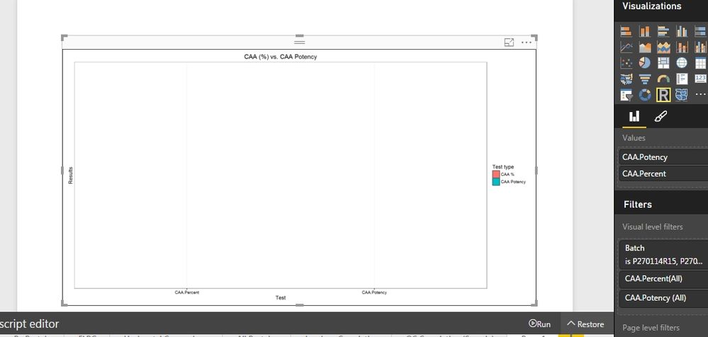
I've ploted a bar chart with standart error in Rstudio, when addapted it to BPI only the frame was ploted with no bars or se.
please help finding and resolving the problem.
Thanks,
Z
Please find the script and the Rstudio plot:
library(ggplot2)
library(Rmisc)
library(tidyr)
## Source file  Directory  ##

SourcWD<-"C:\\Users\\Lenovo\\Desktop\\BI-O\\Data Files"

setwd(SourcWD)

##  Loading File as dataset  ##
dataset<-read.csv(file="C:\\Users\\Lenovo\\Desktop\\BI-O\\Data Files\\caa.csv", header = TRUE, sep = ",")
attach(dataset)
dataset


# Converting from Wide to Long

keycol <- "Type"
valuecol <- "Mean"
gathercols <- c("CAA.Percent", "CAA.Potency")

dataset_long<-gather_(dataset, keycol, valuecol, gathercols)

#Summerizing

dataset_data <- summarySE(dataset_long, measurevar="Mean","Type")
dataset_data

#Ploting

ggplot(dataset_data, aes(x=Type, y=Mean, fill=Type)) +
  geom_bar(position=position_dodge(), stat="identity",
           colour="black", # Use black outlines,
           size=.3) +      # Thinner lines
  geom_errorbar(aes(ymin=Mean-sd, ymax=Mean+sd),
                size=1,    # Thinner lines
                width=.3,
                position=position_dodge(.1)) +
  xlab(" Test ") +
  ylab("Results") +
  scale_fill_hue(name="Test type", # Legend label, use darker colors
                 labels=c("CAA %", "CAA Potency")) +
  ggtitle("CAA (%) vs. CAA Potency") +
  scale_y_continuous(breaks=0:20*4) +
  theme_bw()
and the plot:
Also please find the BPI code:
library(data.table, quietly = TRUE);
library(ggplot2, quietly = TRUE);
library(tidyr, quietly = TRUE);
library(Rmisc, quietly = TRUE);
attach(dataset)

#dataset$Batch <- factor(dataset$Batch)
keycol <- "Type"
valuecol <- "Mean"
gathercols <- c("CAA.Percent", "CAA.Potency")

dataset_long<-gather_(dataset, keycol, valuecol, gathercols)
dataset_data <- summarySE(dataset_long, measurevar="Mean","Type")

ggplot(dataset_data, aes(x=Type, y=Mean, fill=Type)) +
geom_bar(position=position_dodge(), stat="identity",
colour="black", # Use black outlines,
size=.3) +      # Thinner lines
geom_errorbar(aes(ymin=Mean-sd, ymax=Mean+sd),
size=.5,    # Thinner lines
width=.3,
position=position_dodge(.9)) +
xlab(" Test ") +
ylab("Results") +
scale_fill_hue(name="Test type", # Legend label, use darker colors
labels=c( "CAA %","CAA Potency")) +
  ggtitle("CAA (%) vs. CAA Potency") +
  scale_y_continuous(breaks=0:20*4) +
  theme_bw()
and the empty plot:
2 REPLIES 2
- Mark as New
- Bookmark
- Subscribe
- Mute
- Subscribe to RSS Feed
- Permalink
- Report Inappropriate Content
07-18-2016
04:44 AM
@ZviR can you also provide csv file or sample data so that I can troubleshoot your issue.
- Mark as New
- Bookmark
- Subscribe
- Mute
- Subscribe to RSS Feed
- Permalink
- Report Inappropriate Content
07-18-2016
05:31 AM
Batch	CAA Percent	CAA Potency
R15	78	110
R16	79	114
R17	92	123
R19	74	109
R21	76	107
R24	61	84
R25	65	90
R26	66	94
R27	80	102
Thanks,
Z
Helpful resources
Announcements

Microsoft Fabric Learn Together
Covering the world! 9:00-10:30 AM Sydney, 4:00-5:30 PM CET (Paris/Berlin), 7:00-8:30 PM Mexico City

Power BI Monthly Update - April 2024
Check out the April 2024 Power BI update to learn about new features.

Featured Topics
Top Solution Authors
| User | Count |
|---|---|
| 111 | |
| 96 | |
| 80 | |
| 68 | |
| 59 |
Top Kudoed Authors
| User | Count |
|---|---|
| 150 | |
| 119 | |
| 104 | |
| 87 | |
| 67 |


