- Power BI forums
- Updates
- News & Announcements
- Get Help with Power BI
- Desktop
- Service
- Report Server
- Power Query
- Mobile Apps
- Developer
- DAX Commands and Tips
- Custom Visuals Development Discussion
- Health and Life Sciences
- Power BI Spanish forums
- Translated Spanish Desktop
- Power Platform Integration - Better Together!
- Power Platform Integrations (Read-only)
- Power Platform and Dynamics 365 Integrations (Read-only)
- Training and Consulting
- Instructor Led Training
- Dashboard in a Day for Women, by Women
- Galleries
- Community Connections & How-To Videos
- COVID-19 Data Stories Gallery
- Themes Gallery
- Data Stories Gallery
- R Script Showcase
- Webinars and Video Gallery
- Quick Measures Gallery
- 2021 MSBizAppsSummit Gallery
- 2020 MSBizAppsSummit Gallery
- 2019 MSBizAppsSummit Gallery
- Events
- Ideas
- Custom Visuals Ideas
- Issues
- Issues
- Events
- Upcoming Events
- Community Blog
- Power BI Community Blog
- Custom Visuals Community Blog
- Community Support
- Community Accounts & Registration
- Using the Community
- Community Feedback
Register now to learn Fabric in free live sessions led by the best Microsoft experts. From Apr 16 to May 9, in English and Spanish.
- Power BI forums
- Forums
- Get Help with Power BI
- Desktop
- R Script ggplot Line Plot
- Subscribe to RSS Feed
- Mark Topic as New
- Mark Topic as Read
- Float this Topic for Current User
- Bookmark
- Subscribe
- Printer Friendly Page
- Mark as New
- Bookmark
- Subscribe
- Mute
- Subscribe to RSS Feed
- Permalink
- Report Inappropriate Content
R Script ggplot Line Plot
Hello,
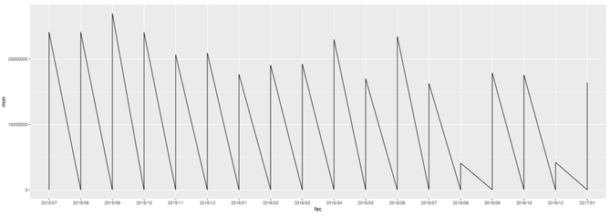
I'm trying for the first time ever R Scripting with ggplot. However I've encountered a small roadblock. While attempting to do a line chart, why does my data plunges to 0 but lines back to the number it should be? My data doesn't behave in such way, so what am I missing? I'm truly an beginner in this topic, so it might be something dumb, however I haven't found any answers online yet.
library(ggplot2)
library(gtable)
library(grid)
#library(extrafont)

data <- dataset
mon <- data$Monto
trans <- data$Transacciones
fec <- format(as.Date(data$Fecha), "%Y/%m")

options(scipen=999)
p1 <- ggplot(data, aes(fec, mon, group = 1)) + geom_line()

p1
* Note: I've been attempting to create a visual of two y axes. That's why I'm using ggplot. I'm halfway there, but I need to get this fixed first.
Solved! Go to Solution.
- Mark as New
- Bookmark
- Subscribe
- Mute
- Subscribe to RSS Feed
- Permalink
- Report Inappropriate Content
Based on your code, it seems you put date field into your dataset. I assume you have data on day level. As you format your Date into "YearMonth", which means you have multiple data point on same X axis category. This the reason why your line goes crazy.
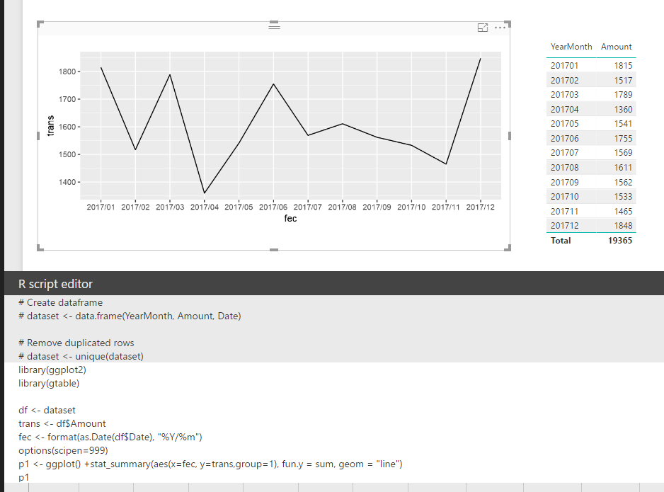
In your scenario, you should use stat_summary() function to have those data points aggregate on each "YearMonth". Please refer to my sample below:
library(ggplot2)
library(gtable)

df <- dataset
trans <- df$Amount
fec <- format(as.Date(df$Date), "%Y/%m")
options(scipen=999)
p1 <- ggplot() +stat_summary(aes(x=fec, y=trans,group=1), fun.y = sum, geom = "line")
p1
Regards,
Helpful resources

Microsoft Fabric Learn Together
Covering the world! 9:00-10:30 AM Sydney, 4:00-5:30 PM CET (Paris/Berlin), 7:00-8:30 PM Mexico City

Power BI Monthly Update - April 2024
Check out the April 2024 Power BI update to learn about new features.

| User | Count |
|---|---|
| 107 | |
| 99 | |
| 78 | |
| 64 | |
| 58 |
| User | Count |
|---|---|
| 148 | |
| 111 | |
| 94 | |
| 84 | |
| 67 |


