- Power BI forums
- Updates
- News & Announcements
- Get Help with Power BI
- Desktop
- Service
- Report Server
- Power Query
- Mobile Apps
- Developer
- DAX Commands and Tips
- Custom Visuals Development Discussion
- Health and Life Sciences
- Power BI Spanish forums
- Translated Spanish Desktop
- Power Platform Integration - Better Together!
- Power Platform Integrations (Read-only)
- Power Platform and Dynamics 365 Integrations (Read-only)
- Training and Consulting
- Instructor Led Training
- Dashboard in a Day for Women, by Women
- Galleries
- Community Connections & How-To Videos
- COVID-19 Data Stories Gallery
- Themes Gallery
- Data Stories Gallery
- R Script Showcase
- Webinars and Video Gallery
- Quick Measures Gallery
- 2021 MSBizAppsSummit Gallery
- 2020 MSBizAppsSummit Gallery
- 2019 MSBizAppsSummit Gallery
- Events
- Ideas
- Custom Visuals Ideas
- Issues
- Issues
- Events
- Upcoming Events
- Community Blog
- Power BI Community Blog
- Custom Visuals Community Blog
- Community Support
- Community Accounts & Registration
- Using the Community
- Community Feedback
Register now to learn Fabric in free live sessions led by the best Microsoft experts. From Apr 16 to May 9, in English and Spanish.
- Power BI forums
- Forums
- Get Help with Power BI
- Desktop
- Quartile with calculated mearues
- Subscribe to RSS Feed
- Mark Topic as New
- Mark Topic as Read
- Float this Topic for Current User
- Bookmark
- Subscribe
- Printer Friendly Page
- Mark as New
- Bookmark
- Subscribe
- Mute
- Subscribe to RSS Feed
- Permalink
- Report Inappropriate Content
Quartile with calculated mearues
Hi, I want to do a quartile analysis of some data.
I am having trouble calculating the quartiles because I have to create them over a calculated measure called "Cts P&MO" but as long as I have seen the percentile DAX forumlas work over specifics columns of a table nd not over calculated measures. After calculating the quartiles I guess with a conditional I will put the Q1, Q2, Q3 or Q4 depending on the case.
Thanks.
- Mark as New
- Bookmark
- Subscribe
- Mute
- Subscribe to RSS Feed
- Permalink
- Report Inappropriate Content
Hey,
as @LivioLanzo
In the meantime to might consider to use something like this
GROUPBY(ADDCOLUMNS(SUMMARIZE(...), "yourmeasure", [Cts P&MO],"value", PERCENTILEX.EXC(CURRENTGROUP(), [yourmeasure]))
Here you will find some info about PERCENTILEX.EXC:
https://dax.guide/percentilex-exc/
Please be aware that, my example DAX above may have issues because I'm just guessing what may work.
Regards,
Tom
Did I answer your question? Mark my post as a solution, this will help others!
Proud to be a Super User!
I accept Kudos 😉
Hamburg, Germany
- Mark as New
- Bookmark
- Subscribe
- Mute
- Subscribe to RSS Feed
- Permalink
- Report Inappropriate Content
Hello @Anonymous
perhpas you could post some data??
Did I answer your question correctly? Mark my answer as a solution!
Proud to be a Datanaut!
- Mark as New
- Bookmark
- Subscribe
- Mute
- Subscribe to RSS Feed
- Permalink
- Report Inappropriate Content
Hi @LivioLanzo and @TomMartens
Here it´s what I actually have:
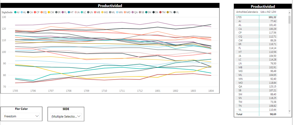
The lines that appear in the graphic are the elements that I select from the slicer "SEDE", the measure that it´s showing it's "Productividad" (it has been stored at a table called "Negocio") and it´s showing it over a period of time for the things that I select on the slicer "Flor Color".
What I wanto to do it´s to calculate quartiles so I don´t have to select all the elements of "SEDE" just select one, for example "VL" and see only "VL" and where is it relative position but only seeing the quartiles like in the image bellow (Excel):
Hope I clarify
- Mark as New
- Bookmark
- Subscribe
- Mute
- Subscribe to RSS Feed
- Permalink
- Report Inappropriate Content
Hey @Anonymous,
as @LivioLanzo already mentioned in his first post, please prepare sample data, upload the source data (different sheets in one xlsx) and the pbix file to onedrive or dropbox and share the link.
Regards,
Tom
Did I answer your question? Mark my post as a solution, this will help others!
Proud to be a Super User!
I accept Kudos 😉
Hamburg, Germany
- Mark as New
- Bookmark
- Subscribe
- Mute
- Subscribe to RSS Feed
- Permalink
- Report Inappropriate Content
Hi @TomMartens sadly I can´t put mucho more data because now I´m working with a live connection.
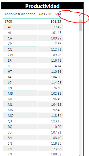
Basically I wan to calculate the quartiles for the column "Uds x M2 12M" (a calculated mesaure). I guess that I will have to create a calculated mesure separetly for every quartile. Then I want to aggregate another colum to that visualization to put the classification on the quartiles (Q1, Q2, Q3 or Q4).
Helpful resources

Microsoft Fabric Learn Together
Covering the world! 9:00-10:30 AM Sydney, 4:00-5:30 PM CET (Paris/Berlin), 7:00-8:30 PM Mexico City

Power BI Monthly Update - April 2024
Check out the April 2024 Power BI update to learn about new features.

| User | Count |
|---|---|
| 113 | |
| 100 | |
| 78 | |
| 76 | |
| 52 |
| User | Count |
|---|---|
| 144 | |
| 109 | |
| 108 | |
| 88 | |
| 61 |


