- Power BI forums
- Updates
- News & Announcements
- Get Help with Power BI
- Desktop
- Service
- Report Server
- Power Query
- Mobile Apps
- Developer
- DAX Commands and Tips
- Custom Visuals Development Discussion
- Health and Life Sciences
- Power BI Spanish forums
- Translated Spanish Desktop
- Power Platform Integration - Better Together!
- Power Platform Integrations (Read-only)
- Power Platform and Dynamics 365 Integrations (Read-only)
- Training and Consulting
- Instructor Led Training
- Dashboard in a Day for Women, by Women
- Galleries
- Community Connections & How-To Videos
- COVID-19 Data Stories Gallery
- Themes Gallery
- Data Stories Gallery
- R Script Showcase
- Webinars and Video Gallery
- Quick Measures Gallery
- 2021 MSBizAppsSummit Gallery
- 2020 MSBizAppsSummit Gallery
- 2019 MSBizAppsSummit Gallery
- Events
- Ideas
- Custom Visuals Ideas
- Issues
- Issues
- Events
- Upcoming Events
- Community Blog
- Power BI Community Blog
- Custom Visuals Community Blog
- Community Support
- Community Accounts & Registration
- Using the Community
- Community Feedback
Register now to learn Fabric in free live sessions led by the best Microsoft experts. From Apr 16 to May 9, in English and Spanish.
- Power BI forums
- Forums
- Get Help with Power BI
- Desktop
- Re: Quarterly Average displayed on Date Record
- Subscribe to RSS Feed
- Mark Topic as New
- Mark Topic as Read
- Float this Topic for Current User
- Bookmark
- Subscribe
- Printer Friendly Page
- Mark as New
- Bookmark
- Subscribe
- Mute
- Subscribe to RSS Feed
- Permalink
- Report Inappropriate Content
Quarterly Average displayed on Date Record
Hello,
I appreciate any help anyone could give me on this issue. I have spent more time than I thought I would on what I thought was a simple problem.
In my example below, I have tried about 3 different measures to achieve what I am looking for.
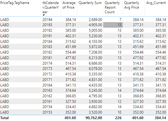
In this first image, the "Average of Price" column is the one that is automatically generated by Power BI.
I added a measure to calculate the SUM of the quarter and the occurances in that quarter and the 2nd measure "Quarterly Avg Price" is based off of those two fields.
The third Avg_Current is a measure that basically combines the previous one together into one.
All of these are working as intended so far.
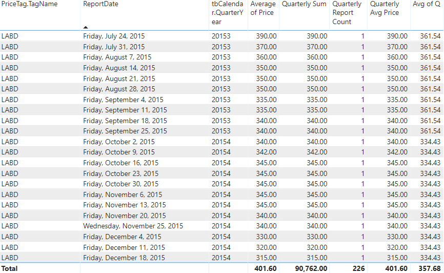
The issue comes when I add the report date. I want to maintain the average for the quarter even though I have expanded the report date as well, but doing so seems to throw off all the measures.
Any way to keep the initial Average that was calculated for the quarter, even when adding the actual weekly reports? Id like to see a flat line on a graph for 13 weeks basically.
Thank you in advance!
- Mark as New
- Bookmark
- Subscribe
- Mute
- Subscribe to RSS Feed
- Permalink
- Report Inappropriate Content
Hi Bulvers,
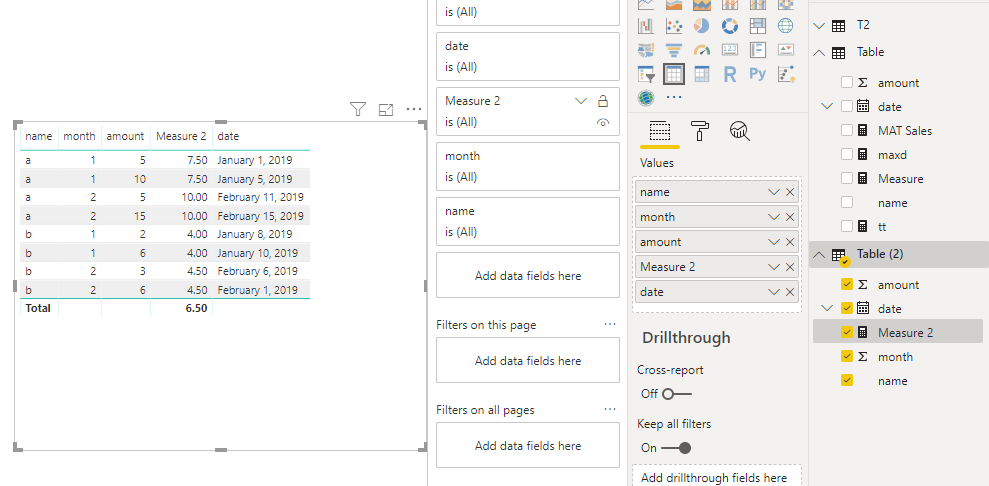
According to your description, it seems that you still want to get average based on month when you add date in Table, right? If so , you need to create measure to achieve this goal. Below is my sample
let
    Source = Table.FromRows(Json.Document(Binary.Decompress(Binary.FromText("i45WSlTSUTIEYiMDQ0t9Q30Q01QpVgdDwhTENQDLJKHKWICY2CSAynWUzOCGGcFkjPQNUa1BlgHbYwo3DlkKbhqahBmQaawUGwsA", BinaryEncoding.Base64), Compression.Deflate)), let _t = ((type text) meta [Serialized.Text = true]) in type table [name = _t, month = _t, date = _t, amount = _t]),
    #"Changed Type" = Table.TransformColumnTypes(Source,{{"name", type text}, {"month", Int64.Type}, {"date", type date}, {"amount", Int64.Type}})
in
    #"Changed Type"
Measure 2 =
CALCULATE (
AVERAGE ( 'Table (2)'[amount] ),
ALLEXCEPT ( 'Table (2)', 'Table (2)'[name], 'Table (2)'[month] )
)
Best Regards,
Zoe Zhi
If this post helps, then please consider Accept it as the solution to help the other members find it more quickly.
- Mark as New
- Bookmark
- Subscribe
- Mute
- Subscribe to RSS Feed
- Permalink
- Report Inappropriate Content
Awesome, Ok so this works for getting the correct Quarterly Avg in the table, however it still does not look right when put on a line graph. It appears to just be graphing the total rather than the value I would expect to see for each quarter. See below.
Is there any way to get it to graph the value of that Avg of Q measure for each report date? I would expect to see 13 week straight lines on the graph.
Helpful resources

Microsoft Fabric Learn Together
Covering the world! 9:00-10:30 AM Sydney, 4:00-5:30 PM CET (Paris/Berlin), 7:00-8:30 PM Mexico City

Power BI Monthly Update - April 2024
Check out the April 2024 Power BI update to learn about new features.

| User | Count |
|---|---|
| 117 | |
| 107 | |
| 70 | |
| 70 | |
| 43 |
| User | Count |
|---|---|
| 148 | |
| 106 | |
| 104 | |
| 89 | |
| 65 |


