- Power BI forums
- Updates
- News & Announcements
- Get Help with Power BI
- Desktop
- Service
- Report Server
- Power Query
- Mobile Apps
- Developer
- DAX Commands and Tips
- Custom Visuals Development Discussion
- Health and Life Sciences
- Power BI Spanish forums
- Translated Spanish Desktop
- Power Platform Integration - Better Together!
- Power Platform Integrations (Read-only)
- Power Platform and Dynamics 365 Integrations (Read-only)
- Training and Consulting
- Instructor Led Training
- Dashboard in a Day for Women, by Women
- Galleries
- Community Connections & How-To Videos
- COVID-19 Data Stories Gallery
- Themes Gallery
- Data Stories Gallery
- R Script Showcase
- Webinars and Video Gallery
- Quick Measures Gallery
- 2021 MSBizAppsSummit Gallery
- 2020 MSBizAppsSummit Gallery
- 2019 MSBizAppsSummit Gallery
- Events
- Ideas
- Custom Visuals Ideas
- Issues
- Issues
- Events
- Upcoming Events
- Community Blog
- Power BI Community Blog
- Custom Visuals Community Blog
- Community Support
- Community Accounts & Registration
- Using the Community
- Community Feedback
Register now to learn Fabric in free live sessions led by the best Microsoft experts. From Apr 16 to May 9, in English and Spanish.
- Power BI forums
- Forums
- Get Help with Power BI
- Desktop
- Python visual in Power BI
- Subscribe to RSS Feed
- Mark Topic as New
- Mark Topic as Read
- Float this Topic for Current User
- Bookmark
- Subscribe
- Printer Friendly Page
- Mark as New
- Bookmark
- Subscribe
- Mute
- Subscribe to RSS Feed
- Permalink
- Report Inappropriate Content
Python visual in Power BI
I have simple Python code that I run in the Jupyter editor:
import matplotlib.pyplot as plt
import seaborn as sns
data = [["a", 4], ["a", 5], ["b", 8], ["b", 9]]
df = pd.DataFrame(data, columns = ["x", "y"])
sns.violinplot(x = df["x"], y = df["y"])
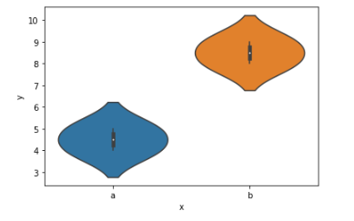
which correctly produces the following visual:
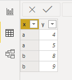
In Power BI, I create the same table:
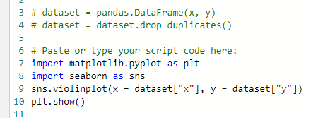
Insert a Python visual with the code:
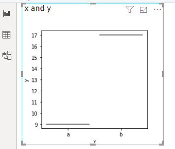
but the result is not the same:
Anyone know what I am doing wrong here? Why is it not the same graph as in the Jupyter notebook? This graphs seems to be summing the data and not showing the distribution.
Solved! Go to Solution.
- Mark as New
- Bookmark
- Subscribe
- Mute
- Subscribe to RSS Feed
- Permalink
- Report Inappropriate Content
Hi @sm_accordion,
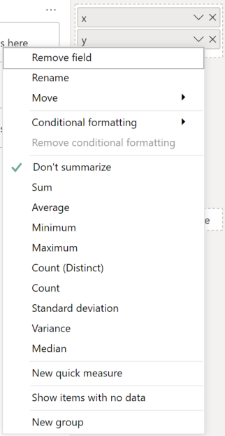
Power BI will typically group data by unique values. This can be mitigated by specifying Don't Summarize for your fields in the visual, e.g.:
This will produce a dataset like the following:
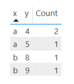
But, even this will consolidate rows if you have the same value repeated multiple times, e.g. x=a, y=4, and this will mess with your distribution. I've added a duplicate row to the above dataset and added a count to the table to show what happens:
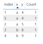
If you truly want to have individual rows passed into your visual, you'll need to add unique value to each row of your dataset (such as an auto-incrementing int) to prevent grouping, so it looks something like this:
| index | x | y |
| 1 | a | 4 |
| 2 | a | 5 |
| 3 | b | 8 |
| 4 | b | 9 |
| ... | ... | ... |
Here's the table representation now (note that count = 1):
If you want further details, I've produced a violin plot custom visual, and have written an article on how grouping/sampling needs to work in these situations. Hopefully this will be useful for you.
Good luck!
Daniel
If my post helps, then please consider accepting as a solution to help other forum members find the answer more quickly 🙂
Did I answer your question? Mark my post as a solution!
Proud to be a Super User!
My course: Introduction to Developing Power BI Visuals
On how to ask a technical question, if you really want an answer (courtesy of SQLBI)
- Mark as New
- Bookmark
- Subscribe
- Mute
- Subscribe to RSS Feed
- Permalink
- Report Inappropriate Content
Thanks a ton. This solved the problem. I appreciate the detailed response and for taking the time to read through the post.
Helpful resources

Microsoft Fabric Learn Together
Covering the world! 9:00-10:30 AM Sydney, 4:00-5:30 PM CET (Paris/Berlin), 7:00-8:30 PM Mexico City

Power BI Monthly Update - April 2024
Check out the April 2024 Power BI update to learn about new features.

| User | Count |
|---|---|
| 110 | |
| 94 | |
| 82 | |
| 66 | |
| 58 |
| User | Count |
|---|---|
| 151 | |
| 121 | |
| 104 | |
| 87 | |
| 67 |
