- Power BI forums
- Updates
- News & Announcements
- Get Help with Power BI
- Desktop
- Service
- Report Server
- Power Query
- Mobile Apps
- Developer
- DAX Commands and Tips
- Custom Visuals Development Discussion
- Health and Life Sciences
- Power BI Spanish forums
- Translated Spanish Desktop
- Power Platform Integration - Better Together!
- Power Platform Integrations (Read-only)
- Power Platform and Dynamics 365 Integrations (Read-only)
- Training and Consulting
- Instructor Led Training
- Dashboard in a Day for Women, by Women
- Galleries
- Community Connections & How-To Videos
- COVID-19 Data Stories Gallery
- Themes Gallery
- Data Stories Gallery
- R Script Showcase
- Webinars and Video Gallery
- Quick Measures Gallery
- 2021 MSBizAppsSummit Gallery
- 2020 MSBizAppsSummit Gallery
- 2019 MSBizAppsSummit Gallery
- Events
- Ideas
- Custom Visuals Ideas
- Issues
- Issues
- Events
- Upcoming Events
- Community Blog
- Power BI Community Blog
- Custom Visuals Community Blog
- Community Support
- Community Accounts & Registration
- Using the Community
- Community Feedback
Register now to learn Fabric in free live sessions led by the best Microsoft experts. From Apr 16 to May 9, in English and Spanish.
- Power BI forums
- Forums
- Get Help with Power BI
- Desktop
- Putting 2 groups of data (from the same column sou...
- Subscribe to RSS Feed
- Mark Topic as New
- Mark Topic as Read
- Float this Topic for Current User
- Bookmark
- Subscribe
- Printer Friendly Page
- Mark as New
- Bookmark
- Subscribe
- Mute
- Subscribe to RSS Feed
- Permalink
- Report Inappropriate Content
Putting 2 groups of data (from the same column source) on the same chart
Hello,
I am quite new to PowerBI, so any help with this would be greatly appreciated!
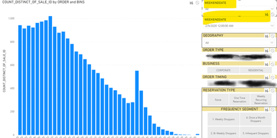
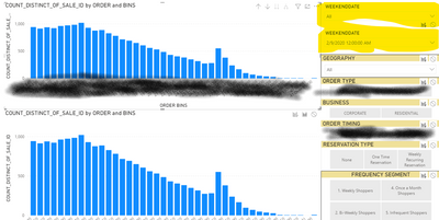
I'm trying to display 2 snippets/subsets of data within the same chart, using 2 separate date slicers to select each date's corresponding data (see highlighted slicers.) Ideally, the chart I create should look like the third screenshot attached, except the colors would designate the 2 different dates I choose from the slicers
The data itself is a distribution of sales records that fall into different bins (across the bottom) and each bar's height is a COUNT of those records.
I've created a copy/separate Date table with a 1-to-1 join relationship with the original Date table, in hopes that changing one wouldn't change the other. Unfortunately, the slicers are still somehow correlated and the only option on the second slicer after selecting a date on the first slicer is the selected date. Alfternatively, if it is easier to correlate each slicer with its own chart (second image attached), that type of view could work as well.
Solved! Go to Solution.
- Mark as New
- Bookmark
- Subscribe
- Mute
- Subscribe to RSS Feed
- Permalink
- Report Inappropriate Content
Hi @noahiz917 ,
There's a relationship between two date tables, not doubt the changing one will affect the other.
You could try to delete or inactive the relationship and create a measure like below then add it to visual.
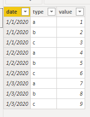
Measure = CALCULATE(SUM('Table'[value]),FILTER(ALL('Table'),'Table'[date]=SELECTEDVALUE('date2'[date])&&'Table'[type]=SELECTEDVALUE('Table'[type])))
Best Regards,
Jay
If this post helps, then please consider Accept it as the solution to help the other members find it.
- Mark as New
- Bookmark
- Subscribe
- Mute
- Subscribe to RSS Feed
- Permalink
- Report Inappropriate Content
Hi @noahiz917 ,
To what I can understand you want to have selection of two date slicers and the calculate the count of the values accordingly to those selections.
What you need to do is to create two additional date table that will allow you to have the slicer values this table should be disconnected from your original table then you need to create measures similar to this ones:
Calculation1 =
CALCULATE (
    COUNT ( Table[Column] ),
    FILTER ( ALLSELECTED ( Table[Date] ), Table[Date] IN VALUES ( SLICER_1_TABLE[Date] ) )
)

Calculation2 =
CALCULATE (
    COUNT ( Table[Column] ),
    FILTER ( ALLSELECTED ( Table[Date] ), Table[Date] IN VALUES ( SLICER_2_TABLE[Date] ) )
)
Now use this two measures on your visualization and the Data tables has your slicers
Regards
Miguel Félix
Did I answer your question? Mark my post as a solution!
Proud to be a Super User!
Check out my blog: Power BI em PortuguêsHelpful resources

Microsoft Fabric Learn Together
Covering the world! 9:00-10:30 AM Sydney, 4:00-5:30 PM CET (Paris/Berlin), 7:00-8:30 PM Mexico City

Power BI Monthly Update - April 2024
Check out the April 2024 Power BI update to learn about new features.

| User | Count |
|---|---|
| 111 | |
| 100 | |
| 80 | |
| 64 | |
| 57 |
| User | Count |
|---|---|
| 145 | |
| 111 | |
| 92 | |
| 84 | |
| 66 |


