- Power BI forums
- Updates
- News & Announcements
- Get Help with Power BI
- Desktop
- Service
- Report Server
- Power Query
- Mobile Apps
- Developer
- DAX Commands and Tips
- Custom Visuals Development Discussion
- Health and Life Sciences
- Power BI Spanish forums
- Translated Spanish Desktop
- Power Platform Integration - Better Together!
- Power Platform Integrations (Read-only)
- Power Platform and Dynamics 365 Integrations (Read-only)
- Training and Consulting
- Instructor Led Training
- Dashboard in a Day for Women, by Women
- Galleries
- Community Connections & How-To Videos
- COVID-19 Data Stories Gallery
- Themes Gallery
- Data Stories Gallery
- R Script Showcase
- Webinars and Video Gallery
- Quick Measures Gallery
- 2021 MSBizAppsSummit Gallery
- 2020 MSBizAppsSummit Gallery
- 2019 MSBizAppsSummit Gallery
- Events
- Ideas
- Custom Visuals Ideas
- Issues
- Issues
- Events
- Upcoming Events
- Community Blog
- Power BI Community Blog
- Custom Visuals Community Blog
- Community Support
- Community Accounts & Registration
- Using the Community
- Community Feedback
Register now to learn Fabric in free live sessions led by the best Microsoft experts. From Apr 16 to May 9, in English and Spanish.
- Power BI forums
- Forums
- Get Help with Power BI
- Desktop
- Purging stale data from charts
- Subscribe to RSS Feed
- Mark Topic as New
- Mark Topic as Read
- Float this Topic for Current User
- Bookmark
- Subscribe
- Printer Friendly Page
- Mark as New
- Bookmark
- Subscribe
- Mute
- Subscribe to RSS Feed
- Permalink
- Report Inappropriate Content
Purging stale data from charts
Hello everyone,
I am having an issue understanding how data gets purged from charts in a streaming analytics to power bi setup. I have a bar chart that displays the count of trips that are late by 15+ minutes, 30+, 45+, etc... (think delivery driver). With streaming analytics, I am able to process messages from an event hub and send the results to the power bi bar chart. My query does a group by on the trip id and when I test my query it only ever produces one row per trip, which is what I want. However, over time, I notice the bar chart is holding on to the result of each past query. The net effect is I have a bar chart displaying trip A is 10 min late, then trip A is 12 min late, and then trip A is 14 min late. What I want to see is just that trip A is 14 min late.
How can I purge (or update) existing data in power bi via streaming analytics?
Thanks for the help!
Mark
- Mark as New
- Bookmark
- Subscribe
- Mute
- Subscribe to RSS Feed
- Permalink
- Report Inappropriate Content
Hi,
Even Power BI can generate dataset for streaming data, it’s still not supported to purge the stream data and keep the latest only.
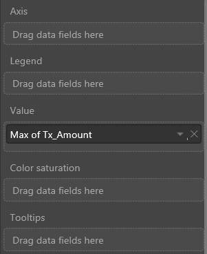
In this scenario, since you want to get the max last minutes, you can change the aggregation type for the late minutes field on visual level.
Best Regards
Alex
- Mark as New
- Bookmark
- Subscribe
- Mute
- Subscribe to RSS Feed
- Permalink
- Report Inappropriate Content
In my scenario, the driver could potentially make up time between stops, so I believe I will need to add a timestamp with each data record and only display the latest record for a given driver/trip.
Thanks for the ideas. I'll let you know if I'm able to get this to work.
- Mark as New
- Bookmark
- Subscribe
- Mute
- Subscribe to RSS Feed
- Permalink
- Report Inappropriate Content
Hi, to me that looks like a problem with the relationships. Can you post a picture of the relationship diagram.
//if this is a solution please mark as such
- Mark as New
- Bookmark
- Subscribe
- Mute
- Subscribe to RSS Feed
- Permalink
- Report Inappropriate Content
Hmm, I don't see how to view the relationship diagram in the online version of power bi. Is there something I'm missing? I see the relationships tab in the power bi desktop app, but I'm only using the online version right now.
This leads to another issue, which is I would like to be able to define my dataset and all associated charts, upload that to the online power bi, and then have streaming analytics just fill the dataset. Is this possible?
- Mark as New
- Bookmark
- Subscribe
- Mute
- Subscribe to RSS Feed
- Permalink
- Report Inappropriate Content
Hi, you can not look at relationships in the online version. Yes that is possible if you have a gateway up and running.
Helpful resources

Microsoft Fabric Learn Together
Covering the world! 9:00-10:30 AM Sydney, 4:00-5:30 PM CET (Paris/Berlin), 7:00-8:30 PM Mexico City

Power BI Monthly Update - April 2024
Check out the April 2024 Power BI update to learn about new features.

| User | Count |
|---|---|
| 109 | |
| 98 | |
| 77 | |
| 66 | |
| 54 |
| User | Count |
|---|---|
| 144 | |
| 104 | |
| 100 | |
| 86 | |
| 64 |


