- Power BI forums
- Updates
- News & Announcements
- Get Help with Power BI
- Desktop
- Service
- Report Server
- Power Query
- Mobile Apps
- Developer
- DAX Commands and Tips
- Custom Visuals Development Discussion
- Health and Life Sciences
- Power BI Spanish forums
- Translated Spanish Desktop
- Power Platform Integration - Better Together!
- Power Platform Integrations (Read-only)
- Power Platform and Dynamics 365 Integrations (Read-only)
- Training and Consulting
- Instructor Led Training
- Dashboard in a Day for Women, by Women
- Galleries
- Community Connections & How-To Videos
- COVID-19 Data Stories Gallery
- Themes Gallery
- Data Stories Gallery
- R Script Showcase
- Webinars and Video Gallery
- Quick Measures Gallery
- 2021 MSBizAppsSummit Gallery
- 2020 MSBizAppsSummit Gallery
- 2019 MSBizAppsSummit Gallery
- Events
- Ideas
- Custom Visuals Ideas
- Issues
- Issues
- Events
- Upcoming Events
- Community Blog
- Power BI Community Blog
- Custom Visuals Community Blog
- Community Support
- Community Accounts & Registration
- Using the Community
- Community Feedback
Register now to learn Fabric in free live sessions led by the best Microsoft experts. From Apr 16 to May 9, in English and Spanish.
- Power BI forums
- Forums
- Get Help with Power BI
- Desktop
- Pull data labels from adjacent column cells
- Subscribe to RSS Feed
- Mark Topic as New
- Mark Topic as Read
- Float this Topic for Current User
- Bookmark
- Subscribe
- Printer Friendly Page
- Mark as New
- Bookmark
- Subscribe
- Mute
- Subscribe to RSS Feed
- Permalink
- Report Inappropriate Content
Pull data labels from adjacent column cells
Hi,
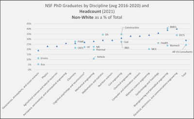
I'm trying to recreate a chart in PowerBI that is simple to create in Excel. The data table looks like this:
| NSF Fine Field Disciplines | Average 2016-2020 NSF Non-White PhD Grads | 2021 Non-White Headcount | Practice(s) | 2021 Non-White Headcount | Practice(s) | 2021 Non-White Headcount | Practice(s) |
| Geosciences, atmospheric, and ocean sciences | 19% | 11% | Enviro | 5% | Eco | ||
| Physics | 23% | ||||||
| Agricultural sciences and natural resources | 23% | ||||||
| Aerospace, aeronautical, and astronautical engineering | 26% | ||||||
| Chemistry | 26% | 28% | PSMC | 21% | CRFS | ||
| Cognitive psychology and neuroscience* | 27% | 22% | HF | ||||
| Mechanical engineering | 28% | 22% | ME | 20% | Thermal | 11% | Vehicle |
| Mathematics and statistics | 29% | 34% | DS | ||||
| Nutrition sciences | 29% | ||||||
| Civil engineering | 31% | 27% | Civil | 28% | B&S | 35% | Construction |
| Chemical engineering | 33% | ||||||
| Computer and information sciences | 33% | ||||||
| Materials science engineering | 34% | 20% | MCE | ||||
| Epidemiology and Toxicology | 36% | 26% | Health | ||||
| Bioengineering and biomedical engineering | 39% | 24% | Biomech | 40% | BMES | ||
| Electrical, electronics, and communications engineering | 40% | 34% | EECS | ||||
| Total | 29% | 24% | All US Consultants |
The Excel chart looks like this:
I am able to come close to recreating this in PowerBI as follows, but I cannot figure out how to add the text labels to the markers from the columns in the table next to the data points. In Excel you simply set the data label to value from a group of cells. But I don't see any way to do this in PowerBI. Is it not possible?
Ideas are much appreciated.
Sally
- Mark as New
- Bookmark
- Subscribe
- Mute
- Subscribe to RSS Feed
- Permalink
- Report Inappropriate Content
Hi, @scottcrk ;
s I know, the data label is based on value, so we could not use custom label or use text in label. You could use this in tooltip. By the way, I suggest you could submit this in power-bi-ideas .
Or you could try this custom visual.
Solved: Power BI - Visuals that support custom data labels... - Microsoft Power BI Community
Best Regards,
Community Support Team _ Yalan Wu
If this post helps, then please consider Accept it as the solution to help the other members find it more quickly.
- Mark as New
- Bookmark
- Subscribe
- Mute
- Subscribe to RSS Feed
- Permalink
- Report Inappropriate Content
Unfortunately this is not a solution. I'll subit as an idea.
Helpful resources

Microsoft Fabric Learn Together
Covering the world! 9:00-10:30 AM Sydney, 4:00-5:30 PM CET (Paris/Berlin), 7:00-8:30 PM Mexico City

Power BI Monthly Update - April 2024
Check out the April 2024 Power BI update to learn about new features.

| User | Count |
|---|---|
| 108 | |
| 100 | |
| 78 | |
| 64 | |
| 58 |
| User | Count |
|---|---|
| 148 | |
| 111 | |
| 94 | |
| 84 | |
| 67 |


