- Power BI forums
- Updates
- News & Announcements
- Get Help with Power BI
- Desktop
- Service
- Report Server
- Power Query
- Mobile Apps
- Developer
- DAX Commands and Tips
- Custom Visuals Development Discussion
- Health and Life Sciences
- Power BI Spanish forums
- Translated Spanish Desktop
- Power Platform Integration - Better Together!
- Power Platform Integrations (Read-only)
- Power Platform and Dynamics 365 Integrations (Read-only)
- Training and Consulting
- Instructor Led Training
- Dashboard in a Day for Women, by Women
- Galleries
- Community Connections & How-To Videos
- COVID-19 Data Stories Gallery
- Themes Gallery
- Data Stories Gallery
- R Script Showcase
- Webinars and Video Gallery
- Quick Measures Gallery
- 2021 MSBizAppsSummit Gallery
- 2020 MSBizAppsSummit Gallery
- 2019 MSBizAppsSummit Gallery
- Events
- Ideas
- Custom Visuals Ideas
- Issues
- Issues
- Events
- Upcoming Events
- Community Blog
- Power BI Community Blog
- Custom Visuals Community Blog
- Community Support
- Community Accounts & Registration
- Using the Community
- Community Feedback
Register now to learn Fabric in free live sessions led by the best Microsoft experts. From Apr 16 to May 9, in English and Spanish.
- Power BI forums
- Forums
- Get Help with Power BI
- Desktop
- Re: Proportional Histogram
- Subscribe to RSS Feed
- Mark Topic as New
- Mark Topic as Read
- Float this Topic for Current User
- Bookmark
- Subscribe
- Printer Friendly Page
- Mark as New
- Bookmark
- Subscribe
- Mute
- Subscribe to RSS Feed
- Permalink
- Report Inappropriate Content
Proportional Histogram
Hi everybody,
I want to create an histogram with two columns like that :
Firstly, I don't success to create this two columns on the same histogram.
Secondly, I need to have proportionnal ratio on histogram. For example, pink row show 62.17 and the other 106.58. But the 62.17 is so big than the other and its not logical on reality.. does anybody can explain me, if it is possible, how I can resolve my problem and have two proportionnal histogram.
Thanks
DavidB023
Solved! Go to Solution.
- Mark as New
- Bookmark
- Subscribe
- Mute
- Subscribe to RSS Feed
- Permalink
- Report Inappropriate Content
Hi @DavidB023,
These data are like mine and like I said previously, I want to have two columns on one graph if it is possible, and I want a proportionnal repartition. On my example, you can see that for a same kind of category like E, the forecast is bigger than the real on the figure but not on the visual.
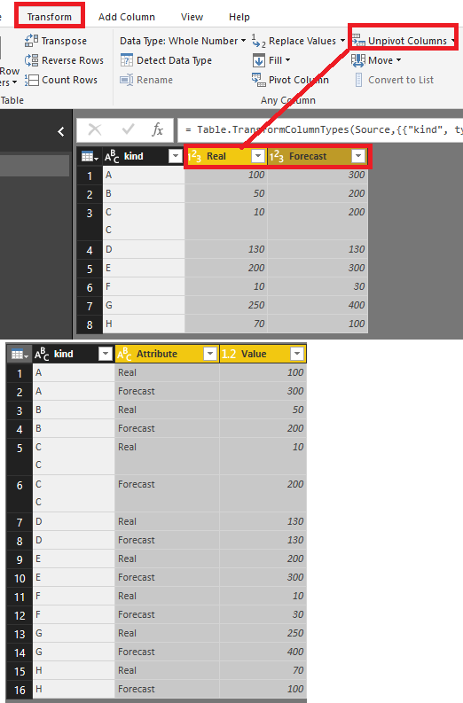
Firstly, if you want to put two columns on one graph, you need to change your data structure in Query Editor.
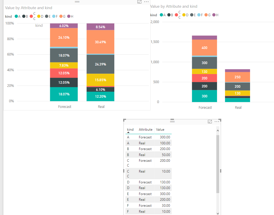
Then I suggest you create the visual with Stacked column chart.
If you create the 100% Stacked column chart which is allocated by percentage so it will show 'category like E, the forecast is bigger than the real'.
Reference: test pbix file
Hope it can help you !![]()
Best Regards,
Cherry
If this post helps, then please consider Accept it as the solution to help the other members find it more quickly.
- Mark as New
- Bookmark
- Subscribe
- Mute
- Subscribe to RSS Feed
- Permalink
- Report Inappropriate Content
Hi @DavidB023,
Which chart did you created?
I have made a test with the Stacked Column chart with Power BI Desktop April version, everything works as expected.
If it is convenient, could you share a dummy pbix file which can reproduce the issue, so that we can help further investigate on it? You can upload it to OneDrive or Dropbox and post the link here. Do mask sensitive data before uploading.)
Best Regards,
Cherry
If this post helps, then please consider Accept it as the solution to help the other members find it more quickly.
- Mark as New
- Bookmark
- Subscribe
- Mute
- Subscribe to RSS Feed
- Permalink
- Report Inappropriate Content
@v-piga-msft Thanks for your time, so I put as an attachment an example of data. These data are like mine and like I said previously, I want to have two columns on one graph if it is possible, and I want a proportionnal repartition. On my example, you can see that for a same kind of category like E, the forecast is bigger than the real on the figure but not on the visual.
That create an unlogical visual for my dashboard..
https://1drv.ms/u/s!AlpYVjQtU7WhiS1xfWK_pBilOtGO
Best regards
DavidB023
- Mark as New
- Bookmark
- Subscribe
- Mute
- Subscribe to RSS Feed
- Permalink
- Report Inappropriate Content
Hi @DavidB023,
These data are like mine and like I said previously, I want to have two columns on one graph if it is possible, and I want a proportionnal repartition. On my example, you can see that for a same kind of category like E, the forecast is bigger than the real on the figure but not on the visual.
Firstly, if you want to put two columns on one graph, you need to change your data structure in Query Editor.
Then I suggest you create the visual with Stacked column chart.
If you create the 100% Stacked column chart which is allocated by percentage so it will show 'category like E, the forecast is bigger than the real'.
Reference: test pbix file
Hope it can help you !![]()
Best Regards,
Cherry
If this post helps, then please consider Accept it as the solution to help the other members find it more quickly.
- Mark as New
- Bookmark
- Subscribe
- Mute
- Subscribe to RSS Feed
- Permalink
- Report Inappropriate Content
Helpful resources

Microsoft Fabric Learn Together
Covering the world! 9:00-10:30 AM Sydney, 4:00-5:30 PM CET (Paris/Berlin), 7:00-8:30 PM Mexico City

Power BI Monthly Update - April 2024
Check out the April 2024 Power BI update to learn about new features.

| User | Count |
|---|---|
| 109 | |
| 98 | |
| 77 | |
| 66 | |
| 54 |
| User | Count |
|---|---|
| 144 | |
| 104 | |
| 100 | |
| 86 | |
| 64 |


