- Power BI forums
- Updates
- News & Announcements
- Get Help with Power BI
- Desktop
- Service
- Report Server
- Power Query
- Mobile Apps
- Developer
- DAX Commands and Tips
- Custom Visuals Development Discussion
- Health and Life Sciences
- Power BI Spanish forums
- Translated Spanish Desktop
- Power Platform Integration - Better Together!
- Power Platform Integrations (Read-only)
- Power Platform and Dynamics 365 Integrations (Read-only)
- Training and Consulting
- Instructor Led Training
- Dashboard in a Day for Women, by Women
- Galleries
- Community Connections & How-To Videos
- COVID-19 Data Stories Gallery
- Themes Gallery
- Data Stories Gallery
- R Script Showcase
- Webinars and Video Gallery
- Quick Measures Gallery
- 2021 MSBizAppsSummit Gallery
- 2020 MSBizAppsSummit Gallery
- 2019 MSBizAppsSummit Gallery
- Events
- Ideas
- Custom Visuals Ideas
- Issues
- Issues
- Events
- Upcoming Events
- Community Blog
- Power BI Community Blog
- Custom Visuals Community Blog
- Community Support
- Community Accounts & Registration
- Using the Community
- Community Feedback
Register now to learn Fabric in free live sessions led by the best Microsoft experts. From Apr 16 to May 9, in English and Spanish.
- Power BI forums
- Forums
- Get Help with Power BI
- Desktop
- Re: Project Tracking
- Subscribe to RSS Feed
- Mark Topic as New
- Mark Topic as Read
- Float this Topic for Current User
- Bookmark
- Subscribe
- Printer Friendly Page
- Mark as New
- Bookmark
- Subscribe
- Mute
- Subscribe to RSS Feed
- Permalink
- Report Inappropriate Content
Project Tracking
Hi there,
I'm trying to create a project tracking chart, whihc is basically a project managemnet S curve.
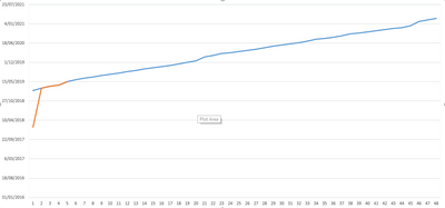
The only difference is my X axis is date (so continuous variable) and my Y axis are the different projects - 48 different sprints - (so a categorical variable).
I was able to do it in excel (picture below), and I'm trying ot accomnplish this in power BI.
Please help.
Cheers
Solved! Go to Solution.
- Mark as New
- Bookmark
- Subscribe
- Mute
- Subscribe to RSS Feed
- Permalink
- Report Inappropriate Content
Hi @Anonymous
Line chart doesn't support to use "date" in the y-axis.
One workaround is as below:
Open Edit queries,
Click on "sprint" column, then select add column- duplicates column,
Click on the duplicated column, then select transform->split column,
Select "planned" and "actual" columns, then select transform->unpivot columns,
Close && apply,
Create another table and connnect it with original table
calendar = CALENDARAUTO()
Best Regards
Maggie
Community Support Team _ Maggie Li
If this post helps, then please consider Accept it as the solution to help the other members find it more quickly.
- Mark as New
- Bookmark
- Subscribe
- Mute
- Subscribe to RSS Feed
- Permalink
- Report Inappropriate Content
Hi @Anonymous
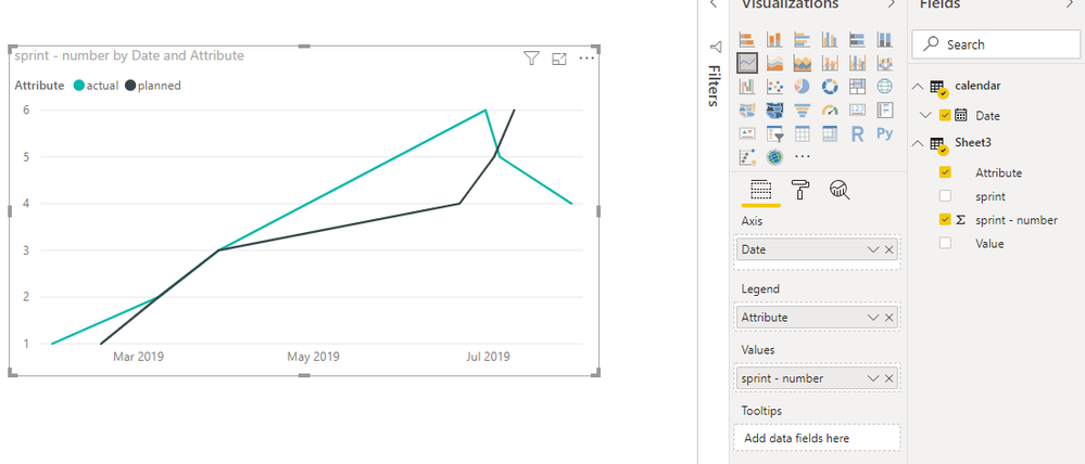
Another workaround is to create a R visual so that the date field can be used in Y axis.
After transformation as my previous post, create a r visual as below:
https://community.powerbi.com/t5/Desktop/dates-on-Y-axis/td-p/339940
Best Regards
Maggie
Community Support Team _ Maggie Li
If this post helps, then please consider Accept it as the solution to help the other members find it more quickly.
- Mark as New
- Bookmark
- Subscribe
- Mute
- Subscribe to RSS Feed
- Permalink
- Report Inappropriate Content
Hi @Anonymous
Line chart doesn't support to use "date" in the y-axis.
One workaround is as below:
Open Edit queries,
Click on "sprint" column, then select add column- duplicates column,
Click on the duplicated column, then select transform->split column,
Select "planned" and "actual" columns, then select transform->unpivot columns,
Close && apply,
Create another table and connnect it with original table
calendar = CALENDARAUTO()
Best Regards
Maggie
Community Support Team _ Maggie Li
If this post helps, then please consider Accept it as the solution to help the other members find it more quickly.
- Mark as New
- Bookmark
- Subscribe
- Mute
- Subscribe to RSS Feed
- Permalink
- Report Inappropriate Content
Hi @Anonymous ,
Sounds pretty straight forward, where did you get stuck?
Reg,
Robin
- Mark as New
- Bookmark
- Subscribe
- Mute
- Subscribe to RSS Feed
- Permalink
- Report Inappropriate Content
Hi Robin,
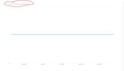
I've added a screenshot of the data I'm trying to visualise in power BI.
As you can see, the sprint data is on the x axis and is categorical and the y axis is the date the sprint is completed (there will be 2 trendlines, planned finish vs actual finish).
This is what I'm getting in Power BI.
As you can see, it's trying to count the sprints, but I need the sprints to be discrete.
Hope this provides more clarification.
Cheers.
Helpful resources

Microsoft Fabric Learn Together
Covering the world! 9:00-10:30 AM Sydney, 4:00-5:30 PM CET (Paris/Berlin), 7:00-8:30 PM Mexico City

Power BI Monthly Update - April 2024
Check out the April 2024 Power BI update to learn about new features.

| User | Count |
|---|---|
| 114 | |
| 98 | |
| 86 | |
| 70 | |
| 62 |
| User | Count |
|---|---|
| 151 | |
| 120 | |
| 103 | |
| 87 | |
| 68 |


